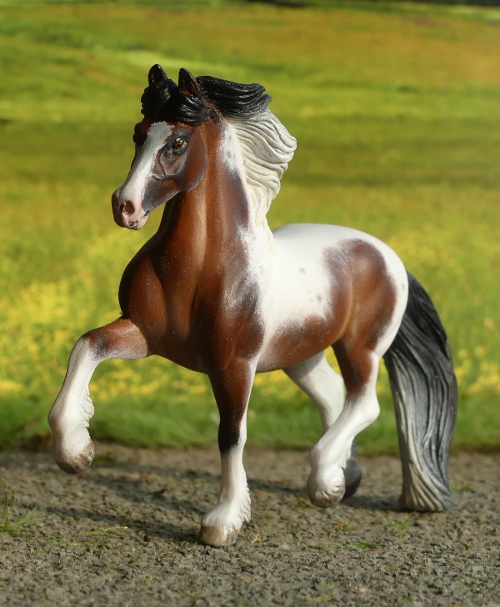
Monday, 9 November 2020

Tales from the Body Box - the day of the Akhal-Teke

One of my favourite more unusual horse breeds is the ancient and striking Akhal-Teke, there's just something about their beauty and strangeness which is fascinating. Last year, I treated myself to a copy of Golden Horse : The legendary Akhal-Teke, a huge, beautiful thing to be read slowly and savoured, as much a work of art as it is of information, full of stunning photography by Artur Baboev - chances are, if you've spent any time looking at pictures of this glorious breed online, you'll have seen a lot of his.

Inspired by the book, I really wanted to make myself a custom Breyer Akhal-Teke. I've got models of them already (two resins and a Collecta), but in my Breyer herd there was only the OF metallic dun on the Lonesome Glory mould (I won him in a raffle!), and I really wanted to make a model look more Teke than just a thoroughbred mould in a metallic paintjob!

First things first, I'll admit it : I'm not the biggest fan of resculpting. I usually regard it as something to tackle if it absolutely unavoidably has to be done, like a damaged body which needs repairing, or a portrait custom which needs a different mane to look like the real horse. All other customs just get painted as they come, with just some craft-knife carving now and then to sort out seams and occasionally refine legs or jawlines. But it was clear that this time, I was going to have to get out the knife and milliput if I wanted the model to look right.
Back then I didn't have the new walking TB which would probably have been a far better starting point, but this project began last summer and moulds which've come my way since just weren't in the body box at the time - the only one I had with potential was the dressage/hanoverian, so that's what I picked out. 
Now, I did intend to take photos as I went along, and I'm certain I took at least two stages, but seem to have lost them entirely since then, so you don't get step-by-step pictures, and I'll just list what happened to the poor horse...

Plaited mane and forelock removed. 
Neck and topline reshaped.
Throat cut almost all the way through to lift the chin without detaching the head.
Ears filed pointier.
Shoulders and hips filed to remove warmbloody bulk and roundness.
Belly filed to 'lose weight' along flanks and underneath.
Legs carved thinner, especially thighs and cannons.
Raised foreleg sliced and bent at knee and fetlock.
Tail filed away so it hangs to a point, not a thick tail cut straight across.
Ribs scored in with the edge of the file.
Milliput added along spine to sharpen & straighten back and add the prominent withers & hip.
New throat filled in.
Eyelid and profile slightly resculpted.
Horse set aside because intended colour is difficult and painter is better at delaying than getting on with things.
Over a year goes by.
Dust gathers.

Last week, I finally got myself into the right frame of mind (you know, the paint this while you're still painting at all cos once you stop it'll be years again one), and it was time to tackle the Teke...


He's done! And, amazingly, he looks more or less exactly how I hoped. Perhaps my mental image was a little bit darker, more layers of the sooty shading, but I reached this stage and somehow he just looked like the colour he was meant to be, so I stopped the shading layers before I ruined him! 
I've named him Mele Bürgüt, 'brown eagle' in the Turkmen language, as many Akhal-Tekes are given names which reference their colour or liken their speed and character to birds.


I had a tube of gold paint (just a pound shop metallic acrylic, bought years ago for a Household Cavalry tack project), which I started off mixing into the tan and sandy shades, but found two problems with this - a) the paint took forever to dry and felt sticky, and b) you couldn't see the gold. I think the normal paint was coating the fine metallic specks so much it was lost in the mixture, and adding more just made it all the stickier. So I abandoned the gold paint, concentrated on getting the colour I wanted, then once he was done, dry-brushed the gold lightly over the top to give the metallic sheen I'd been trying for. It's there, but it's subtle, and looks more noticeable in person than in static photos.


Here he is with some dramatic low-sun lighting, in tribute to the Baboev photography which inspired his creation!

And then I washed my brushes, braided him a little colourful collar, and sat him on the mantelpiece, enjoying that moment of satisfaction and relief that the paintjob had worked. At long last, a custom project which'd been sitting half-finished for over a year, all done.
Now what?
Start another straight away, of course, one Akhal-Teke wasn't enough!

There in the body box was a mare mould who had the basics of Teke conformation - deep chest, high withers, long flat back, slim legs, fine long ears, and a flighty, spirited pose to suit the character just fine. Sure, she had way too much mane and tail, but that was nothing a sharp knife and a metal file couldn't fix...


Meet Roksolana, palomino mare on the Magnolia mould. Her colour's based on the gorgeous palomino on the Golden Horse book's front cover, a slightly greyed-down shade rather than the famously 'new penny' kind, again with the metallic paint gently smudged on as a thinly applied dry top coat (actually, I took the worst of each brush-dab off on the back of my hand before it touched the horse, so I ended up almost as shiny as she did!)


Another traditonal neck collar, and I think she looks just typey enough to say 'akhal-teke' at a glance, even without having had all the resculpting work the stallion did. Have a look for the little black spot inside her stripe - I didn't mean to put one there, but a slip of the hand while detailing her nostrils and she gained a marking which looks like it was designed on purpose!

And the painting didn't end there, either - having made myself a pair, it only seemed right to give them a matching foal, and there was a good mould for that in my body box, too...


I had a think about what colour babies would be possible for a buckskin and palomino bred together, and rather than have to paint the same as either adult, I went with a double cream dilution and made her a cremello. Akhal-Teke foals are traditionally named with the same letter as a parent - colts to match the stallion, fillies the mare, so this little one is Roxana to go with her mum.


Here they are together, and below, the whole family of three. That's enough painting for one day, I'm happy now!


Monday, 2 November 2020

A whole lot of photo showing

As with many events lost from the calendar, 2020 unavoidably brought the cancellation of lots of live model horse shows, including two Julip ones I'd have gone to if things had been different. Luckily, we're a resourceful lot in this hobby, and our models can compete just as easily by photograph as in person - some shows were converted from live meet-ups into an online equivalent, others were thought up as something to occupy and distract ourselves, during lockdown or difficult times for those still working. A lot of these shows provided lovely rosettes by post for the winners, so I thought it'd be nice to show my appreciation to the show runners with a little recap of the prizes my models have won this year. 

First up, is Sarsen, who won Julip's Model of the Month competion back in February.

Each month is allocated a theme, February's was No White Markings, and there's a story to him being my choice - not very interesting, but a tiny mildly amusing snippet of Julip history, anyway!
Years ago, long before Julip changed hands, the connemara mould was being recast and announced at one of the Open Weekend events down in Cattistock. Annabel wanted to have a couple of finished models to display on the day, so everyone could see how the new version looked in person, all painted up. So she secretly told two of us beforehand that we could order connemaras in whatever colour, and they'd be there at the show to advertise the mould and then take home with us. I asked for mine to be 'very dark bay, as dark as you can get it, with a LOT of white on', thinking this would look really distinctive and dramatic, with big markings on a dark colour. I said just make up the markings, rather than me finding and sending a reference pic of any real horse, cos I know how much easier it is to invent them than to copy from photos.
On the day, the connemara was revealed, and as Annabel handed him over, I noticed he was dark all over, asked 'Where's his white?' and she answered 'Was he meant to have white on?'
We had a little laugh about her completely forgetting half of what I'd asked for, and said I could go and put his markings on myself as there was a Paint Your Own table in the hall, so it would've been easy enough to update him. But I decided I liked him as he was, and it was just funny rather than disappointing. So he stayed without white forever, and this was the first time he'd ever been able to take part in a competition just because someone forgot his socks!

Next came a free mini photo show run by a fellow Julip fan on the forum, the only category was My Favourite Julip, and along with choosing a single photograph, we had to write why we'd picked this model to enter. Here's my explaination...
"Rosie might not be the prettiest pony, she's not clean or tidy or any good for showing, her mane looks more like moths have been at it than anything that could possibly have been made that way on purpose, but she means the most to me out of all my herd as she's my own custom portrait of my horse of a lifetime. Every speckle on her nose, every flaw in her fleabitten coat, that's what makes her lovely, to me. Real Rosie once met the mini Rosie, and that makes her even more precious."

And here's the  proud winner, enjoying her big shiny rosette - real Rosie would secretly have preferred a cheese sandwich to a rosette, but the model one has never nicked my lunch at a show yet, so let's assume she's better behaved!

The next show of the year was an altogether bigger event, the May Madness CTF Photo Show, run by a collector rather than any one company, with a huge class list and categories for all different types of CTF model. My herd held their own against a lot of very pretty horses, here's the Julip winners with some of the lovely rainbow satin rosettes which were on offer on a pay-as-you-win basis.


Left to right, we have : Scruffy Murphy (1st, Donkey), Smoke N'Oakum (1st, CJP), Gato (1st, Family Horse), Legatissimo (1st, In-hand Light Horse), Jaffacake (1st, Dartmoor), and at the end little Rufus the donkey foal, who was given the special Tango Award by the judge!

Later in the summer, Chestnut Ridge held their Grand Photo Show, a competition with a difference - rather than having a limit per class (usually three or four), you can enter up to a total of fifty models, spread across whichever classes you want. This means you can focus on one brand or finish or several, you can pick out your favourites or very best models only, or if a certain breed is your thing, you can enter as many of those as you can fit in that fifty limit. I decided to give the Julips a rest this time (they can't have all the fun!), and give my Breyer, Stone and resin models a virtual 'day out' instead.

One of the horses I entered was Harecroft Taradhish, a custom marwari who did amazingly well - not only did he win his class, but he took the custom championship, too! Here he is with his prizes, not just the beautiful big rosette with sparkly edges, but some extras, too : the little Mini Whinnie on the right has already been painted up as a new addition to my ever growing herd of coloured cobs, and the bee-fabric bag on the left has been filled with the bias binding I use on my home-made Julip rugs.


August brought another success in Julip's Model of the Month competition, this time the theme was 'Cheekiest Pony', and it was a tough choice - ALL pit ponies are made of pure trouble, but skewbald Popcorn probably has the most sneakily up-to-something glint in his eye out of all mine, and clearly Laura at Julip thought so too, because in the post at the end of the month was this special rosette for Popcorn, bigger than he is!


The Lake District Live and Julip's own official Live show were both converted into photo shows instead this year, each using more or less the same class list as they'd planned for us to take part in person, but carried out online during lockdown and restrictions. 
One of the Lake District classes was 'Fab Five' - any five Julips with something in common, photographed together as a group. Rather than go for a conga line of all the same mould, or a set of matching colours, I decided to go a little bit more fabulous, and entered five arabians all dressed in their bright and beaded Bedouin-style show halter sets. They must have caught the judge's eye, because not only did they win this class, but also took the Fun division championship!
The Julip live also had a Conga class, and while we usually use this term to mean a row of the same mould, the rules specified 'any other common theme' was fine too, so I entered my dressed-up arabians again - and again, they won the class, and the Fun championship!


Here they are (Larkhill, Harvest Moon, Galileo, Winter, and Echo) with both their big, beautiful championship rosettes, Lake District on the left and Julip on the right.

And to finish with for now, the Summer Swing CTF Photo Show, which again catered for different brands, not just Julips - my highest-placing horse was this handsome chap, Julius Elmar, the WIA Gustav in original finish spots, who took Reserve to Reserve Champion in the Plastic division.


But one of my Julips did astonishingly well, too; this is Olympic Flame the 1981 thoroughbred, who was champion in the Vintage sub-division.


He looks so calm about his win, I imagine him as a gentle old veteran who's seen it all before and always puts in a sensible, workmanlike performance without letting the showring get to his head!
It was so, so nice to be able to show so many old Julips this time, most shows tend to have one vintage class, occasionally split into Vintage Horse and Vintage Pony, but this time we had classes for most of the common moulds and space for the rarer and poor-condition models, too.

The pay-as-you-win placing rosettes were all different colours this time, so rather than only treat my first-place Julips, I decided to ask for one of each placing so there'd be a full rainbow of gingham for my rosette wall, and on the back I'd write all the names with that placing, so they can share - I don't think they'll squabble when I'm not looking! Click the pictures if you'd like a closer look.


1st : Olympic Flame, Petra, April, Ichabod, Albermarle, Scruffy Murphy, Charlie, Echo, and Gato
2nd : William, Neapolitano Bellamira, Bertie, Tarquin, Requiem, and Equinox
3rd : Goldie, Horatio, and Merriweather


4th : Colin, Bernard, Stardust, and Tiffin
5th : Seraphim, Ford Prefect, and Butterfly Ben
6th : Big Connie, Frank, Khalife, and Danny


7th : Neapolitano Ramona and Robin
8th : Richmond and Phari
Highly commended : Donnie, Calluna, Rodrigo, Smoke N'Oakum, The Grey King, Sylvester, Puffin

Argh. Oh dear. I've just this minute realised that I totally forgot to allow for Performance results in these pictures - there's others who should've been in the photos, really, as well as some of these needing to be in two shots cos they placed for performance classes as well as their mould. Oops! I'll make sure I add their names on the back of the rosettes, though.


And finally, another Tango Award, this time for Olympic Flame, Jaffacake, and with apologies to little chestnut foal Ginger, who also has a share in this but seems to be hiding somewhere in my house - I couldn't find her anywhere to join the picture. 

My thanks to the show runners for organising all these events - for your hard work sorting and judging, for giving us something fun to do with our models, and for every one of the beautiful rosettes - I treasure them almost as much as any my real ponies ever won!

Sunday, 25 October 2020

Breyer 70th Anniversary Andalusian

 A much-awaited brand new model arrived here with me yesterday...


Yes, at long long last, Breyer's 70th Anniversary Traditionals have reached UK stockists!

This may seem crazy if you're a US collector and have had this set around since the spring, but over here we're often subjected to long waits for some regular run items. The current estimation for one of the 2020 'mid year' models is spring next year!

But this is the first time I've ever ordered one in January and had it arrive in October. Actually, I'm just relieved he's here at all. On top of unavoidable production delays from covid and the international distribution being a bit rubbish, the company I pre-ordered him with never even acknowledged or confirmed my order in the first place, then in ten months I never had a single email update on delays to likely delivery dates (meanwhile the website said 'due March' and this was never changed), and they ignored not one, not two, but three increasingly worried emails through the autumn, as I tried to contact them and got no response whatsoever. So I wasn't sure I'd ever be getting this model, and he definitely takes the record for longest I've had to wait!


Way back when the Anniversary collection of five Traditionals was first announced, this was the one who stood out, for me, and the only one which I knew I was going to want to buy. 
I realise collectors have been raving over the Saddlebred most of all, they sell out in minutes, but I reckon I'm the odd one out there : he hasn't even made it to my wishlist yet! At first it was the oddly twirly sculpting of the tail which put me off, but when we saw 'real' photos which clearly showed his paint finish, I didn't like the highly metallic body and pearly mane & tail. I think a little metallic sheen can be a good thing, golden colours can reflect the light that way in real life, but too much and it's more like a decorator finish than a realistic coat. Some saddlebreds seem worse than others, I've seen a few which are perfectly done with just a hint of gold, so there's a lingering 'maybe' if I ever get chance to hand-pick one, or buy second hand with clear photos, so I could be sure of getting one which was less shiny. But now, back to the Andalusian!


He's just as nice in person as I'd hoped. The amount of black shading on them does seem to vary a little bit from the promo photo; some have starker contrast with a lighter near-white base coat, or entirely dark hindquarters and a more solid streak down the shoulder, mine's faded out more gradually into a dove grey body colour. That combined with well-rounded, distinctly non-fishscaley dapples makes him look quite soft and subtle. There's been none I've seen that looked absolutely terrible, though, some previous Trad runs have had 'good ones' and 'bad ones' but the painters have done a great job with copying this design - they do vary but even the ones which stray most from the prototype paintjob still look nice, if you get what I mean!


Here he is in different light, it's extremely tricky to find any big-enough patch of sunshine in my garden for many minutes each day between October til March, so these photos aren't the best - I had to make his shadow fall either left or right, to avoid hitting the backdrop behind. You can click any picture I post here on the blog to see it full size.
I think the photos with his shadow in front of him look the nicest, but these with it away behind him probably show him a bit more clearly, so it'll be difficult deciding which to use in photo shows!


The other side, it's one of those moulds which looks handsome either way round, and they'd display equally well on the shelf cantering left or right, I just love the big wild-flying mane so I tend to favour the near side. As the back of the box details, in explaining why they chose this mould to represent the 1990s-2000s, there's a lot more detail and complexity in the moulding, with cut-outs in the mane and tail. I've liked this dramatic and handsome mould ever since it first appeared, in 2004 as the unnamed black first edition (incidentally, still one of the best black OFs ever made, with shading and dapples worked in to his colour rather than just spraying it all over with a semi-gloss pure black paint and calling that good enough!)


You can just about see if you look closely at these two photos, that he's missing the tips of his ears, more drastically on the near side but the off is curiously blunted, too - it looks like over-zealous buffing of the mould to remove seam lines and going too far, not broken ear tips which escaped notice and got painted over. Luckily you can't really tell in the side-on photos, nor at a distance, so he looks just fine for display or photo showing - you probably hadn't noticed til I hadn't pointed it out, either!

I've tentatively gone with calling him Aniversario, as he's likely the only one of the 70th Anniversary Trads I'll end up with it, and in Spanish it doesn't sound too unappealing as a horse name - it's just rather unoriginal and if I think of anything better later, I'll change it!

Friday, 23 October 2020

Tales from the Body Box - four skewbalds and a grey

Today's batch contains a bit of a catch-up from all October so far, as the weather's not been co-operative in getting the pictures taken.


First up, a chestnut overo on my favourite of all the Stablemate foal moulds. Not only is it a fun playful pose, with a sweet face, but it's the most steady on those little feet, less likely to topple over and damage paintwork or set off a domino trail along the shelf!


I've named her Harecroft Red Horizon, here's a couple more shots of this very photogenic little one!

Next to be completed, the final G2 paso fino in my body box - this mould I never really clicked with, knowing very little about the breed (not to be confused with the peruvian paso), til I read up more about their history and watched some Youtube videos of their unusual running-walk gait. Do look them up if you've only ever seen still photos, it's quite something to see in action!
Despite not being one of my favourite moulds, in certain colours I do really like it, and luckily I struck on a colour I'm very happy with, here. She looks a very soft and gentle mare, so I've named her Pachamama, after the mother earth goddess of the Inca.


Something much much more familiar, next, my own local 'native breed' in the form of a coloured traditional cob. Ever since I got this body (as a free gift with an order from the much-missed Utterly Horses online model shop), I've had a skewbald cob in mind, and at long last I fished him from the body box and got painting! He turned out pretty much exactly as I'd planned, with a typical tobiano pattern and fluffily feathered edges to contrast with the sharper style I usually use.


I didn't have to wait long to think of a fitting name for him, while I was still finishing off his paintwork I happened to hear mention of the pirate Calico Jack on tv, and it seemed perfect - a calico cat is one with a tri-coloured patchy coat, and another of my recent cob customs was named Pirate, so this suits him very nicely indeed.


Here's another colour idea which has been hovering in the back of my mind for years rather than days before actually happening on a model! She's inspired by a couple of grey skewbalds I've seen out on the cross country course, horses which would have started out dark with white markings, but the greying process has taken away their colour little by little, til they're left as a pale or fleabitten grey with markings almost lost as white on white at first glance. When they're clipped, the grey stands out a little more, as the contrast of black skin or pink can be seen clearly - especially after they've been through the water jump! I've named this one Bluebird, and with those chunky legs and dinnerplate feet, I imagine her as a partbred heavy horse with the feather clipped off!


And here's the last of this batch, Valparaiso, one more mini Alborozo for my herd. He was from the unicorn suncatchers paint set, but once the horn's carved away and the clear plastic is painted over, you'd never know - it's quite a handy and good-value way to get hold of four nice newish moulds to customise!


I'd been trying to pin down colours for my last two Alborozos for a while - being a harder-to-get mould, it does take careful consideration to make the most of the bodies which come my way. Having done a bay, a dark rose grey, and a mulberry grey, a pure pale white-grey seemed tempting next, or perhaps fleabites or some faint dappling for a little more interest than a plain one? Then I turned the page of my calendar to see a fleabitten, faintly dappley grey with a blonde-and-grey mixed mane, and ah, there was my colour.


It was only after finishing him that I realised how much he reminded me of this grey version of Napoleon Crossing the Alps - mine has shorter socks but the likeness is there, especially in this sidelong lighting!

Fifteen years apart

When I was re-arranging my Stablemate customs along their shelves to try to squeeze in a few more of the newer ones, I noticed I'd painted two which are more or less the same colour, and on the same mould. The first was one of my very earliest customs ever, and the second from last year - I had a little count up and reckon they were painted fifteen years apart! 
So I thought it'd make a nice blog post, to see how my painting has progressed, so here's the little pair of pinto mares together :


While the first paintjob isn't terrible, and I'm not planning to tuck her away in a back row out of sight, or sand her down and start again, I'm definitely pleased to see how much better the second one looks - a sign I have got better over the years, rather than just painting more of the same without progressing at all!

I really would credit most of my improvement over the years to finding the right paints and brushes.

The horse on the left was painted with normal artist acrylics from an art & craft shop. The one on the right was Citadel colour from Games Workshop, where you get about a quarter of the quantity for twice the price, but the texture means they blend and layer smoothly, and the finish has that soft sheen of a healthy horse coat. The art acrylics are far too matte, looking dry and dusty, and the thickness needed to cover (especially with the white) means there's lumps and brush marks, and no room for finesse in shading or blending. 
Expensive paint doesn't make good painters. But paint you get along with makes painting to the best of your ability a whole lot easier, while the wrong paint makes it impossible to do good things. Find the paint that suits the way you want to paint, and you're halfway there.

Compare these two tobiano mares again, and you can also see how I've got far more confident with intricate markings, with more complex shapes, feathery edges and detailing, and shading within the patches. This is a combination of co-operative paint, and helpful brushes - much like I stick to the same paint brand I know and love, I also buy the same kind of brushes over and over again. 
Despite having tried (and struggled with) the various, often pricey, specialist brands aimed at the model painting market, I eventually found the best kind for how I paint are the packs of brushes sold for nail art. Yes, they're designed for applying nail varnish, but the springy, silky synthetic hair texture and compact, tight construction is perfect.  I get them from ebay, in two batches - in the chunky brush packs you get a range of bigger brushes for thin smooth layers of paint and smudgey shading, while the thin-handled sets contain a mixture of smaller ones for detailing and markings, and the finest sharpest points for detailing eyes, edges of pinto patches, and hair-by-hair roaning. And they only add up to about £4 in total for six fat brushes plus eight or ten small ones, when you could easily pay more than that for one brush from the model shop.

I really don't know exactly how many customs I've painted in the fifteen years between these two, but it's been interesting looking back on one of the very first, and figuring out what's helped most in making my paintwork get better over the years. 

Monday, 12 October 2020

Tales from the Body Box - Shantih

I think reading horsey fiction is pretty universal for anyone who grows up loving horses. Whether you've got your own, ride at a riding school, or just adore horses without ever getting much contact with the real thing, pony stories have always been a part of that obsessive phase which so many of us have as children or young teens, and not all of us grow out of. 

There's horsey books to suit just about every kind of horsey child, and my favourites were the Jinny at Finmory series by Patricia Leitch - they didn't have the tweedy, jolly poshness of the typical pony story, the 'horsey set' I'd never come into any contact with, and couldn't identify with. Jinny's world was easier to relate to - things went wrong, real life got in the way, and ponies weren't perfect : they were difficult things, stubborn and dirty and sometimes badly behaved, and you couldn't just snap your fingers and have all the tack and equipment you wanted, it was realistic mucky down-to-earth horse-owning on a budget. And central to every story in the series was the bond between Jinny and her horse, Shantih - a strained, stressful thing of love and worry, joy and panic, which everyone who's ever owned a much-loved but difficult horse must've been through, too.

Recently I've been having a chat about the books with a couple of model horse friends who'd loved them as well, fished my copies out, and ended up re-reading them - I think some others in the series must've been library borrowings, because I've definitely read more than I've got here.
And, of course, I loved them all over again : the beautiful, lyrical quality of the writing makes them an absolute pleasure to read, the horse characters as strongly drawn as the humans, and the setting so atmospherically brought to life you can almost feel the wind from the moors. The nostalgia is strong, too, written in the 1970s they're utterly evocative of an era which isn't quite 'historical' yet, but has definitely gone from most places any modern teen would ride.

One thing which came up, as to be expected in any discussion between model horsey people, was the markings on the horses posing as Shantih for the cover photos (you can see a good informative post about them here). In the text, Shantih is described as having a white face and four socks, making the first model the most accurate, but the second one caught my eye more, the stallion Prince of Orange - not only does he have a nice quirky face marking, but he's got a chestnut patch inside his white sock, which is pretty rare to see.

By the time I'd finished the first two or three books, the idea of painting a mini Shantih had settled in my mind, and this weekend I dug through my body box to find an SM-scale arabian I knew was in there. A while ago, I'd filed down the ears to a better length, carved the legs thinner and hooves smaller, refined the throat and jawline, and filed a bit off each overly chunky shoulder, but never picked a colour and so it went unpainted. Now, I had an idea, some reference photos on the book covers, and plenty of orange paint (I've run out of a couple of colours, but not my 'chestnut' pot), so it was time to get to work...and here she is!


I'm very pleased with her, after knowing this fictional horse for about 25 years it's kind of satisfying having a little version, but I'm already thinking she needs a little black highland Bramble to keep her company! I don't tend to paint all that many chestnuts, finding it can be a bit of a plain colour unless they have a lot of shading and contrast, but the markings on this one make her that little bit more interesting to look at, even if you don't know the character.


I did google 'Breyer Shantih', 'model horse Shantih' and 'Shantih custom', just to make sure I wasn't making a direct copy of anyone else's model version, but oddly couldn't find any others - there were models named Shantih, but none of them chestnut arabian customs which could've been done as portraits. You'd think such a popular fictional horse would've been painted many times over, but if so, they're hiding from google!


A couple more angles to show the markings, and I even found a bit of suitable background scenery (though admittedly it came out of a connemara's box, not a highland, so it's the wrong nationality of stone wall and moorland!)

So there we have it, my own little Shantih, in painted plastic form. I wonder if any other fans of books might happen to find this post. Did you ever read them? Or did you have different favourites? Do let me know in the comments!