Monday 14 February 2022

Breyer 2020 Traditional - Winx

When Breyer first showed the photos of their portrait model for the famous racehorse Winx, I admit I was disappointed. Though I don't follow Australian racing, so I wasn't a particular fan of hers, I've seen photos of the real Winx, and she has beautiful colouring. See here - there's various shades of rich brown through her coat, and even some dappling if you see her here without her saddle. On the other hand, the model in the promotional photo looked a uniform mahogany red-brown, with shading only applied in the grooves of the muscles. I was disappointed enough that at the time I said I probably wouldn't ever buy her, unless at some point a cheap second hand one came up and they hadn't released the mould in a better colour by then.

But at various points through the year, I saw collectors' real photos of the Winx models, and they were much better than Breyer's original shot - more depth of shading, lighter patches on the flank, and a richness to the finish which made the colour look vibrant despite being dark. And I began to slowly change my mind, looking at the prices from various retailers I knew, checking out how many were in stock, perhaps I needed to hurry or regret it?

And yet I still held off, because perhaps they were varied, with different batches having the paint handled in a more subtle and skillful way than others, and I didn't want to make up my mind on the fact I'd seen good paintjobs, then get a flat dull one and be disappointed. I even bid for one on Ebay, but dropped out once the price got quite a bit higher than I knew I could order a brand new example!

Last week, I saw one more 'real' photo of an actual model, and gave in to temptation - I just had to risk it, and order myself a Winx : I'd regret it if she sold out once retailers concentrate on the 2022 models coming in, and I never did get chance to own one. The worst that could happen is owning a truly beautiful, elegant, and realistic sculpt, but in a bit of a boring colour, and that's no hardship or waste of money at all!

This morning, my parcel arrived, and while the cat 'helped' me with the box, I got to see her for the first time...

And she's lovely! Phew! 
I got one of the nicely painted ones, with a dark but deeply painted colour, almost black in places with really warm glowing highlights which show through in natural places. Sure, not quite so shaded and bright as the real horse, but as I said, I never followed her career from here anyway (we tend to see just UK and Ireland racing on free tv, and I don't have any of the subscription stuff for international sport), so although I can appreciate and admire her fantastic racing record (37 wins, the last 33 of which were in a row), I've no huge attachment to the real mare to need an accurate portrait.

Trying to catch a big enough bit of sun was tricky, this one's brighter but the shadows on her aren't so flattering.

I think the mould looks even more striking in this dark, sleek, shiny colour than it does in the pale matte buckskin I have already. It draws attention to the detail and contour in the sculpt, the way the light catches.

Breyer tend to do a lot more action-posed moulds these days, so it's a change to have a placid, relaxed-looking horse just standing there.

The other side looks just as handsome when you're handling the model, but with her head turned slightly away it's not so flattering for photos.

A really fine example of the lean, racing-fit Thoroughbred breed - how I'd love this to be the next mould they scale down to add to the Stablemates range, then I could paint more racehorse portraits of my own!

Because racing people just love a clever name bringing together something from each parent, I went through the Thoroughbreds page of my website and find some classy-sounding combination between two of my existing models.
I've got a very dark bay thoroughbred mare (Zenyatta) called Ravenswing, and a brighter bay stallion (Frankel) called King And Country, so Winx's show name will combine monarchy with the bird species and sound quite cool too : The Raven Queen


Hello! Look at those lovely long ears.


Friday 11 February 2022

Tales from the Body Box - Six Stablemates

The next batch of Stablemate repaints are ready! Some from my 'order 10 random horses and paint whatever I get' experiment, some older others from the box of bodies.

Breyer once released this Connemara mould at the original larger scale as a Sable Island Pony, and because of the pose, I much prefer it as a feral breed type than a polite domesticated pony (my own horse's portrait being the notable exception, as she's playful and rough rather well-mannered and placid). So I decided to do at least one of my mini versions as a Sable Island, too.

I spent some time looking through colours, and while many are the same shades of bay and chestnut that you'd see on any other kind of pony, there's some more unusual colours, too - often sun-faded and sea-bleached from their outdoor all-weathers island lifestyle. In the end, I decided to go for a shade I've never tried painting before, and based my paintwork on the horse on the right in this photo.


The hardest part was getting the blonde mane to go over the top of the dark shading, I don't think I've quite got the softness and blending of colour I was aiming for, but it was too difficult getting the colour right with my limited palette (and my blondest-looking paint dried up in the pot, so I was making it from white, yellow, and beige), and I kind of gave up when it looked decent even though it's not very neat or smooth. A bit more like impressionist oil painting than I usually like to leave it!


I've named her Estrella - I chose my first Sable Island Pony's name from a list of ships wrecked there in the 17-19th centuries, as that's how it's believed horses came to be living on the island in the first place. So I went back to the list and chose another which made a likely sounding name for a pony as well as a ship.

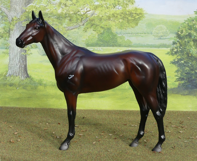
Now, something much more familiar and local to me, a couple of traditional cobs!
I looked at what I'd painted already, one piebald and one bay skewbald (or black tobiano pinto and bay tobiano pinto, to use the international terms) with about the same ratio of white to colour on each, and decided the next logical variation I should go for a different base colour, combined with less white and more patch.


I really like how his markings turned out, I painted them over the seal brown base coat rather than base-coating white then trying to paint carefully within the patches, which made it a bit easier - this works best when there's going to be more colour left showing, but is the frustrating way round when you've got a lot of white to colour cos it's hard to get it perfectly smooth if you're covering a lot of surface.


He looks like the sort of horse you'd enjoy seeing frolic out in the field, but wouldn't especially want to have to lead anywhere!
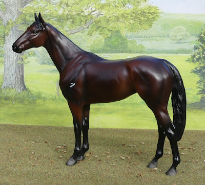
By the way, you can click any photo on this blog to see them full size - especially worth it when I've arranged them as side-by-side small versions for formatting reasons!


I've called him Harecroft Helter-Skelter. My large scale one in this same mould is Hurly Burly, so it's kind of carrying on a theme!

Rather than go straight for another variation of a tobiano, I thought I'd try something really different with the next one - a blagdon cob. The splashed, freckled, and roaned sabino horses are known as blagdons in the cob/traveller community, an older name for them which hasn't been changed now there's been all the research and understanding of equine colour genetics. So this custom is a sabino or a blagdon, depending on which tradition you want to go with - here's a real example just so you can see the kind of colour I was aiming for!


I set about his colour in a different way than I'd usually paint, just cos it's so hard to figure out how to get the mottled colour effect. First the body had a total coat of white, several layers very thin so it would be as smooth as possible. Then, I scribbled all over him with a pencil!
I hoped getting the hairy, roany colour laid down with scribble first would give the finished thing more texture, so it doesn't have to be as painty-looking. Over the top of the scribble was another layer of thin white paint, to help blend it in but also to seal it, so it wouldn't rub off or smudge while I carried on handling him. Then the pinking for where the skin shows through the coat, and some diluted grey added over the top of the colour patches with a fine brush, so they're emphasised and blended in without being too dark or too heavy.


I gave him two blue eyes, cos white markings which catch an eye socket often have that effect on real horses. His name is Harecroft Jack-the-Lad, because I happened to be watching a history documentary which explained the origin of that phrase!


The colour does look quite good on the mould, so far I've only done the more typical tobianos with large solid patches of colour, and I don't generally do many pale colours on any kind of mould, so it's been interesting for me to try this (I've been pushing myself for more variety lately, so you probably have seen light coats from me on here, but over all the years I've been painting, I know I have a big bias to darker colours and dark pintos)

I have two more of the cob mould left from the lucky dip parcel; I'm thinking a buckskin or golden dun tobiano would look nice - another with more colour and less white.

Next, I made an attempt at a really dark sooty buckskin, which ended up looking FAR more like a bay than I wanted!


At a glance you'd just think I was aiming for dappled bay, which is disappointing cos I've done that colour loads of times before, and really thought I'd avoid it coming out too similar cos I used different paint colours in the mixing here. But no, just another bay-ish horse after all!


It's a nice enough result, the colours blended together okay, so it's no disaster - I like her, and have named her Basilisk. It's just incredibly frustrating that I can't figure out a way to keep the light areas more golden in tone, when using any combination of my cream/gold/tan paints with brown and black to darken them somehow always ends up making either a mess, or yet more warm, reddish shades! This is a real sooty buckskin, even with trying to find the closest match to the bright one I painted you can see his light areas are more orangey-golden.

So I decided to take a deep breath, pick another body from the box, and get well away from the sooty/dark kind of buckskin and just paint one I thought I could manage, with no darker browns getting involved in the body colour at all!


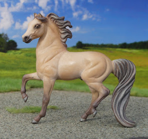
Meet Harecroft Diamond Hill - named after a mountain in the Connemara national park - she's an example of the famous Connemara 'dun'. Yes, they're traditionally known as duns, despite being a completely different colour genetically!

A moment to explain...
Dun is a dilution gene, which acts on whatever basic colour the horse carries, and gives them a dorsal stripe, dark points, leg barring, often a dark face, and sometimes pale-haired 'frosting' on the top of the tail and outside edges of the mane. Think of a Norwegian Fjord horse - you just pictured a dun.

Cream is different dilution gene, it lightens colours. Inheriting one gene creates a halfway effect, inherit a gene from both parents and the colour goes even lighter, with pink skin and pale eyes.
If your horse's basic colour is bay, inheriting one cream gene turns the brown/reddish/mahogany-coloured body to a lighter gingery/tan/gold shade, while the points stay black.

Centuries ago, the British & Irish horse breeders, owners, and riders didn't know all this. They called any horse with a sandy body and dark points a dun, and ingrained traditional words are really, really hard to get rid of in the horse world. Even these days, with the majority understanding horse colour a lot better thanks to online information and genetic testing, within certain breeds there's an outright refusal to change terms used. So buckskin Connemaras, and Welsh ponies/cobs, are often stubbornly described, and officially registered, as dun - even though there's no actual dun genes in the breed.


Despite all the potential confusion about colour, I wanted to paint the lovely bright clear buckskin, which is a very popular and famous colour for this breed to be - the 'duns' are often favoured over other colours for sales prices and for show ring honours, and almost all the horse books will make a point of mentioning them, though they rarely point out that dun's not dun in this case!
So ever since this mould came out, I'd thought that this would be the perfect colour to paint it, and it seemed timely, too - helping even out my previous failed attempt by getting a buckskin right this time!

While I was looking through reference pictures for a standard pale buckskin, I happened across a couple of photos I'd bookmarked a while back - silver buckskins. Here's one of them (sorry for the horrible way of linking Google has come up with lately, there's no other way of doing it without stealing the photo and uploading it myself, and I wouldn't do that!)

Silver is yet another gene which can alter basic horse colours. On a bay horse, it turns the mane and tail silvery and the lower legs brown, instead of black. Now add cream as well, and you've got a pale sandy body colour, brown points, and blonde/silver streaky mane and tail. There's a challenge I couldn't resist!


I think he turned out really well! As long as I'm not trying to add darker shading into the body colour, these cream and beige paints work nicely together, so I can add in highlights and even some dapples to give it a bit more depth.
Morgans are great for painting unusual colour combinations, as there's so many different genes carried within the breed.


I've already painted a silver bay on this mould, and named him Harecroft Silver Dollar, so this one is Harecroft Silver Buck - it works as a themed money pun, a buck as in a stag, and would shorten to just Buck as a nice nickname if he was a real horse!


Here he is with the normal buckskin - you can see the difference is mainly in the lightened points, but I also added more yellow to the mix for the Connemara, and a hint more peach and grey for the Morgan.

That's all for now, but there's plenty more in my body box!

Monday 7 February 2022

Some colourful CollectA arrivals

Back when I first started buying CollectA horses, almost every sculpt was released in two different colours, at the same time rather than over subsequent years. To save on money, and avoid having to buy any badly designed disappointing paintjobs, I decided to go with buying whichever was my favourite colour for each breed.
And til recently, I was really happy with this method of adding to my collection - the horse which first made me doubt the decision was the Icelandic coming out in bay dun, a colour which suited it even more than the original first release. But one colour per model was my rule, so I stuck to it.

With the 2022 announcements including several gorgeous re-releases which featured beautifully done new colours on already familiar sculpts, my resolve wavered a great deal - and I thought I probably would end up buying them once they come into stock.
Recently, seeing a collector's real photo of the buckskin Appaloosa reminded me of how much I'd liked it - and that made me realise something : if I've already given in to the inevitability of buying the 2022 new colours, it made absolutely NO sense to keep any of the older alternative colours out of my herd!

So I placed a little order of horses in moulds I already have, but these are all their 'other colour' releases, and now the sun's been out I have photos to share.

The Appaloosa, which was the final straw in my choice to collect multiple colours. His spotted blanket pattern is rather stylised, but I like it, especially the way the dark spots vary in size.

His face is interesting too, the blue eyes are a first for CollectA (normally the eyes are just black, even in colours which could be blue-eyed), and they've used a grey dividing line to look like the 'mapping' overlap between white and colour which often shows on face markings.

The spotty pattern on the other side. I haven't named him yet, but I did paint a custom a similar colour last year, so I might try to pick something themed alike for them both.

Next, the Norwegian Fjord stallion in grey dun. I chose the yellow originally as it's their commoner colour, but actually this version is a nicer interpretation, with more shading.
I must admit, I did temporarily have this one last year, and felt it was a real shame to paint over him when I didn't have the colour already and liked it so much, but he had some missing paint on his face and feet, so he wasn't quite good enough to keep for my collection. And now I have him again, but nicer!

His dorsal stripe is carefully painted in to go all the way through the middle of his trimmed mane, just like it should. I've named him MÃ¥neskinn, Norwegian for 'moonshine' thanks to his bright silvery colour.

Now, the Icelandic, the release which originally made me doubt my one-per-mould rule in the first place!
He doesn't have the lovely pale mealy muzzle shown in the catalogue photo, but having seen several different 'real photos' of the finished models, it seems none of them do, so it must've been too much effort/time to paint when it came to the production line.

I've named him Stjörnufákur - many Icelandic horses are given names which include descriptions of their colour, markings, or other physical attributes, and this name means a riding horse with a star marking on the head.

I really like his colour, despite lacking the pale nose the dark face is a good example of typical dun features, and his leg shading and dorsal stripe are lovely and softly applied. There really is no such thing as too many Icelandics in a collection, and it's nice to have another for my CollectA selection.

The final 'other colour' choice is the Akhal-Teke mare in metallic golden buckskin. I originally went for the perlino, thinking it was a much rarer colour to see on a model horse, with the pinkish tone under a silvery sheen - one of the very few breeds where I actively like a pearlised paint application! But there's nothing wrong with the buckskin version, and it was the logical one to track down and finally buy now I'm gathering more colours.

It's a lovely sculpt, catches the fine hard profile of the head well, and the unusual conformation without being too exaggeratedly thin and raw-muscled, which suits a mare.
I've named her Iriska, a name picked from a sales page of real-life Akhal-Teke horses. I always figure that when dealing with languages I don't speak and find it too hard to research, if I choose a name a real breeder has given to a horse of the same colour, it can't be wildly inappropriate - like naming a chestnut something which means 'spotted', or a black horse a name which means it's very pale!

And finally, one last choice, not an alternate colour, but I needed something to push my order over £40 for free postage (no point spending the price of a model on shipping when the company will ship for free and I get an extra horse!), and thought I'd go for one more I'd originally decided against...

The mare and terrier set. Well, I'm not sure if it counts as a set when they're actually attached, but never mind! In a way it's a shame they are fixed together, I'd have liked to be able to photograph them separately as well as in their pair pose, and I'd imagine kids would have fun playing with the dog loose, 'jumping' in and out of it's resting position on the horse's back.

Despite that, it's a nice fun pairing, and you do see stableyard pets on horses' backs sometimes - it was a favourite with photographers doing a shoot with showjumpers or famous racehorses for horsey magazines back when I read them in my early teens, if the cat or dog had a particular pal who'd let him settle up there.

Neither of them have been given a specific breed in CollectA's catalogue, other than the vague terrier, and the words pony mare in the description they issue for shop sites, and she's definitely pony sized when stood between these other models. Maybe wire haired Jack Russel for her little friend.

So that's it for now, a parcel which doesn't contain any new breeds for me, but still a really good one - it's been very satisfying to go back and pick out the colours I probably should've been collecting all along.
I'm still not going to aim for an Every Model Released collection of CollectA, the less exciting or just plain disappointing alternate colours can remain unbought, but from now on, I'll be picking everything I want, rather than sticking to a rule!

Schleich parcel day

A little parcel of second-hand Schleich this morning!

I've always thought they did a better job with ponies than horses - the compact, cute sculpting style is a better fit with breeds which are, well, compact and cute! So quite a proportion of my Schleich herd are ponies, foals, and also donkeys which work nicely in their style.
Today's parcel adds a few more to the smaller end of the breed spectrum - starting with one of the tiniest breeds of all, the Falabella.


These two are both custom repaints, by my friend at Last Alliance Studios - although I bought them from a different friend, so they've had at least one home in between since they were painted.


I don't know what real Falabellas are like to know, but this one looks so cheeky, like it could easily be as much trouble as any Shetland pony!


I really like this little mould, I've got the original spotted release from way back when it was new - in fact, I'm pretty sure that was my first ever Schleich model. It looks really good in one-off colours as well as the familiar original finish paintwork; this fiery golden shade stands out very bright and pretty!


And the second one of the pair, in silver dapple - he looks a little bit more innocent, despite being the same sculpt - it must be the way their faces are painted!


You scratch my back, and I'll scratch yours! They're going to have to have matching names, I just haven't though of them yet.


After this Falabella stallion, Schleich released a mare of the same breed, I got her free when I bought some other models once! Today's parcel included a repaint on the same mould, this time by the seller they came from.


As well as the repaints, I'm now the proud owner of some rather sweet original finish Shetland ponies!


This is another surprisingly good quality sculpt, it catches the shetlandy build and character rather nicely, and I think I like it more than their older trotting one, which is something unusual for me - in general, I find the newer sculpts get less accurate and appealing, but here they've improved the face a lot, and not lost track of proportions or angles in the body.


Now, there ARE braids in the mane, which I know can be a 100% hard NO for a lot of collectors, and in general I'm totally with you on the grumbling about putting stupid bows and frills on everything - but these honestly aren't too bad.
Look at them again - they're simple three-strand plaits with neat elastic bands on the end. The exact kind of plait people would put in ponies' manes, if they were a plaiting kind of person. Now I've had my shetland nine years and never seen need to plait her, but I know some do it, for various reasons : I've seen owners using a row of plaits to keep a mane tamed and clean before a show or drive, and I've seen kids putting these sorts of plaits in their pet ponies just for fun.
It's not the ridiculously over-the-top impractical kind of looped and criss-crossed and beaded and bowed braiding Schleich like to inflict on horse figures, this time; it's reasonable, realistic plaits like ponies might put up with from their owners in real life, heh


The other side. I'm not entirely sure what colour they're aiming at here, it doesn't really match any of the true options for a creamy coloured coat :
Perlino is a cream body with darker mane and tail, but usually has darker legs too and would have pink skin not grey on the nose.
Cremello would have legs the same shade as the body colour, but the mane & tail would be white and the nose would be pink.
Pale palomino would have the grey nose, but also a blonde or white mane and tail, never darker than the body.
I think I'll just have to put 'cream' in her caption on my website, and pretend it doesn't bug me that my other models have accurate colour info and this one has a vague descriptive term instead!


The foal that comes with her is a very sweet little thing, it's got that fluffy teddybear look of small ponies in their first fluffy baby coats. Both the cream pony and this chestnut foal came from 2017's Horse Club advent calendar set.


This liver chestnut was from a Pony Agility set - every example of this mould seems to have been sold in sets or special editions, there was never a common single regular run release (which is a shame, as I'd like to collect more of them!)


Again, the braids really don't aggravate me, and the green elastics on this one are a little bit nicer than the pink ones!


Her colour is much more possible, a simple dark chestnut with a slightly lighter mane, she looks too shiny in this low outdoor light but inside she's fine and less plasticky!