Monday 31 May 2021

A mixed box of Schleich, Safari and Papo, plus shetland ponies!

Somewhere between Stablemate and Classic scale, you'll find a lot of medium sized brands - CollectA, Schleich, Safari, Papo, Bullyland, Mojo Fun and WIA. I think of these under the totally made up umbrella term 'mid scale plastics' in my herd, and tag them as such on here - original finish and custom finish found on separate tags.

Recently, I've had a few arrivals which can all be grouped together as this type, so they can all share one post.

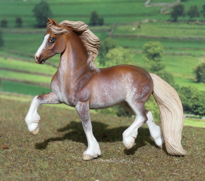
Probably the most exciting of the batch for me, the Safari Tinker stallion from a few years ago. Their models went to a weirdly stylised, smooth sculpting style a few years back, and at first I was put off and didn't order any more, but later started to regret not getting at least this guy for my herd of cobs. But by the time I went looking for him, all the ebay listings were really high-priced, more than twice or three times I'd ever paid for Safari in the past, and I decided against getting him several times over as I failed to find an affordable listing. Then he popped up on my friend's sales list, and I got him at long last!

I think I might name him Ace of Hearts, cos he's got a little heart-shaped white marking in one of his patches.

Although I still wouldn't say I love the sculpting style (it reminds me of 3d computer modelling, not physical clay moulded by hand), I find he's a very endearing horse, with a lovely attitude - ears back, but not grumpy or ill-tempered, just not on full alert forwards like most models are posed.

He's got an enormous amount of feather on his legs (wouldn't want the job of keeping that clean and detangled if he was real, the cob I used to take to shows had half as much and I was always glad we only competed in jumping and mounted games cos I'd NEVER have got her legs clean enough for actual showing in a traditional cob or coloured class, haha!)

Along with him came the current-mould Schleich donkey foal, but in brown instead of grey - this one was a special edition, found only in the Farm Life advent calendar. It looks like he only has one ear in this shot!

He's very cute, I like the normal grey one a lot so it's nice to have the extra colour version, even if he doesn't have a matching mum. I really should name him something chocolate-themed, as that's the more usual kind of advent calendar contents!

Next up, Papo donks! I don't generally think much to their horse range, there's only been a few moulds I've liked enough to get (pinto cobs for my herd, the sleeping foal), so I haven't really followed what they release, and had totally missed that these donkeys existed til I spotted them on the sales photo.

Quite a decent sculpt, compared to their horses! Whether it's from the same sculptor, who just does a far better job on donkeys, or whether they had someone else do these (cos I've noticed they have some good and truly awesome sculpting in the wildlife ranges!), I don't know, but they're really rather nice.

They've also got a well done paintjob for mass produced models, with thin grey paint which gathers in the dimples of the hair texture and gives them a two tone effect, and properly donkey-detailed pale noses, eye-rings, and ear-fluff! Because these are described as Provence donkeys from France, I've named her in her native language : Cailloux, which means 'pebbles'.

And here's the baby, who I've called Pascal, in a fun running pose, with all the same appreciated detail as the mum.

Note the quagga background being repurposed as old fashioned stableyard scenery already!

The two together - I seem to have a lot of family pairs of donkeys, toy brands really like releasing matching babies!

The Safari buckskin mustang mare, one of the older-style sculpting from when I really liked what Safari were doing. I have a scuffed palomino on this same mould in my repaint pile, but I like this colour much better and am keeping her for my original finish herd.

And the Safari przewalski's horse. I've been tempted by this one ever since they released him, but couldn't find a new one affordably. They're one of those brands which seem to be mainstream and readily available in mainland European countries, but aside from Toobs they're not really stocked here - I have the choice of hoping the ones I want ever reach ebay, catching second hand ones from other collectors, or buying in from overseas (or probably Amazon, but I boycott them so I don't know!)

He's very cute, but without losing the typical build and look of the takhi, the sculpt isn't overly stylised. He's kind of the halfway point between the old Safari style I loved (Icelandic, Shire, that kind of era), and the newer ones which I'm less keen on. But I am thinking the Fjord would go well enough with him and the rest of my herd that I might have to get that at some point!


I named him Zerleg Salkhi, 'wild wind' in Mongolian. Plus one extra picture, because doesn't he look adorable from the front!

And finally, some resculpted shetland ponies. These are a little bit bigger, but can still share the post, as they came from the same home and still fit in with the toy-type theme - they started out as a toy brand called Gee Gee Friends. They're hard hollow plastic and come in packs with accessories, aimed at small children, and often spoilt with painted-on hearts and flowers and bows. Here's one in box. But my hobby friend likes to rescue them from pink pastel purgatory and change them into proper little ponies, in real colours. They've both had their bodies extensively resculpted, heads repositioned, and new manes and tails.

I just had to have two instead of picking only my favourite, so it wouldn't be a lonely only pony in my collection!

This one's sooty palomino, the same colour as my own real shetland, I can't call it after mine, though, cos I already have four portrait models of her (CollectA, Magpie, Julip, Stablemate) and am running out of variations on her name!

And here's her friend again, he almost got a soaking cos it started to rain heavily while I was doing his photos, I think I got him inside my jacket before any spots landed on him!

Sunday 23 May 2021

Tales from the Body Box - CollectA Campolina and Camargue

This weeks custom projects were a bit bigger than the recent Stablemate size - I've been brave and done some big CollectAs!

First, a Campolina body who I got some time ago, but put off painting cos I couldn't decide on a colour for him. This Brazilian breed has some lovely primitive-marked duns, and for a long time I had a sandy bay dun half in mind for him, but it just didn't seem quite right, he was telling me he wanted to be darker, much darker...

And now he is! I think this colour suits the mould really well, more so than the red dun it was originally issued in. I gave him deep brown tones rather than the more mousey grey of a typical grulla I've usually painted,.


The colour looks very different in different lighting, this angle makes his paler highlights stand out more, and the sun across his cheek shows his head off well.
It's a really noble-looking mould, with the typical curved nasal bones giving him an unmistakable profile. Early on in the breed's establishment, there was a lot of inbreeding, which would've exaggerated the head shape, but now it's not fashionable to aim for more and more curve - modern breeders are careful to avoid anything extreme, and favour a head shape which is still distinctive, but not too dramatic.

You can see his primitive markings very clearly here - the dark stripe across his shoulders, the zebra marks on his knees and hocks (called 'zippers' by the campolina breeders, a colour detail they prize), and the frosting of pale colour either side of his tail.

I made up his markings as I went along, he didn't seem to need any white on his head, but his feet looked better with a little bit of white interest, and that lets me have fun with striped hooves, too!

This angle is great, really catches his upright, alert pose.
The CollectA sculpt seems to be the only example of this breed in the entire model horse world - some people out there may've done customs from other breed moulds, but none of the other brands have released one, and there's not even a single campolina sculpt listed on Equine Resins Directory!
This means he's only the second of his breed to join my herd, and the lone OF CollectA example on my website will soon have some company on the campolina page - once I've managed to choose a name for him!

His companion is a breed from the other side of the world, one of the famous 'white horses' of the Camargue in southern France

I've loved this mould for ages; in fact, my original finish Camargue mare was my very first CollectA model ever - I won her as a prize in a Chestnut Ridge photo show!
And I've always wanted to do a repaint to really catch the detail of an interesting colour which is lost in the basic factory paintwork. 

I didn't want her to look too clean, it was important that my model could capture the hardy outdoor lifestyle of the breed, and their natural management, without the human-imposed standard of cleanliness - this is not a grey kept spotless with baths and shampoo and clipping and trimming. She's tame, but not pampered.
Perhaps my bias here comes from the fact my first horse was a fleabitten grey (arab x welsh C, rather than camargue, but still, fierce independent-minded mucky speckled beast which was never washed to white!)

The brands on camargue horses have certain meanings : the letter stands for the year, the number indicates the order they were born in the herd (first foal of the year gets 1, second has 2, and so on), and the larger stylised logo or initials are the breeder's unique identifying mark. I designed one which reads H F for Harecroft Farm.

I based her on the example in Dorling Kinderley's 'Ultimate horse book' - my grandad gave me my copy in the early 1990s and the photos are so familiar and iconic to me, they're often the first I think of as my mental image for any set breed. Here is the Camargue page from one of their more recent books, with the same main photo. 

To help fully capture the camargue personality, I made her a traditional simple halter, as all the books seem to like noting that they're made of twisted horse hair rope. You can see in this close-up the mixture of colours - one strand of blonde hair, three of mixed light and very dark brown, so I copied that with embroidery thread.

I haven't managed to name her yet, either (I only finished her yesterday!), but she's already one of my favourites.

Wednesday 19 May 2021

Breyer Traditional Peptoboonsmal at long last!

Finally, the last of Breyer's 2020 mid-year models has reached the UK, almost halfway through the following year! It's not our British retailers' fault in the slightest, they're as keen to get the models as we are to buy them, and it's felt like a very long wait for what everyone else has had for ages.

I decided to go for Peptoboonsmal rather than a new 2021 release precisely because of that delay - he's been on my wishlist longest, and although it was tempting to go for something shiny and new, somehow he deserved to come along first.

Luckily it was a bright clear day for a change, so he got taken straight out into the sunshine after work for a photoshoot!


This is my first time seeing and handling the Dundee mould, and it's a lovely one in person. I especially like how it combines a motion pose with a relaxed, casual attitude; often models sculpted in action can have a taut and strained look, but he looks very at ease and laid back, like a good working horse, or reliable steady-minded leisure horse. 
The only slight flaw in his design is something not obvious without closer inspection - Peptoboonsmal is a famous stallion, and this mould is sculpted as a gelding - oops!


His colour is nicely done, with quite a lot going in to that paintjob. Firstly the base coat of chestnut is sprayed heavily in some areas and very thinly in others, leaving him paler flanks and elbows, a mid tone on body and neck, and darkest on the head and legs. There's dapples, on belly and quarters, then fine white roaning to further lighten and speckle his paler parts, and a light smattering of dark flecks over the top. His markings are crisply masked, a good match for the real horse, and I love the striped hooves!


Now, I admit I was initially sceptical about the paintwork for the production runs of this model : in photographs he seems to vary a huge amount. The example here on IdentifyYourBreyer is extremely pale with white roaning, while other real photos coming through on US ebay listings last year showed the body colour as just a very slightly paler chestnut than the head and legs, with hardly any of the misty roaning spray layer. 
I was worried : what if, buying blind online, I got one which didn't have much contrast? Reassured by having spotted photos of a 'good one' from a UK seller, when it's likely all our retailers would have received horses of the same batch, I decided to take my chances, and am very pleased with the one I got!


The mould's official name seems to have been settled as Australian Stock Horse, which leaves me a bit undecided what to do - it's a breed I'm already familiar with, in fact I show all my Peter Stones in the Palouse mould as Australian stock horses, but the real Peptoboonsmal is famously an American Quarter Horse, and this being a portrait of him, it kind of follows that it'd be fitting to use that breed for our models, too. Normally it wouldn't matter, I'd decide later, but I'm in the process of compiling a new collection website with all the models split by breed instead of brand/finish/scale, and I don't know which page to file him on!


All in all, a lovely addition to my collection - it's nice to see a great new mould making its debut into the regular run line, and that his colour is done so well.

He shared his box with a little extra. Chestnut Ridge are selling the 70th Anniversary blind bags opened, so you can decide exactly which model you want, rather than taking pot luck and getting too many duplicates. I've collected a few already, but one notable gap was the silver bay, so I snapped him up as a travelling companion for my Trad scale purchase!


I'm not a fan of the pearly sheen on so many Breyer models lately, but I can overlook it in small doses - SM scale is just about ok, especially when the body colour isn't metallic, only the mane and tail. This silver bay looks great on the mould, and the novelty of these mini versions of Traditional moulds hasn't worn off for me yet, I really like them!


I haven't managed to name my Peptoboonsmal quickly, but this one can be Harecroft Eye Of The Storm, one of those names which has been a while on my noted-down list, waiting for a horse to arrive and suit it.

Tales from the Body Box - a busy weekend

Last week, I bought a nice little parcel of bodies from a hobby friend, and included were a couple of moulds I'd been hoping to get hold of. I always have a little mental list of ideas to paint, but til now I hadn't got the breeds I wanted for the colours I had in mind.


First up, Alskær Fra Harecroft, an Icelandic in a gorgeous shade of dun inspired by this reference photo. The horse is described as a bay dun on Pinterest and other image-collecting pages, and annoyingly I can't find an original source, but I'm wondering if perhaps he isn't just an unusually light bay dun, but rather a dunskin - buckskin plus dun.


This photo was taken in the shade with the camera's cloudy day white balance setting, in reality he's somewhere between the two pictures. His name translates as 'most bright' cos he's just about as bright as a dun colour can be, and my prefix becomes a suffix in the Icelandic naming tradition.


A high angle to show his dorsal stripe, the most nerve-wracking bit of any dun paintjob!


Making use of my free bit of Icelandic scenery from the Breyer Elska box - it's such a shame they've abandoned these attractive and useful photo backdrops in the boxes' bland new redesign. 
I do love this Icelandic mould, and still have plenty more colour ideas I'd really like to paint, whenever more of them come my way.


This one was the result of a bit of recent reminiscing with another Breyer collector online - she loves her Llanarth True Briton model just like I love my Danaway Tango on the same mould, and remembering his wild patchy roany sabino paintjob inspired me to finally get round to the sabino SM welshie I'd had in mind for years. 


I didn't base him on Danaway Tango himself, just used made up markings over a similar bright chestnut shade. I find messy smudgey roaning on bays tends to get worryingly pinkish, so the more gingery tones in this colour prevented that from happening.


He isn't quite how I intended, the white softer than my original plan to flick it on as speckles with a toothbrush - in the end I chickened out of such a haphazard method in case I lost control and got more paint where I didn't want roaning than where I did. I've named him Harecroft Baledwr, the welsh for balladeer, as in writer and singer of folk songs.

Finally, not just another clipped bay thoroughbred, which I know I've painted several times already, but one more for my line-up of famous racehorses in miniature - Faugheen!


One of those horses who made a big initial impression and went on to live up to the hype, Faugheen always stood out as full of character and enjoyment of the game, and in return I enjoyed following his career over hurdles and then over fences. 
He retired safe and sound at the beginning of the month, and the very same day I picked out one of the G2 TB models I've been saving specially for portraits. Something about it just didn't seem quite right for him, and when I was looking for reference photos to properly copy his distinctively shaped stripe, I realised what it was - he seems to have his ears pricked so often, I just had to resculpt his mini self to match!


The new ears really change the expression of the mould, while it didn't look unhappy before, just concentrating and running hard, with them pricked up it's got that look of a horse who thoroughly enjoys his job!

Saturday 8 May 2021

Tales from the Body Box - the London Zoo Quagga


A while ago, this colour-tinted magic lantern slide came up on ebay, in one of my 'vintage horse' searches. Although I don't collect these, and had no intention of buying it, I immediately recognised the subject - a quagga mare who lived in London Zoo, the only one of her kind ever to be photographed alive. She's the iconic example, used in all books and online information about this extinct subspecies of plains zebra. You can read plenty more about them on the unusually comprehensive Wikipedia article.
And an idea was sparked in my mind which just wouldn't go away. I should paint a custom of the quagga. Not just any quagga, but that one. With photographs of both sides and her face, I could copy her stripe pattern exactly, and make a model which was not only an example of the species, but a portrait of the famous London mare. 
As well as the black and white photos, I needed some frame of reference for the colouring, and collected up pictures of taxidermy specimens in museums. They seem a varied sort of creature, with different specimens showing different shades of beige and brown, and different patterns and extent of striping, but I picked a middling example with good photographs available from different angles - the Berlin quagga, for those who know these well! I even saved a few 19th century paintings and illustrations of the species into my reference folder, as a bit of added inspiration.

I chose the CollectA plains zebra as the body for my quagga project, it's my favourite of the mid-scale plastic moulds, with the most recent Mojo Fun release a close second, but the deciding factor was that I wanted my quagga's display side facing left, like the most well-known photo of the real one!
Here's a series of pictures showing the colour going on, layer by layer...


And then a necessary pause for breath before tackling the most difficult part!

Starting on the striping was the only nerve-wracking thing about the entire paintjob.
Something I'd never done before, I haven't even painted a normal zebra, but I really wanted to create this quagga and convinced myself I'd be able to do a decent job - it can't be any harder than intricate horse patterns like appaloosas or the more fiddly kinds of pinto, it's just familiarity and experience which makes those seem less daunting.  
Sure, quaggas are animals I've been aware of for a really long time. I've seen the photos and the paintings, read the history, looked at the modern project to create quagga-looking zebras. They're not horrifyingly unfamiliar in the same way someone saying 'Hey, paint this species you've never heard of, here's a google image!' would be.
But stripe painting is new territory, and no amount of poring over photographs of museum specimens can really teach your hand how to make that happen. Sometimes you just have to try, and hope for the best!

I started by choosing a single stripe to copy onto the model at a point mid-way down her neck, to try to avoid the stripes clustering either too high up the neck and running out by the time I reached the shoulder, or vice versa. From the first stripe, I could count out how many more she had in each direction, and painted in the mane streaks first, to make sure I spaced them out the right amount. I should have started on the non-display side, to make it less scary as any mistakes would be less noticeable, but I think I just wanted to get it over with, and the relief when it turned out looking perfectly ok was immense!


I'm so pleased with her, even though I'm used to painting horses, and know the satisfaction when a portrait model turns out looking just like whoever it's meant to be, this one feels special cos she's so different to push my painting into new territory, and a significant species for my herd - she fills a quagga shaped gap I didn't realise I needed to tick off the list!

Adding the stripes wasn't as hard as I'd anticipated, tense but not technically complex! The paint I thinned a little by licking the fine brush to a point then touching a small amount of paint dabbed into the lid of the pot - this just helps it go on in a translucent way, and avoids overly thick or accidentally clumsy strokes, leaving a result which looks less 'painty' and more natural on the finished animal. Pleeeeease don't do this unless you're SURE your paint is non toxic! 
Two or three layers of paint were enough to get the stripes as pale as I wanted them, applied in tiny brushstrokes which follow the direction of the hair growth, not the direction of the stripe. I used a little pure white just to brighten them in the most distinct places, and darkened the roots of the mane hair where dirt collects.


It's hard to interpret the fading out of the stripes onto the body of the quagga through a black and white picture. At some points our London mare seems to have darker stripes as well as paler ones, especially behind the shoulder blades, so I've added just a hint of darker paint to back up the paler stripes and blend them into the body colour as they fade out.


As with all custom painted models, there's an element of artistic interpretation, and with an extinct animal with a lot of known variation in colour and pattern, there's going to be even more variety in how we make our models. This isn't the definitive quagga, just my idea of how one individual would've looked in colour and in life.


Many modern illustrations of the quagga show them with a strikingly black and white striped head and neck, but I just don't see any evidence of that look - every single museum quagga I could find good pictures of shows cream stripes on a brown coat, so I've made the choice to stick to that colour scheme.


I even managed to find a photo showing one of the museum quagga specimens from above, to copy the join between vertical and dorsal stripes accurately.


I didn't manage to find a photograph of any tail from behind, so for this detail I relied on the artistic integrity of one of the painters who depicted the quagga in the 1880s, taking it on trust that there really was a dorsal stripe which faded out down the length of the tail!

You might've noticed I've photographed her against all-new scenery, rather than any of my backdrops seen before - I decided my usual scenery just wouldn't cut it for this special portrait model of a very specific animal we know from 19th century natural history. She lived in London Zoo, so it was only right to create her little corner of the zoo for her photoshoot!

After five hours of gluing little bits of cardboard to bigger bits of cardboard...


Her brick wall, the door painted green because in contemporary colour-tinted copies of her most famous photo, the door is shown green - either by choice to give the photo a bit more life and they happened to have some green, or because the doors of London Zoo really were painted green at that time! Either way, I had no reason to decide any other colour would look better or be more authentic, so green it is!


And the yard floor, which looks like block paving, or possibly very neat rectangular stone (used a lot in stableyard buildings of that era), but you can't tell the colour, only that it's lighter and more uniform than the bricks of the wall, so I chose grey.


The set put together, but not glued. I like to leave my pieces separate so I can combine them mix-and-match for other models in future - this yard could go with a fence backdrop instead, or I could use the wall with a road in front of it, and so on.

But for now, it's home to the London Zoo Quagga.