Showing posts with label Not A Horse. Show all posts

Thursday, 27 October 2022

Julip Spares Night, 2022

As an alternative to the annual Julip live show when we could buy brand new one-off Julips in person, the company now runs a photoshow, along with a big Spares Night with lots of horses prepared specially to sell online, on the weekend the show would've been held, toward the end of September each year. 
There's strict one-per-customer and first-bid-claims-the-horse rules, but there's always more people than there are horses to go round, so there's a huge amount of competition for every model, as we each to try to be first on the ones we like best.

This year, I thought I'd been unlucky on two in a row, with someone else getting in before me both times. But while I was waiting for more chances as the evening progressed, a couple of friends pointed out that they thought I had got one - I checked and it turned out that the person who beat me retracted their bid, leaving me as the 'winner' after all, and I did get to buy the exact horse I'd tried for first!


Here he is straight from the wrapping, with his mane and tail all fluffy. With just a little mousse to tame it he would've looked fine, and I was really tempted to do exactly that and leave it, but that keeps on happening : I have ideas for plaiting a new Julip I'm waiting for, then can't go through with it cos the loose mane is so nice. So I decided to at least try this time!
After all, I could always undo it if it didn't look like I hoped, and cos the style I had in mind didn't need any cutting, or gluing, the long hair would all still be in there - there's nothing stopping me unpicking the braid in years to come if I ever do decide to go back to loose again.


And here he is! I think it looks fine, just like I'd hoped and the braids are really firm and tight so they lie nicely on the neck, and shouldn't ever start coming undone. The bows are silk ribbon I had left over from another project, it's very fine and thin, and looks less plasticky against the natural hair than synthetic satin ribbon.
The tail went curly on it's own, all I did was comb it through, add some mouse to stop the flyaway fluffiness, and left it it dry.


This is my first time seeing this mould in person, it was sculpted as a Lipizzaner and that meant I never really thought about the possibility of wanting it in any colour other than grey! I think it makes a lovely historical/Iberian horse, and would even work as a dressage warmblood. The face shape is lovely too, very kind and gentle-looking.


I knew he wasn't going to stay as a Lipizzaner cos of his dun colouring, but it took me a while to decide whether he'd be the Spanish PRE (Andalusian), or the Portuguese Lusitano. In the end I decided to go for Lusitano, as he isn't quite so chunky in the neck as a typical PRE stallion. I haven't entirely settled on a name yet but I'm considering Próspero or Valério; I think the latter suits him better, and I already have a Prospero without the accent.


Here's the other side, you can see how his forelock's tucked to one side, I tied it to the mane braid to keep it from hanging down in front of him, in real life they're usually tucked into the bridle or halter.

I was planning to make a bridle, but I got halfway then had all sorts of issues! My glue wouldn't stick unless I held each join together for ages, the paperclip I'd found to make the bit cheeks with was too hard to bend properly, the beaded tassel idea I'd got for the browband wouldn't work when I tried it, and I couldn't even touch the horse to try for size cos his mousse wasn't dry yet - so that hasn't happened!

As well as horses, ponies, and donkeys, the Spares concept also applies to the other, smaller animals which Julip make to go with their equine models, and we get the chance to buy all kinds of dogs, cats, rabbits and guinea pigs, foxes, and even some domestic and wild birds.


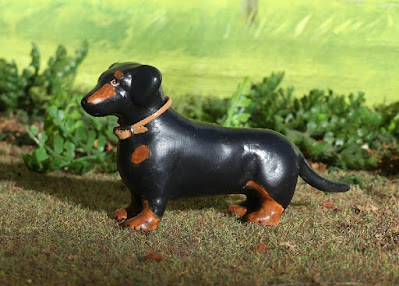
New this for this year was the dachshund mould, just like the horses they're hand made in latex and each one is slightly different. Competition for the Dachshunds was fierce, so I was very pleased to manage to catch one of the very first batch made!
I've named him Henry, after one this colour I only met once - he started chasing me up the lane while I was biking home, and it took quite some effort and multiple attempts to return him cos he was so determined this cyclist had to be thoroughly chased off (in the end his owner's neighbour picked him up and held him til I was out of sight, so he wouldn't wriggle out under the fence again, and they were going to Henry-proof the gap once the owner got home!)


A second photo cos I made him a little collar. Even though all the dachshunds in the group were slightly different anyway (he has more brown than some, less than others, and little anxious eyebrows!) I always like to give my Julip dogs collars, just for a bit of extra individuality.


And finally, my second cockerel. I had plenty of hens, and two henhouses, so I decided it was time to add another cockerel, cos in real life once they think they have 'enough' girls each, they'll live happily without fighting. And this was the exact colour I had in mind, the bright multi-coloured sort, to contrast with my original grey one. So when he came up in the Spares I decided to ignore all the other chickens this time, and focus on trying for this one, so I was delighted to get him!

Monday, 23 May 2022

The Mini Megaloceros

Something very different for a change! Papo's magnificent Megaloceros sculpt becomes my first ever prehistoric repaint, the first deer model to enter my collection, and my first custom to come with his own illustration!

When I paint my horses, I'm generally working from a reference photo or two for the colour or pattern I'm trying to recreate, or just making up something I know is realistic, from memory - because, well, I've seen horses before!
With my other wildlife repaints - the Fox, the Cormorant, and the Hare - I've used nice big clear photos from Google to make sure I'm getting the markings and colours in as realistically as possible, in terms of placement, detailing, and paint mixing.
I've painted an extinct animal before - the Quagga - but the Megaloceros (also known as Irish Elk) went extinct a little less than 8000 years ago, rather than lasting into the modern era and leaving photographs and taxidermy specimens in museums.

All the same, I knew I'd be much happier and more confident working from some kind of reference, rather than trying to design my paintwork actually on the model with wet paint and trial-and-error layers to make design changes as I went along.
And I really didn't want to piggyback off someone else's efforts, recreating somebody else's reconstruction or illustrative art from books or CGI tv episodes; even though that can be an honest tribute and perfectly valid resource, I want this to be my interpretation, not borrowing someone else's creativity.

Luckily, we do have one fantastic source for information on how prehistoric wildlife looked, in cave art which has survived all down the centuries from the people who saw the animals first hand.

Here's the first example. All we can really gain from this one is a general impression of darker on the neck and shoulder, and along the back - but it's possible the painting is either unfinished, or cropped to focus on the head and antlers, and the 'paler' part is just not there!

Here is the next example, a much more complete animal. Again, we see darker along the back, the neck and throat, and the shoulder added as shading within the outline. There's also a very distinct diagonal stripe from the hump at the shoulders down to where the hind leg meets the underside of the belly. This is a recurring detail in cave paintings from different locations, so can't just be one artist's weird quirk or error in constructing the body shape - more than one person painted a stripe, it's reasonable to take that as proof it was there.

Here is another example, two animals overlapping but if you just follow one set of lines at a time, you see the same thing - dark hump, dark shoulder (as a stripe this time), diagonal body stripe . There's also a dark throat, though this time the neck itself is paler.

Of course, all these paintings are simplified, and stylised, and all are more outlines with markings, rather than full colour like some of the horse and cattle paintings, where we can see shades of brown entirely filling in the body shapes.
But the general idea I get from them, and other examples, is a paler body colour with a darker top line, dark neck possibly with throat and chest 'collars' rather than a single wide band, and there must be a marking along the side.

When I was reading up on the Megaloceros, I learnt they were a relative of the Fallow Deer rather than the Red Deer, which makes perfect sense when you consider the antler shape in all the preserved remains.
This is my only real-life connection to the species, by the way - I have seen a head of 'Irish Elk' antlers on the wall at a castle here in the UK, found in a bog and mounted as an impressive curiosity in the 19th century gentleman-naturalist boom era.

So I decided it was quite important to avoid making the model look like an oversized (and over-antlered!) Red Deer when designing my paintjob, and the best way to do this would be to not even look at Reds in my preparation time, and take my colour palette from a darkish Fallow stag - this exact photo, to be precise.

The markings I've adapted, of course, by adding in the diagonal band along the side of the body, and altering the placing of the white and dark from the throat down toward the chest. I just worked where it seems to naturally blend and mix with the real deer's colour, while keeping each marking we see in the cave art.
And I've taken the spots away entirely - because I'm sure if the ancient deer had had such a noticeable feature, the cave artists would've put them in. They painted some spotted horses, and DNA analysis on horse bones and teeth from the era has proven leopard spotting genes were present in the prehistoric horse population at that time. Other animals in the same caves, like Red Deer and Przewalski-looking dun horses, are painted in accurate colours we easily recognise today. So I think the painters can be trusted on this, and if there were spots, they'd have put spots.

Enough rambling, here's the actual picture bit of the post (well done if you read all that instead of just scrolling this far, hahah). I've never drawn a deer before, so I worked from the Papo model instead of figuring out anatomy and inventing a different pose from scratch, and after all, it's for him rather than a stand-alone artwork in it's own right.

Here he is blank and waiting for his colour.


My intended design - though I'm not sure how easy it will be to match the actual paintwork to what I've done with him here! But I don't mind if it's a little different, and I'm not going to drive myself crazy trying to replicate these precise shades and blending exactly, as after all it's all guesswork and based on tweaking a modern animal, cos none of us have seen the real thing, except those cave artists who left us such helpful clues!


And finally, here he is with a background, just cos he makes a pretty portrait (recycled from the folder of my older art - that one originally had a horse in front of most of it so it's a bit rough and unfinished, but was the only background I had which didn't include a hedge, gate, stone wall, brick-walled stable yard, or ploughed field!)

Now, on to the model...


Here's the before picture, so you can see what colour he started out. 
He's not the same scale as Papo's horse models, or any of the other horse ranges you'd be familiar with, so I can't really say 'oh, he's a big as a so-and-so' to give you a better mental image - I'd say he's standing around halfway between Breyer Stablemates and Schleich/CollectA large breeds in size, but not scale - remember, the Megaloceros was much bigger than a horse in real life, more like a moose (although not many of us in the UK have ever seen a moose either!)

And now some in-progress stages. Apologies they're not very bright or clear photos, I started too late in the day to use real sunlight, and I couldn't figure out how to switch on the flash on my camera!


Layer one, adding some more milk-chocolate brown to soften down the dark colour, and some tan shading where the lighter parts start.


More of the paler brown, mostly to the lower half of the body, plus the initial layer of cream to the legs under the belly, and top of the head. At this point, I'm applying the paint straight from the pots so it's thick and sticky, smudged with a big brush to spread it as far as possible and rub into all the little hair details of the sculpt.


Starting the texturing of the body colour, and beginning the detailing of the face, with light round the eyes and nose. At this stage, I'm using some dry-brushing to catch the sculpted texture on the mould, and at other times I lick the brush then touch it to the paint, so it's diluted and thinner. As I've said before, only do this if you're sure your paint isn't poisonous; if you're not certain it's safe and/or you're less lazy than me, you could set up a soaked sponge in a bowl to get the same damped effect, without saturating your brush too much like dipping in a glass of water would.


And now upping the contrast a bit, with added white for the chest & belly, and darker colour for the back of the neck, shoulder hump, and side/chest stripe markings. Again, there's some dry-brushing and some fine brushstrokes.
I tried to make the markings quite blended in and not have a 'painted on afterwards' look, I know some animals do have very sharply defined stripes (like the dark band markings on Thompson's gazelles) but cos the sculpt has quite shaggy fur I didn't think there could be quite such a crisp dividing line between black and beige, more of a soft overlap would happen.


More definition and detail for the markings, especially filling in the face with eyes and nose and a hint of pink inside the ears, then the feet (I always do them toward the end, otherwise handling the model on my lap to continue the body colour rubs the paint off the edges and toe-tips), and finally the antlers. They were done with a base layer of beige, then blacks and browns dabbed on with a very fat brush, to try to get a different texture to the body fur. The very tips are given white highlights - where deer rub their antlers the bone polishes very clean, white and smooth at the points.


Finished!
The next day, he went outside for a much better photoshoot in the sunshine...


I'm so pleased with how he turned out, I really like him and will enjoy having him in my collection, even if he is my only prehistoric mammal and has no friends to stand with yet.


The shade makes his dark markings stand out more, but he looks prettier in the sun, so most of the other photos I've chosen do favour bright light.


There's a couple of areas which don't fully match my drawn design, but as that's also just an interpretation and not an authentic image of the real animal like when we can work from photographs of modern species, I'm not too annoyed with myself for going accidentally off-plan!


I may have gone a bit overboard on the number of pics, but this sculpt looks great from so many angles!


Do not sneak up on the Megaloceros from behind.


Those antlers are just amazing; they'd look impossibly impractical and unrealistic, if we didn't have so many examples as proof in real life, from peat bogs and the like!


You know that feeling when a Red deer stag stares you down, and you don't know whether to feel intimidated cos he's massive and potentially dangerous, or safe cos you're such a small insignificant creature in comparison that he'd not even waste the energy to come at you? This one has the same look about him!


SUCH a handsome head! I'm really pleased with his face, but the sculpt has a lot of detail there anyway, so it's giving me a lot to work with. I took his face markings from another Fallow deer reference; the little pale rings around the eye which help exaggerate it, and the way the profile of the nose shades to dark, but with white just around the nose and mouth.


I took a couple of different headshots without the miniature background, his outline contrasting nicely against my nice dark hedge.


A close-up portrait, and more of that mildly-threatening side-eye going on!


And one more full photo to finish on. A very different project for me, but a lot of fun. 
I'm considering doing a cave-painting inspired prehistoric horse next, so he's got some contemporary company, though there's no specific sculpt for that era so I'd be picking from modern horse breeds to find the most primitive look. Perhaps the CollectA Mongolian for that upright mane and flat back, or the Exmoor or Konik which are so often described as the closest to our European horses' ancestors.

For now, I'm just happy with my little giant deer!

Sunday, 3 October 2021

The Devil's Cormorant

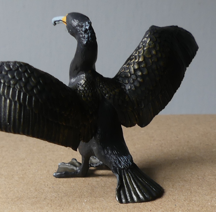
Time to introduce another non-equine repaint (don't worry, I'll be back to horses in my next post!), one of my favourite birds - the cormorant.

The Papo cormorant had already caught my eye earlier this year, but the moulded lettering along the front of the wings was a bit of a deal-breaker on an original finish model - just too obvious, too obtrusive.
After I'd painted my fox, I was wondering what other animal I was most inspired by, which would be another meaningful choice to carry on this new direction of wildlife repaints. And then I realised - if I was going to be customising anyway, I could get the coveted cormorant to repaint and deal with the ugly lettering at the same time!

Here he is, straight from the packaging...


I really like how they've given him a metallic sheen, by rubbing gold over the sculpted feather texture. As with the fox, it's not that he's got a bad paintjob to start with, just that I really wanted to play with painting and see what I could do to make him look even better.

Unfortunately, his tail had been pushed out of shape by the plastic protective support he came in. But I held his tail in a glass of boiling water, intending to try pushing the bent bit back to shape, and as soon as it got hot enough for the plastic to soften, it popped back to exactly the right position, without me even touching it. So if you collect bird figures and happen to get a dented cormorant, dunk him!

You can see another slight issue he had on arrival - he tips back onto his tail, with his toes in the air. The centre of gravity was just off, meaning he couldn't balance upright on a flat level surface. This was also fixed with the hot water trick : hold his legs under the surface a few seconds to soften the plastic, then take him out and stand him on the counter, supporting him by the wings while the legs cool down and the plastic goes solid in the corrected position.

At first I tried carving the lettering off, but because the Papo plastic doesn't sand down very well, I couldn't get a smooth enough finish, so in the end he had to have some patched feathers!


There's his two little patches of resculpted wing (I rubbed them down to smooth off the rough edges once the Milliput was dry).

Once it was time to get painting, I chose two reference photos...


This one I took myself, for the white marking to match a cormorant I've actually met and photographed, rather than something more interesting but copied from a total stranger! They have different white patches in their breeding plumage than the rest of the year, and it does vary quite a bit from bird to bird.

And because my photo didn't show the wing feather colouring particularly well, I found this really bright and clear professional shot on google as my main painting reference.

So here he is - my first ever bird repaint!


I tried to get as much colour in to his wing feathers as possible, the reference photo linked really shows how much the tone varies, even though they just look like a black bird at a distance, up close there's a lot of deep brown, and pale highlights. The only part I didn't repaint was his eyes - my blue paint had set solid so I just went carefully round his old eyes, and gave each a speck of clear nail varnish afterwards to make them shiny.


He balances very nicely on this little resin tree trunk! I used a light application of metallic gold acrylic paint to give him some of the same sheen seen in his original paintwork, just a tiny dot of paint rubbed between my fingers then gently over the surface so it caught the tiny tiny sparkles without covering or changing his base colour. There's a little bit of dark green bloom on him, too, but just painted in with diluted viridian over his black, cos I didn't have any metallic green paint!

And here he is posing for an all-round photoshoot, with a nature book opened at a relevant page to provide a fitting background - all my horsey ones are fields with fences or walls, or grassy landscapes, so I needed something totally new for a water bird!


I love my little cormorant! The title of this post, by the way, comes from the excellent book about these fascinating birds, The Devil's Cormorant - A Natural History, by Richard J King. I couldn't find a copy in the UK, so had to have one sent over from a library clearance in the US!

Friday, 1 October 2021

On the mixed subject of Julip animals, and making things from cardboard

This week I had a little parcel of pet animals made by Julip, these are all individually hand made with latex and each is a one-off model, sold on a first-come-first-served basis, so you have to be quick and lucky to add them to your collection!

I've been wanting one of these loudly spotted speckled hens ever since they first showed up in the spares, and finally managed to be first to ask about one!
I googled chicken breeds to find out what she was - the preview text below a matching photo was cut off saying 'Speckled Sus...' and my mind randomly filled in 'Susan' before I clicked and it turned out to say 'Speckled Sussex', but of course her name just has to be Susan now!

I also caught two ducks!

It amuses me that after years of wanting a normal mallard pair, and never managing to get them yet cos they sell out in instant and I'm never quick enough, I ended up getting both these extra-fancy rare breed ducks, when I'd have thought these would've gone in a flash for being so different!


Along with the new poultry, came this ginger cat, who just needed a little white patch adding on his chest to become a perfect lookalike model of my real one.

Proving that the colour match is very close, the mini version almost blends in with that dusty-shade-of-ginger fur!

Someone arrived on the board I use for my outdoor pictures, so I got a photo of him looking at his mini self - and then almost eating it! No model animals were harmed - he got a bit soggy but no toothmarks!

You may've spotted some of my model-making in the photos at the beginning of this post - I decided the arrival of yet another chicken meant my original henhouse was getting to be far too full, and it was time to build some new homes for my chickens and ducks.

The first henhouse, on the left, was made when I had about five or six chickens, I'm now at a total of 11 so they can be split into two groups, with the newer arrivals moving in to the new henhouse, in the middle. And on the right, a duck house for my first pair of ducks, and any future friends they might gain.

Henhouse 2 - I thought I'd got for a totally different shape and colour to the first one, so they look nice and varied in pictures, and so it wasn't too repetitive to make.

Like the first, it's made from a sheet of cardboard (a cereal box), painted with streaky acrylic paint, sliced into strips to make planks, then glued onto a smaller cardboard box trimmed to shape. The roof is just painted card, too, so it's all just recycling tea and food boxes - environmentally friendly and zero cost for building materials!

And here's the duck house - I had to google what the difference should be, and most of the duck ones had this steep angled roof - unlike chickens they sleep on the ground, not perches, so they don't need the upright space.

The ducks seem to like it! I'm hoping to get more at some point - I'd still like a mallard pair, and at work we have white and beige tame ducks, so perhaps one of each of those, too.

Here's the giveaway shot which proves they really are just cardboard boxes!

While they were outside in the garden, I set up some scenes with all the chooks'n'ducks looking happily settled into their houses


And one final shot cos it amuses me - over the last few years I'd found the chickens had a habit of falling over when bumped or nudged, and being made of rubber, if they roll off the edge of the shelf they bounce away and it becomes quite the hen-hunt to get them back again, so I found something to keep them safe...