Showing posts with label Mini Smart Chic. Show all posts

Saturday, 24 June 2023

A Breyer parcel from Germany - Zorah Belle, and some 2023 Stablemates

UK Breyer collectors recently received the bad news that this year's models wouldn't be coming in June as expected - the company which used to import and distribute them emailed all the sellers to say their orders were cancelled and no stock was coming.

It's possible another import company will take on the brand in future, but right now all British Breyer fans are left with the choice of patiently waiting in hope they eventually end up on the market here again, or ordering in from overseas.

I decided that I just couldn't wait and risk missing out on the must-have model from this year's releases, the Fjord I absolutely HAD to add to my collection after many years of being a fan of the breed, and much excitement back when they announced we were getting a regular run on this gorgeous new mould!
And if I was ordering that horse, it was the ideal time to get some WIA models I'd had on my wishlist too - I gave them a post to themselves, here. And then I may as well put the 2023 Stablemates on the order as well, cos they might never reach this country directly either (or be as elusive and fleetingly in stock as the last batch were!), so in the end I had a nice big parcel on the way from Germany.

By the way, if anyone else in the UK is considering buying from overseas during this time of Breyer drought and uncertainty, I can happily recommend Modellpferdeversand as an option. They're amazingly quick and efficient, I've been buying my WIA models from there for a while now and in my experience parcels arrive almost as quickly as ones bought from companies over here (maybe one day longer, for the extra sorting and travel which happens between the ports)

There's no customs and import fees like we get hit with if buying from the USA, and postage is €11, dropping to just €5 if you spend over a certain amount, so it's not excessive.
The site works in English, and Paypal automatically converts currency for you when you go through the checkout, so no need to worry about how to pay in Euros.
And be aware that the prices you see on the website will CHANGE after you log in - something to do with VAT tax rates, we pay less per model than other countries. For example, my Traditional scale buy is marked up at €49.65 on the site, but drops to €41.72 if I log in with my UK-addressed account.

Ok, so international buying option thoroughly covered, here's what was in my parcel!


The NORWEGIAN FJORD! Hurrah! As I said, I wanted this one so badly from the moment I saw it, out of all this year's new models this was the one which jumped out, and I'm so glad to have managed to get hold of her.

She's a portrait model of a real mare, Sweetwater's Zorah Belle, who's been successful at sport driving in the USA. The photo on the box shows her with a clipped off coat, but the model hasn't been given the paler body and 'edge' lines where the clip ends, so this must be her natural unclipped summer-coated look. I've called mine Harecroft Astrilde, after a Norse goddess (using an alternate variation of the name, because Breyer used the more common 'Astrid' for another Fjord release!)

Her colour's nicely chosen, not too bright and orangey, but not too pale and wishy-washy either, and the dark points are done well, with the black down the middle of the mane and a straight neat dorsal stripe, the shading on her legs is especially subtle, and the black nostrils faded gently into a pale nose are just right!

Breyer packaged her facing this way in the box, but I prefer how she looks from the other side - a combination of the leg position looking more balanced, and the ear being visible rather than swamped in her forelock!

She's a nice sculpt, a good representation of the modern breed, which is slightly lighter and more like a native riding pony type, than the small-draft-horse ancestry they come from.

I wonder what other colour Fjords we might see in future, I doubt we'll ever have a regular run grey dun (grulla) because they used that for a Breyerfest special, and that only leaves a couple of other shades even found in the breed. Perhaps they'll just use the alternate untrimmed mane version of the mould to bring out other breeds on this sculpt.

Now, on to the Stablemates!

This is the Darley mould, sculpted as an Arabian but so much the American show-ring type, with the long-limbed action both high-stepping AND stretched, that it doesn't resemble the old-world Arabian as I know it. So I show all mine as the National Show Horse breed, created as a cross between the Arabian and the Saddlebred for exhibitors who wanted something part way between the two, flamboyant movement combined with Arabian posture and prettiness. I think this mould does a great job of that!

This is my third Darley, and the first one to have serious balance problems. He just did not stand up, straight out of the packaging, and even after the hot water treatment he's leaning very much to one side - I had to tilt the fake grass base at quite an angle to keep him upright for a photo, and now he's standing with a thick coin under his front foot to level him up on the shelf.

The black paintjob is plain but the perfect point between matte and glossy, so it looks like the sheen on a clean and healthy horse coat, rather than too plasticky. I wish the sock had masking rather than that fade-out (leaving it off entirely would've been more realistic than such a blurry edge!) but the face marking is nice enough.


Next out of the box was this Quarter Horse on the mini Smart Chic Olena mould. And guess what - he didn't stand up either. The standing front leg is shorter than the others, meaning he dramatically lurches to one side every time you try to let go of him, and ends up flat on the ground. Great, that's two out of the packaging, and two out of two don't stand up?! Where is Breyer's quality control these days?
I couldn't do much with the hot water, pushing the foreleg slightly outwards while trying to adjust the horse's stance and balance by bending the opposite hindleg up bit to lift that foot and let him lean back in the right direction, but even after all that I still had to use a tilted base board, a small bit of grit from the path under his front foot, AND take my photo really quickly before a breath of breeze had him falling on his face for the hundredth time, hah. Like the black horse before him, he's currently got a coin under his foot, and is going to have to keep it when he moves to his final display position on the shelf later on.

Aside from his inability to stand up, the model is actually really nice - a light and bright colour with plenty of variation in shade given by the thickness of paint application, and chestnut is perfect for the breed. The mould is named after real stallion Smart Chic Olena, and many of his offspring and later descendants are the same colour, I've met some of them at a stud over here, and every one was chestnut in one shade or another!


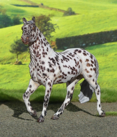
Now, one which stands just fine on her own four feet! It's quite funny cos this mould has been released in solid chestnut, chestnut roan, and now a chestnut based appaloosa with roaning, so it's like they add a little bit more detail each time they want a regular run colour!

The spots are done by hand, with deliberate placement rather than random paint-spatter, and while this means they look less like, well, spattered paint, they do look amusing from above, where you can clearly see the painter had got a method going - four symmetrical and evenly spaced big spots, then a series of equally symmetrical and evenly spaced small ones to fit around them. From the side, it doesn't look so mathematical!

One of the older moulds in this batch, the Stock Horse Mare dates back to when Stablemates were still released in generations, she's a G3 sculpt, which were all done by the same artist (who also did the very best era of Safari horses!), and have distinctive chiselled faces as well as chunky legs with big joints and feet. A little too chunky for the Appaloosa breed, so I show my spotted ones on this mould as Colorado Ranger Horse instead.


Annnd another one whose sculpt doesn't match his official breed, but at least he does stand up, hah! This one's sold as a Clydesdale, but they're a tall, rangy and rather narrow heavy horse, quite athletic and leggy for a draft, not bulky little balls of muscle like this chap! I remember discussing the exact same model with another collector, and I think my eventual best guesses for a more accurate breed were the Breton (which is more famously chestnut, but does come in bay), and the Rhenish German Coldblood, which is suddenly a popular breed allocation in the hobby thanks to Breyer bringing one out for Breyerfest the other year! I haven't decided which yet, so I don't know if I need to name him in German or French!


This one stands up! And looks like the breed it's meant to be! Hurrah!
The colour's nicely done, a deep and rich shade of palomino with the true white mane and tail done with neat masking. I especially like the fine zig zag at the end of the mane where the edge has to interpret where the sculpted detail blends into the coat, but does it without looking blocky or misaligned. The shading on the face is also nicely done, sometimes palominos don't get given the dark noses they need to reflect the fact they have dark skin which shows wherever the coat is very fine.


he final single horse in this year's batch, the mustang, in grey pinto. The little flash of white is quite small, I'd maybe have preferred to see a bit more across the body or neck of the horse just for the sake of being more striking to look at, but he's not at all bad, a perfectly good colour for the breed, and the sculpt is dramatic and energetic - and yes, it stands up!
I've tweaked his breed from just 'Mustang' to Spanish Mustang, because this mould was originally released as an Andalusian, so even in a mustang colour, it carries all the conformation of the Spanish ancestors and can join my website's page of that breed instead.

As well as the individual horses packed on cards, this year saw the release of another 4-piece set. This time, rather than being grouped by breed type or colour/pattern, the theme is 'Poetry in Motion', which is a bit vague - I suppose the link is that all the moulds are moving rather than standing?

One of my favourites, despite not normally being overly keen on the mould (all that mane and tail is a bit too much for my taste!), the colour just works here. Morgans can be roan, and I like the application of the white spray, so fine it captures the speckly look you see if you inspect a roan coat up close, but from a distance it blends into smooth pale colour. They also remembered to leave the darker head, and if you look at the very end of his nose, he's got a hint of more gingery shading there, like a lot of bays have in real life.


Here's a sculpt which wasn't released as any official breed - she's known as the Running Mare! In this set, she's described as a Mustang, which...is ok, I suppose? It's a very middling sort of mould, no strong conformational traits in any direction, quite shallow through the body with barely any withers, and a small angular rump. I've got one other, which I allocated as a Brumby, another feral breed without selective breeding to improve type or maintain good conformation, so I'll put this one as a Brumby as well, just so I'm keeping two of a mould together rather than cos I think she can't stay what she was sold as.

Another one I was keen to get, this was my deciding factor on whether or not I really needed that set on my order! As I said on the previous page, I've been collecting this G2 Warmblood mould specifically for a really long time now, so any regular runs jump out as something I really ought to tick off the wishlist, even though I know I can't get EVERY release on a mould these days, with too many inaccessible exclusives out there.

This stallion is the colour known as dunskin, what happens when a buckskin horse also gets the dun gene. A lovely creamy pale shade, with frosting along the mane and at the top of the tail, and barring on the legs - an impressive level of detail to bother with for a regular run! Sold as an American Warmblood, where there's a lot more variety in the colours than the majority of older European warmbloods, so I'm happy with keeping that as his breed allocation.

The final one from the Poetry In Motion set, and it's the Stablemates portrait of Valegro in grey. We've already had the mould in fleabitten grey with dark points, fairly recently, so I'm surprised they've gone for another so soon, but then they've also done him in dark bay more than once, so I don't think they worry too much about repeating colours! These are supposed to be dapples, but I always think they look more like heavy Tetrarch/Chubari spotting.

He's got a handsome head, and (apart from the tiny feet!) it's a nice well observed little mould, capturing the dressage movement where the horse trots as close to on-the-spot as possible - you can see the concentration on his face.

By this point I was pretty close to reaching the half price postage point, so I thought ok, I'll add another little horse, and had a look back through the Stablemates section, thinking I'd probably put in a duplicate of one of the 2023 singles, whichever I've painted least of already. But in amongst them was a 2021 model I didn't have, one of the blind bag releases which I'm pretty sure was only sold in the USA? I can't find that info on Identify Your Breyer, but as a US-based site they probably wouldn't realise that not all countries got all those Stablemates, and didn't know it was a thing which needed noting!

Here he is, one more of those missing G2 Warmbloods to tick off! I don't know if he was ever sold as a certain breed, or even whether his colour's intended as a very light bay or a golden buckskin, but either way he's a handsome addition, and I'm pleased I spotted him when I was compiling my order!

But I looked across at the total, and oh, it was still a tiny bit below the cut-off point for half price postage - for the sake of spending about 30p more, I'd save myself €5, so I HAD to go back and choose one : it was practically a free horse! I decided to stick on one of the 'Handful of Horses' blind bags, I still haven't managed to get the Icelandic from that set, so there was a one in six chance I'd end up with the one I wanted, and if not then I'd be happy enough with a duplicate to repaint.

So I left that til last, when unpacking my parcel, a random surprise which would either be the Icelandic, or one for the body box...right?

Wrong - as soon as I split the packet I knew I'd got something totally different after all, the silver foil inside was reflecting BRIGHT blue, and out came the one-in-96 'chase' piece!

I don't actively collect decorators, but I do find it amusing when the cool colours come to me by chance - especially as this was such a last minute 'oh I'll have a blind bag' moment just to push the order up by a few pence, I very nearly didn't ever own this horse, and now I do, so I'm quite happy for him to have a shelf space, and can appreciate him for the perfectly mad and visually striking little thing that he is! The metallic blue is very vibrant and more my taste than neon pink or multicolour or see-through-and-glittery, I think in general the 'filigree' pattern is one of the most tasteful designs used for decorator releases. And the other one I got from a previous set of blind bags was similar (the copper filigree Django) so at least he'll have someone to stand with on display!

Tuesday, 26 April 2022

Tales from the Body Box - April additions to the home-painted herd

Time for another recap on a few weeks' worth of Stablemates!

There were four Fell Ponies in my recent whole box, and while their most famous colour is undoubtedly black, which I already painted, they also come in the much more scarce grey, and the very very rare chestnut, which has only recently been allowed in the stud book. (It used to be regarded as rather a disappointment or embarrassment when two black Fells produced a chestnut foal - assumed to be a throwback to some accidental cross-breeding, or dodgy cover-up of a mare's true pedigree, and the chestnuts weren't allowed to be registered, shown, or bred from as pure Fell Ponies!)
But greys have always been acceptable, though not anywhere near as common they're not looked down on in the showing or breeding circles, and I think they're very handsome, here's a real one. So because I already did myself a black Fell, and have one of the chestnut in factory-finish paintwork, that left grey as the last colour to complete the set.


A while ago I did an experimental pencil-scribble dappled grey, and thought it was about time I used the same technique again. But rather than scribble dapples of equal darkness all over the white base coat, I decided to go for this faded-out look of a slightly older horse, where the dark colour is mostly left on the hindquarters and legs, while the front half has almost reached the white-grey stage.
It was quite tricky getting the pencil to go fainter, it seems to catch heavily on the paint surface rather than being able to control the shade of grey precisely like you would on paper, but I used a little bit of white and black paint over the top of the scribbles to help blend them without covering too thickly.


I've named him Harecroft Hailstorm, as we had such a lot of hail it was layering thick like snow on every flat surface and gathering in every hollow, just a couple of days after I painted him and was still trying to think of a name.
I like how he turned out, better than my first try with the pencil (I've got better at applying the marks like little individual lines rather than letting them loop too much), and I think the colour's really pretty and suits the mould well. He's kind of a half-way point between pencil and painting, and that's more effective than pencil alone.


The one down side with the pencil graphite is that it gets a kind of shiny, silvered effect where you lay lots of scribble down in layers, but I found that gently tapping it with my fingertip took the metallic bloom off without smudging or fingerprinting the colour.

With the pencil dappling going so well once, I thought I'd get on with another custom idea I've had for a while, a really pale dappled grey draft horse, the French Boulonnais.


I've wanted to paint one of these for ages, they're always in the horse books with their pretty grey colour pointed out as a feature of the breed (their nickname being 'the white marble horse'), but hadn't had the right type of heavy-set draft mould in my body box til now.


Some before-and-after shots of the mould as it's sold, and my adjusted version with a loose mane and tail made from Milliput.

I just don't like it as the Clydesdale it's supposed to be, the build and conformation is all wrong (true typey Scottish Clydes are rather lanky, deliberately cow-hocked and close behind, and just generally look narrow and upright even when working-fit and strong; this chunk is wide, massively rounded, with a barrel chest and enormous bum, the back feet are far far apart, like the typical Continental-European draft breeds it's more muscle than legs!)


I've given him the name Harecroft Grandeur, though in French naming grammar it'd probably be Grandeur de Harecroft, and the name 'Harecroft' doesn't sound French in the slightest, so I'll just leave it the English way round!


Much like the Fell, I did his base coat of off white first, then the pencilling, with a little bit of black paint on the face and lower legs just to apply some more solid shading.

Next came a custom inspired by a small adventure!
On my way home from a day with my real horses, a very fast loose shetland pony shot across the main road in front of me and darted into a farmer's crop field, pursued by a panicking owner, and two random chaps from the house next door who'd seen him get away and were dashing after him too.
Of course, the pony was having a GREAT time, bombing about this huge field at speed in all directions, and cos there was nothing to stop him leaping out back onto the road in front of oncoming cars, I took on the double role of 'the one who stands in front of traffic' and 'the one who flails wildly at the pony to turn it away from the road every time it comes this way'.
While the people in the field tried to corner the shetland, which kept on evading them, a horsey family from a neighbouring house came out with a bucket of horse feed, some carrots, and a long rope, and joined in the catching game, while I carried on directing traffic, letting them go every time the pony was a safe distance away, and stopping them to a standstill or crawl whenever he was heading back toward the road and could've caused an accident.
The food trap didn't work, and the pony was so skittish and hyped up not even the owner could get near him by gentle sneaking or bribery, let alone the strangers he didn't trust, so in the end they changed tactics and worked as a pack to surround and slowly herd him the way they wanted him to go. There were a few false starts where he realised what was going on and shot between them at top speed bucking, but eventually they'd got him heading toward the corner of the field nearest his home.
I stopped the traffic both ways and stood there as a road block while the people in the field chased him briskly and determinedly across the road, across the bridge he'd escaped over, and back toward his yard. Then it was time for us all to hurry after him, one opened the yard gate while the rest of us blocked every escape route and shooed him in the right direction, and in he went - looking like he'd thoroughly enjoyed his adventure and gone home exactly when he'd had enough of exploring!

I've been passing this pony and his donkey friend in their field for years now - I live in one village, my ponies live in another, and I work in a third village just down the road from there, and they're on my bike route between all three places. 
And I've always thought he was a really nice colour, which would be fun to paint one day. I'd kind of thought I'd just pinch the colour idea and put it on a totally different breed, like an American paint horse or a cob, but after being one small part of his rescue operation, I changed plan and put his colour on a shetland pony after all - so although it's not a true portrait as the placement of his patches is all made up, it's a custom inspired by the real pony.


He's just the G2 Shetland pony mould, unaltered - the real one was shorter-legged, more chunky, and of course still in winter fluff mode at this time of year so his patches blended into his white parts much more, but painting that fuzzy blurry look on smooth plastic wouldn't have looked right, this flat smooth sculpt is obviously intended to show the sleek summer coat (which Shetlands shed soooo slowly they have full shiny coats for about two weeks a year before the winter fuzz starts growing back, hah)


The other side, as I said I've just guessed at a random tobiano pinto pattern for him, cos at the time I was concentrating way more on stopping him from getting hit by cars than on where his markings were.


I think his name was either Thistles or Bristles or Brizzles, it was honestly too hard to hear what they were calling from halfway across a field on a windy day, so I'm calling my little one Thistles cos I think that's the nicest of all those possible overheard names!


Here we have a LOT of spots! I tend to paint very roany blanket appaloosa patterns, so I decided it was time to do another full-on leopard spotted version for a change. He's a bay base, so the spots on his body are brown but the ones on his legs are black.


The spots didn't take too long to put on, each one was painted thickly enough that it took just one coat for full coverage, then a light diluted layer over the top for the halo effect. Normally I don't like applying paint thickly at all, but on an appaloosa it doesn't matter that the spots aren't perfectly smooth - in real life the spots can be felt when you run your hand across the coat, cos they stand up a bit thicker and more solid than the white parts!


The mould was sculpted as a Quarter horse, so it's a bit more chunky in the bum and full-tailed than a foundation type Appaloosa horse, but the majority of show ring Appaloosas are so stock-type these days, and allowed to register as purebred with a lot of QH blood in them. So it's fine for models to echo those real life trends, and I can easily get away with allocating Appaloosa for a sculpt which doesn't look like the old-fashioned true typey examples.

Over the years I've done quite a few racehorse portraits, even since beginning this blog I've introduced four or five new racing stars in miniature, but almost all of them have been jumps horses.
The reason so often given for why UK and Irish fans enjoy jumps racing more is the horses we get to know and love - coming back year after year, for a career of six, seven, eight seasons, in contrast to the flat racing stars, which might only race for one summer, possibly two, before being whisked off to stud.
Where a great chaser or hurders' expertise is in it's experience, and a lasting reputation comes with accumulating a lot of wins over multiple seasons, flat racers aren't usually asked to come back into training again and again. Their prime comes early, and often their careers are so very short, which makes it frankly quite hard to get attached to all these beautiful horses which show up with awesome speed and strength for a few days spread over their immature years, then are never seen again.

So I think it's no co-incidence that the first flat racer I painted was Enable, a hugely talented mare and sympathetically trained for a long career, who raced on successfully for many seasons before finally retiring to her new life as a mum to the next generation.
Now, the same trainer has an eight-year-old stallion, Stradivarius, who's also still racing and winning, long after the average flat horse has disappeared from the public eye. Whether the longevity is all in the kinder training, or the combined attitude of connections to manage the horses with a longer career in mind, I don't know - but it's been lovely to see him continue into adulthood as a magnificent horse at the top of his game.

Here's a photo of the real Stradivarius which shows his bright colour nicely, but what really made me decide I had to paint his portrait was this shot, taken after one of his big wins. His pose is so much like one of Breyer's recent Stablemate sculpts!


And here's the mini version - see what I mean about the pose! It's a very narrow and wiry-muscular mould, which has the look of an old-fashioned hunter or a very fit lean racehorse, I'm really glad Breyer have given us this option as their Thoroughbreds are often fairly stocky and rounded and small-looking somehow.


Stradivarius also has the advantage of being a really eye-catching colour, with his bright shade of chestnut emphasised by so much white, it was fun copying his markings for all four legs and the narrow stripe on his face.


For once I didn't have to resculpt the mane for this portrait, thankfully Stradivarius always races with it loose and unplaited, just trimmed for tidiness, and that's the same way the mould was styled, too. He makes a really nice addition to my racehorse collection.

The final one for this month's batch isn't a portrait as such, but from a reference photo of this anonymous horse which always comes up in my Google image searches for appaloosa pattern ideas and information - she too reminds me of a Stablemates mould, and after I'd seen her so many times, I just couldn't get the idea of that colour and pattern on that mould out of my mind!


So here she is! I made her a mirror image of the real one, since my model photographs better from this side, but other than that I tried to get the colour, shading, roaning, and spotting to be as close as I could to the real horse which inspired her.


As there's no name or details attached to the original photos I picked one at random, Chickadee, as it's such an adorable name for a bird, and from the same country as my little horse would be. She looks very kind and gentle and steady-tempered, the sort of horse which would be very easy to look after and a good influence on the rest of the herd!


I've found several references to appaloosa spotting patterns occurring in the Choctaw Pony breed, which is what I've used for my others on this mould so far, even though there's no modern photo examples, only older black and white ones, so it's possible those genes have died out. It might be better to file her as a foundation-type Appaloosa for her colouring, but as the vast majority of my Appaloosa models - actually Appaloosa models in general - are now spotted paintjobs on modern stock-type horses, she wouldn't really fit in there either, so I'm more inclined to keep her as part of my small herd of true Native American heritage.


Her other side, which isn't quite as nice - I did this side first to figure out the strange new smeary-blotchy-roaned paint techniques by trial and error before going over to her more important display side!

That's it for this month, but I'm really happy with them all. Which do you like best? 

Friday, 1 April 2022

Tales from the Body Box - Another Stablemate roundup

Since my last Tales from the Body Box update in early February, I have quite a few more customs to share!

I recently added a few of the mini 1970 'Indian Pony' mould to my body box, which I was quite pleased about as I'd never painted one of those before. So I picked the first one out, and gave her a new colour...


Meet Shikoba, the Choctaw Pony mare. I wanted to do a pinto all along, but wasn't sure what colour I'd use as the base; I dithered between sandy chestnut, red dun, or this warmer bay dun, in the end I decided this would be most different from her original finish chestnut pinto paintwork colour, so that's what she got.

Her name means 'feather', because my existing original-finish pony in this mould I named Hushi ('bird') and I enjoy linking my same-breed models with a theme, like they're part of a family line. I chose the Choctaw pony breed for my first one, and they come in a wide range of colours so this and any future customs will all be allocated the same breed for my site.

It's important to mention again that calling Native American horse & pony breeds what their indigenous owners and breeders call them is the only respectful way to refer to them - singly, by breed name, rather than lumping them together under the old-fashioned casual racism of 'Indian Pony'.
It's not the 1970s any more, the mould name from back then may not have changed, but all hobbyists can help acknowledge and respect people by dropping racist terms from the model horse world.


Some of the releases in the original 1:9 scale mould have sculpted feathers in the mane, so I thought it'd be a nice detail to add those to the tiny version. I made a couple from painted paper - unfortunately the blustery wind took them off mid-photoshoot and I only managed to find one, so even if I reattach it she won't look quite the same as in these photos.


I was going to do her tail plain black, but as I was applying the first coat the smudgy edges blended so nicely I thought I'd leave it with this fade-in effect - a lot of real duns have a mixed mane and tail where the centre is black and the edges are the same as the body colour, so it's something which looks deliberate and not like lazy painting which needed filling in to the edges.


The dorsal stripe down her back, as I always say, the most nerve-wracking bit of any dun paintjob - to minimise hand-shaking, I hold my breath, and brace my elbow against my side.


And here's some photos from after the feathers got away - I'm not entirely sure they looked realistic enough in the first place, as a copy of the model ones (like on this example here) they were ok, but the thickness of the paper made them look rather chunky and stiff, not soft and fine like real feathers. So I took a second set of pictures without them, in case I decide to leave them off after all.


She's got two blue eyes - a lot of frame overo pintos have a white face and if the marking is wide enough to catch the eye sockets, they'll have full or partial blue eyes. I think she looks very happy and friendly.

The very next day, I painted two more, with spots instead of patches.


I've had a couple of these dressage horses in my body box for a while (they were in the blind bags the first year I got a cheap whole boxful to work my way through!), but hadn't had any nice ideas for colours on them lately, then I happened to see a photo of a spotted horse competing in dressage and realised that would be the perfect fresh idea to give one of my horses a very different paintjob!


I decided to go with Knabstrupper as they're the most famous pure spotted warmblood breed, rather than yet another partbred for my collection! With this new nationality in mind, I've named him Harecroft Heroisk - 'Heroic' in Danish.


One of those moulds which has two good sides, as it's posed moving on a perfectly straight line it photographs just as well from either side.

Now, the next one has a bit of a problem. I painted him working on my lap, as usual, and when I'd finished I was really pleased with how he'd turned out, didn't notice anything wrong at all. The following morning, he still looked lovely, and I was happily satisfied with my work - til I got him outside for a photo.


See the issue? 
Handsome enough horse, pretty colour, no massive errors in the paintwork, no missed bits, no stray fingerprints or stuck fluff... whatever could have made me say 'Oh, no!' out loud at him? 
Look at that back foot! His back leg nearest the camera is so warped, his foot is hovering far above the ground when the pose means it should be touching down, and supporting his weight.

It's because I don't have a desk or table or workbench - if I'd stood the mould on any flat surface before painting, or even during the boring basecoating layers, I'd have noticed this and been able to fix it first!
So okay, I think, I'll just take him inside, use boiling hot water to bend the leg, hope hope hope the paint doesn't peel off with the wet or the heat, then retake his picture.

The paint's fine, but the plastic doesn't soften. Not even a little bit. 
I try reboiling the water and putting him in again. 
I try pouring it directly on the leg.
I try leaving him in longer. 
I try more force. 
I try everything, but the leg just will not bend.

This body was made from a different plastic, completely clear, sold in this set designed for making decorator pieces, like stained glass or rainbow or however you wanted to colour them. They paint up just fine with normal model paints, too, and I've had several of them for turning into ordinary horse-coloured customs in the past, without ever realising that the different plastic can't be softened with heat in the normal way!

So I was left with only one alternative to fix him - first, my little hacksaw to cut the leg almost all the way through, trying not to scratch up the paint anywhere else. Then I wedged the gap open the right amount with a piece of compacted metal foil superglued in, and used Milliput filler to smooth over the edges, with a slight overlap. Then once it had dried hard, I repainted that little section carefully, trying to match the previous day's paintwork enough that the patching won't be obvious.

And then he was back out for another photoshoot...


I'm much happier with him now, I liked the way his colour turned out anyway, and now he doesn't have a mistake in him I can feel pleased with the finished custom!


I took more photos the second time round, so you get to see some extra angles now!


I've chosen the name Campéon ('Champion') for him, and I'm going to have him as a historical breed on my site, one of the Iberian spotted horses from the past, probably a Spanish Jennet  - the extinct kind from old Europe, not the current re-creation project of named crossbreeds in the Americas.

The next project was one where I foresaw the potential for problems...


I'd got one of these gloss finish Fighting Stallions in my body box, and wasn't sure how well I'd get on with painting over the top of the gloss. Not just cos it's shiny and paint may not stick, but also the clear gloss layer is quite thick, and might've settled into the fine detail of the mould, making it look blunt and blobby once painted with colour over the top of that.
But it turns out it's just fine to paint over the gloss, I had no issues with the paint failing to cover well, or rubbing off with layering or handling, and the detail's not obscured at all, so all's well!


I'd had some reference photos bookmarked since a previous sabino custom a while back, and decided to go with this horse's colour for him - although I didn't copy exactly, more took the general idea of where the white was than trying to recreate every patch and speckle as a portrait, the one in the pictures had this interesting marking on one foreleg, with white across the knee above a solid black leg, so I just had to include that!


The real horse he was inspired by is used as an example on a couple of pages about the Barb breed from North Africa, but I think they've got their sources muddled and picked an incorrect picture, as I've found photos uploaded to Flickr by someone who photographed this exact same horse, and they're captioned as the Wilbur-Cruce breeding line of Spanish Barb horses (which is an American breed, also called the Spanish Mustang, descendants of the horses taken there by the colonists).

Later in the month, I painted a few more customs, and because I haven't been keeping up with the blog very promptly, they all get to share this one post.


First up, a dunalino - this is what happens when you get the dun gene working on a palomino coat; the golden colour gains a dorsal stripe, darker points including dark ear tips, and sometimes leg barring and a darker shoulder too.
Here is the reference photo I used, he's the classic photo example used when dunalino is listed or explained!


I used one of the new moulds from my box of anniversary Stablemates - the older G2 Appaloosa/QH sculpt is just as nice but I've painted a lot of them and only a couple of the Mini Smart Chic Olena. So he got to be a colour I've never painted before, on a fresh new mould too.


I really do like how he turned out, especially the shading on his shoulder, and the colour was fun to mix - warmer than the buckskins I did recently, but not as coppery-bright as a palomino can be without the dun adjustment!


His dorsal stripe, which annoyingly isn't at all obvious from the side, yet it's one of the most important parts of the paintjob! I'm just glad to have ticked this colour off my list, it's fascinating how horse colours combine and vary depending on the various dilution factors, and dun plus cream was one I'd wanted to tackle for ages!

Next up, the results of hours reading and research - I wanted to know what other breeds the new Mini Connemara mould would be best suited for.
I've already painted one as the Connemara it was sculpted for, one as my own pony (Welsh x New Forest, looking more like this sculpt than anything else on the market!), and the Sable Island Pony Breyer once released it as themselves. 
But there's a lot of pony breeds out there in the world, and I'm especially fond of the native and feral types rather than the cross-bred showring types, so I sat with my books and referenced Wikipedia and various breed websites, and came up with a shortlist of ponies which matched both the breed type & conformation of the sculpt, and the free, feral attitude in the pose.

So which breed stood out as best suited, and one I'd most like to add to my collection?
The Pottok, from the Basque region of France and Spain.
These ponies are rather like the 'mountain and moorland' natives I'm so fond of in the UK - ancient ancestry, hardy, thrive on the roughest of land, can manage just fine as feral herds doing normal horse things in the wild, but can be brought in to a domestic environment and loved just as much as any other pony when tamed and trained.


They also come in lots of good colours to paint, with pinto being notably common, so my first Pottok is a seal brown pinto mare! Well over 50% of the reference photos I've seen have been flashy tobiano patched bays, chestnuts, browns, and blacks.


I hadn't realised how good this mould would look in a patchy coat, I think cos I'd only seen solid colours so far I'd not even considered it before, but it really does suit it - especially this slightly dirty unpolished coat, I gave her grubby heels and a bit of mud on the knees and hocks, like she's a proper outdoors pony and never gets bathed or shampooed!


Looking very happy frolicking in the spring field. I may well set aside another of the Connemara bodies to paint her a companion, it wouldn't be fair to have only one of the breed in my entire herd!


And the other side, because the markings are never symmetrical on a pinto, so each side will have different shapes.

The final custom of this whole March batch is a portrait of a very famous racehorse, Tiger Roll. He's so well-known in the UK and Ireland that many people who've never watched a horse race have heard of him, while anyone who does watch racing has ended up quite fond of his sweet little face, and admiring his big achievements. He's one who's attracted so many supporters and fans that he gets referred to as 'the People's Horse'.
There's a lot of biographical videos, compilations showing all his races, and even a couple of full documentaries about him, over on Youtube if you have the time, but here's a nice short summary telling his life story while visiting him at home.
When he finished his last ever race, and did his final lap of honour in front of a cheering crowd at the Cheltenham Festival, I just had to paint his miniature - I think I always knew I would, I just wanted to see him retire safe and sound first!


His colour is much redder than a lot of bay horses, here's a photo of the real one to compare - it's a very deep, bright bay with a lot of red tones rather than dark browns and blacks, so he looks quite different to the other racehorse portraits I've done.


The big star on his forehead - in later races he wore a black visor to help him concentrate his attention forward and you couldn't see this, but up to and including his Grand National win, it helped make him easy to identify in a crowded race. His only other marking is a little white patch on his shoulder, which I spotted in a video of him being tacked up - under his saddle pad you wouldn't know it was there.


I think the mould looks better from the other side, the eye is rounder and happier-looking when he's facing left, but his plaits show more on this side. I had to cut away the sculpted loose mane and replace it with Milliput in these little rolled-up braid blobs. I wish more of the famous horses I wanted to paint could run with loose manes, but so many of them seem to have needed plaiting! I also gave him bigger hooves, and a slightly different profile as the original face had too much of a dished nose.

All in all, I'm happy with my month's worth of customs, but already plotting what breeds and colours will be next!