Showing posts with label G2 Thoroughbred. Show all posts

Saturday, 24 June 2023

Second-hand horses for my herd, two little and one large

These actually arrived some time ago, but I only just realised I hadn't updated the blog to introduce them, and they need to be listed before the more recent ones, so you're getting three posts from me today - oops!

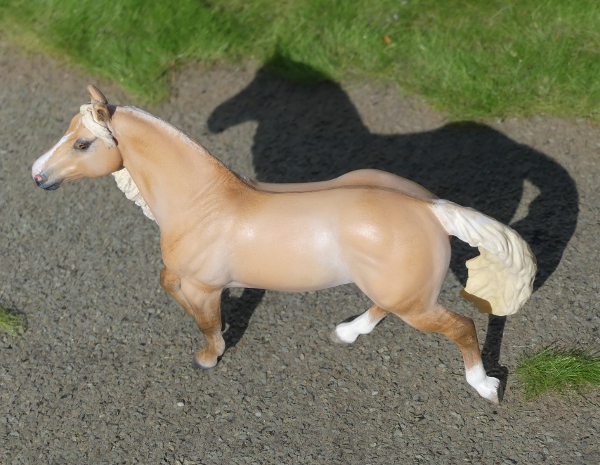
A long time ago, I collected every release on this mould. I didn't really intend to - just like with the G2 Appaloosa and G2 saddlebred, at some point I noticed I had a LOT of them and that made me start looking for the colours I didn't have, and it became one of those 'conga line' moulds where I tried to get as many as I could. One which always eluded me was the bay with diagonally opposite white feet - I had four other solid bays, but not this one! He was part of a limited edition set only sold by JCPenney and only in the USA, so very few made it over here to start with, and I never saw him come up for sale second hand. I stopped doing my conga-lines of every release when Breyer brought in the expensive club specials and more unattainable releases. But when I saw this model which had been on my wishlist for all that time ages ago, I just had to get him after all!

The same seller had this Thoroughbred from the same 2006 special run, and while it's not a mould I ever sought a complete set of, I thought it looked really good in this pretty pale grey colour - unlike a lot of Breyer greys, the paint isn't just speckles and shading over bare plastic, but has a base coat of shaded grey for the body colour too - you can see where the white socks end with a crisp masked line.

The other recent arrival is a much bigger boy - a Traditional scale draft horse!

You might not recognise him at first glance, as in Breyer's catalogue photo he was mostly covered up in unrealistic decorative trappings - here's how he looked in the promo images and in the boxes of models on display.

I don't usually buy the Holiday Horse sets, partly because I don't celebrate any of the holidays they're aimed at, so I don't appreciate the decorations, but mostly because the models inside the costumes are usually given pearly or metallic paintjobs, aimed at making them look prettier and more ornamental when used for their intended purpose. But I only like matte finish models in real-horse colours, so the Holiday special runs are usually something I look at once when the releases are announced, then never think of again!
But every now and then, they do one where the horse is a normal, plain colour, without any fancy paint finishes, and I think 'Oh, I'd have liked that one!'....and STILL don't buy it, cos they're too expensive compared to a normal regular run - I can't justify paying that much extra for the costume and props I'd never use.

So when those real-colour horses come up for sale second hand, at a bargain price - and even better, without all the stuff! - that's when I jump at the change to have them for my collection after all!

Without all the extras, you can see what a handsome mould this really is.
He was sculpted as a Shire, but it would be extraordinarily rare to see any individual of that breed without any white markings - one or mayyyybe two dark legs and some shorter socks, yes, possibly even a star and snip in place of a blaze, but no white at all and that's no purebred Shire horse! So I had to get to work on finding a different breed for him.
A lot of the central-European draft breeds come with little or no white, but most of them are heavier set and lack the leg feathering this sculpt has, so I started to look a bit further afield, and happened across this picture - the North Swedish Draft. Lighter build with longer back? Bay with no white markings? Feathery legs? Long loose undocked tail? He's even got the little pale grey nose! Perfect! This means he's also the first model allocated this breed on my website, which is always fun - I love building up a catalogue of different breeds and types from across the world.

Here's that sweet grey nose again, he has a very kind and happy face. I looked up some names in Swedish and settled on Härskare, which means ruler or monarch, which seemed fitting as he arrived around the time we had the coronation of a new king!

The other side, showing the lovely flowing mane, and also the tiny mark by his shoulder which was why he sold for an affordable price - it's so small it didn't bother me, and this being the 'wrong' side anyway the damage won't show on display - I'll only ever see it when dusting him, and I very rarely get round to that task!

Saturday, 31 December 2022

Tales from the Body Box - Two Stablemates, two CollectAs

I'm trying to catch up on posting, so that all my 2022 customs have a '22 date on their blog posts! Here's the last few customs I did a while ago - as you can tell from the background being open country, they had their photoshoot the same day as Red Queen.

First, two racehorse portraits. I don't always paint the winners of the biggest races, but rather my favourites - the horses I like for their character, their looks, their performances - any where I've especially enjoyed following their careers.


This is Frodon, a tough and sparky little horse (his regular jockey describes him as 'such a dude' cos she loves his cool fun attitude so much) who's defied his size and been the underdog who out-performed all predictions, winning some of the most prestigious races in the country with his front-running speed and stamina.

His name is apparently the name for Frodo in the French translation of The Lord of the Rings, though I've no idea why it needed alteration as it's already not a real name in the author's native English either!

He's a good colour to paint, with just enough white markings to make it easy to capture the likeness - when they're plain bay or chestnut it can be harder to make the model look like the real horse, but a few socks and a face marking or two and it's much better! He varies in colour through the year and depending on how recently his coat has been clipped, but here's a fairly similar picture to how I've painted mine.

Potters Corner is another long distance steeplechase horse, another tough stayer who relishes the winter mud conditions and did great things for a small yard, for a trainer with not many horses he was the first stand-out star. He won the Welsh National, but never made the big one - he won the 'virtual' Grand National the year it didn't happen due to Covid lockdown, when a computer programme worked out the most likely winner based on form, stamina, suitability for the track, and previous jumping ability. He's retired now, so he never will get a real run in the race, but he's been given to the stable hand who looked after him and promised a home for life with 'lots of attention and cuddles', which is pretty adorable in a world where horses can easily be passed on and forgotten when they stop winning.

Another interesting colour to paint, he's officially a bay but with a lot of light brown shades in his coat, including the mane and tail which would usually be pure black. You can see a nice picture of him here. And again, I like that he's got plenty of white on, so it's given me plenty to match to the reference photos.

The next two are CollectA customs, but the first also has a racing link. You might recognise him if you're a Breyer collector, as they've also made a portrait of the same horse.

Harley is a spotted draft horse who works on the racetrack where this year's Breeders Cup racing was held. His role is 'ponying', which is accompanying racehorses down to the start, and back again afterwards - we don't have horses doing this job at all in the UK (it's legally allowed in our rules, but you only ever see it in practise when US horses have been flown over for the big meetings - none of our British or European trainers seem to bother!)

For the last couple of years, the Breeders Cup race meeting has been covered by British tv, so we've got the chance to see Harley in action for the first time. He really is a striking-looking animal, huge and sturdy and with such an eye-catching colour, I started wondering if I should buy his official Breyer portrait release after all.

But I'm not keen on the mould - I love the pose, but not the sculpt style - and no matter how good the colour was, or how much I liked the real horse, I didn't think I'd take to the model. So I decided to paint my own, and with no Stablemate mould really looking like him, I went up a scale and looked through the CollectA moulds to choose the one which was the best match.


This is the 'American Cream Draft', but no longer cream coloured! He was a fun one to paint, with plenty of references out there from all angles cos he spends so much time in the public eye. There's plenty of pictures and a full biography of him here.

A couple more pictures, including the other side, cos I often neglect the 'wrong' side when a mould looks better from a certain direction.


His black bits aren't quite jet black, which made him much more interesting to paint - his nose is especially shaded. And he has a big spotted bottom!

And finally, one more CollectA custom, the Yakut horse.

When this model was first announced, I remember saying it's a shame he's not dun, as that's such a distinctive colour for the breed as well as being a bit more interesting than plain grey - and I've seen several other collectors saying the same thing since. Rather than wait for them to re-release it in dun (now they are reissuing moulds in alternate colours, that's at least a possibility to hope for!), I decided to buy a duplicate and make my own dun one.

He's bay dun, with leg barring to help make it clear that he's intended as a dun not a light bay. I'd love to do some different shades as well, maybe a paler bay or buckskin dun, a black dun, and a greying-out dun which would be even paler, I'd happily have a whole herd of these little things!

He looks nice against the blue sky! I've named him Ärčimnǟx, which means strong and energetic in the Yakut language - most of their horses are named with descriptive terms about their colours or characters, and the word for 'dun' was too hard for me to read or say so I picked something else!


Weirdly the other side of him looks more orange in photos, but it must just be the angle of the light cos I used the same pots of paint throughout! I love the attitude of this sculpt, and I think he looks even more expressive with his features painted in more detail. And he does look good in dun, so we were right!

One last shot, it seemed a shame not to make the most of the frosty ground for this horse breed from a very cold climate, here's a bit of local icy road standing in for Siberia.

Friday, 1 April 2022

Tales from the Body Box - Another Stablemate roundup

Since my last Tales from the Body Box update in early February, I have quite a few more customs to share!

I recently added a few of the mini 1970 'Indian Pony' mould to my body box, which I was quite pleased about as I'd never painted one of those before. So I picked the first one out, and gave her a new colour...


Meet Shikoba, the Choctaw Pony mare. I wanted to do a pinto all along, but wasn't sure what colour I'd use as the base; I dithered between sandy chestnut, red dun, or this warmer bay dun, in the end I decided this would be most different from her original finish chestnut pinto paintwork colour, so that's what she got.

Her name means 'feather', because my existing original-finish pony in this mould I named Hushi ('bird') and I enjoy linking my same-breed models with a theme, like they're part of a family line. I chose the Choctaw pony breed for my first one, and they come in a wide range of colours so this and any future customs will all be allocated the same breed for my site.

It's important to mention again that calling Native American horse & pony breeds what their indigenous owners and breeders call them is the only respectful way to refer to them - singly, by breed name, rather than lumping them together under the old-fashioned casual racism of 'Indian Pony'.
It's not the 1970s any more, the mould name from back then may not have changed, but all hobbyists can help acknowledge and respect people by dropping racist terms from the model horse world.


Some of the releases in the original 1:9 scale mould have sculpted feathers in the mane, so I thought it'd be a nice detail to add those to the tiny version. I made a couple from painted paper - unfortunately the blustery wind took them off mid-photoshoot and I only managed to find one, so even if I reattach it she won't look quite the same as in these photos.


I was going to do her tail plain black, but as I was applying the first coat the smudgy edges blended so nicely I thought I'd leave it with this fade-in effect - a lot of real duns have a mixed mane and tail where the centre is black and the edges are the same as the body colour, so it's something which looks deliberate and not like lazy painting which needed filling in to the edges.


The dorsal stripe down her back, as I always say, the most nerve-wracking bit of any dun paintjob - to minimise hand-shaking, I hold my breath, and brace my elbow against my side.


And here's some photos from after the feathers got away - I'm not entirely sure they looked realistic enough in the first place, as a copy of the model ones (like on this example here) they were ok, but the thickness of the paper made them look rather chunky and stiff, not soft and fine like real feathers. So I took a second set of pictures without them, in case I decide to leave them off after all.


She's got two blue eyes - a lot of frame overo pintos have a white face and if the marking is wide enough to catch the eye sockets, they'll have full or partial blue eyes. I think she looks very happy and friendly.

The very next day, I painted two more, with spots instead of patches.


I've had a couple of these dressage horses in my body box for a while (they were in the blind bags the first year I got a cheap whole boxful to work my way through!), but hadn't had any nice ideas for colours on them lately, then I happened to see a photo of a spotted horse competing in dressage and realised that would be the perfect fresh idea to give one of my horses a very different paintjob!


I decided to go with Knabstrupper as they're the most famous pure spotted warmblood breed, rather than yet another partbred for my collection! With this new nationality in mind, I've named him Harecroft Heroisk - 'Heroic' in Danish.


One of those moulds which has two good sides, as it's posed moving on a perfectly straight line it photographs just as well from either side.

Now, the next one has a bit of a problem. I painted him working on my lap, as usual, and when I'd finished I was really pleased with how he'd turned out, didn't notice anything wrong at all. The following morning, he still looked lovely, and I was happily satisfied with my work - til I got him outside for a photo.


See the issue? 
Handsome enough horse, pretty colour, no massive errors in the paintwork, no missed bits, no stray fingerprints or stuck fluff... whatever could have made me say 'Oh, no!' out loud at him? 
Look at that back foot! His back leg nearest the camera is so warped, his foot is hovering far above the ground when the pose means it should be touching down, and supporting his weight.

It's because I don't have a desk or table or workbench - if I'd stood the mould on any flat surface before painting, or even during the boring basecoating layers, I'd have noticed this and been able to fix it first!
So okay, I think, I'll just take him inside, use boiling hot water to bend the leg, hope hope hope the paint doesn't peel off with the wet or the heat, then retake his picture.

The paint's fine, but the plastic doesn't soften. Not even a little bit. 
I try reboiling the water and putting him in again. 
I try pouring it directly on the leg.
I try leaving him in longer. 
I try more force. 
I try everything, but the leg just will not bend.

This body was made from a different plastic, completely clear, sold in this set designed for making decorator pieces, like stained glass or rainbow or however you wanted to colour them. They paint up just fine with normal model paints, too, and I've had several of them for turning into ordinary horse-coloured customs in the past, without ever realising that the different plastic can't be softened with heat in the normal way!

So I was left with only one alternative to fix him - first, my little hacksaw to cut the leg almost all the way through, trying not to scratch up the paint anywhere else. Then I wedged the gap open the right amount with a piece of compacted metal foil superglued in, and used Milliput filler to smooth over the edges, with a slight overlap. Then once it had dried hard, I repainted that little section carefully, trying to match the previous day's paintwork enough that the patching won't be obvious.

And then he was back out for another photoshoot...


I'm much happier with him now, I liked the way his colour turned out anyway, and now he doesn't have a mistake in him I can feel pleased with the finished custom!


I took more photos the second time round, so you get to see some extra angles now!


I've chosen the name Campéon ('Champion') for him, and I'm going to have him as a historical breed on my site, one of the Iberian spotted horses from the past, probably a Spanish Jennet  - the extinct kind from old Europe, not the current re-creation project of named crossbreeds in the Americas.

The next project was one where I foresaw the potential for problems...


I'd got one of these gloss finish Fighting Stallions in my body box, and wasn't sure how well I'd get on with painting over the top of the gloss. Not just cos it's shiny and paint may not stick, but also the clear gloss layer is quite thick, and might've settled into the fine detail of the mould, making it look blunt and blobby once painted with colour over the top of that.
But it turns out it's just fine to paint over the gloss, I had no issues with the paint failing to cover well, or rubbing off with layering or handling, and the detail's not obscured at all, so all's well!


I'd had some reference photos bookmarked since a previous sabino custom a while back, and decided to go with this horse's colour for him - although I didn't copy exactly, more took the general idea of where the white was than trying to recreate every patch and speckle as a portrait, the one in the pictures had this interesting marking on one foreleg, with white across the knee above a solid black leg, so I just had to include that!


The real horse he was inspired by is used as an example on a couple of pages about the Barb breed from North Africa, but I think they've got their sources muddled and picked an incorrect picture, as I've found photos uploaded to Flickr by someone who photographed this exact same horse, and they're captioned as the Wilbur-Cruce breeding line of Spanish Barb horses (which is an American breed, also called the Spanish Mustang, descendants of the horses taken there by the colonists).

Later in the month, I painted a few more customs, and because I haven't been keeping up with the blog very promptly, they all get to share this one post.


First up, a dunalino - this is what happens when you get the dun gene working on a palomino coat; the golden colour gains a dorsal stripe, darker points including dark ear tips, and sometimes leg barring and a darker shoulder too.
Here is the reference photo I used, he's the classic photo example used when dunalino is listed or explained!


I used one of the new moulds from my box of anniversary Stablemates - the older G2 Appaloosa/QH sculpt is just as nice but I've painted a lot of them and only a couple of the Mini Smart Chic Olena. So he got to be a colour I've never painted before, on a fresh new mould too.


I really do like how he turned out, especially the shading on his shoulder, and the colour was fun to mix - warmer than the buckskins I did recently, but not as coppery-bright as a palomino can be without the dun adjustment!


His dorsal stripe, which annoyingly isn't at all obvious from the side, yet it's one of the most important parts of the paintjob! I'm just glad to have ticked this colour off my list, it's fascinating how horse colours combine and vary depending on the various dilution factors, and dun plus cream was one I'd wanted to tackle for ages!

Next up, the results of hours reading and research - I wanted to know what other breeds the new Mini Connemara mould would be best suited for.
I've already painted one as the Connemara it was sculpted for, one as my own pony (Welsh x New Forest, looking more like this sculpt than anything else on the market!), and the Sable Island Pony Breyer once released it as themselves. 
But there's a lot of pony breeds out there in the world, and I'm especially fond of the native and feral types rather than the cross-bred showring types, so I sat with my books and referenced Wikipedia and various breed websites, and came up with a shortlist of ponies which matched both the breed type & conformation of the sculpt, and the free, feral attitude in the pose.

So which breed stood out as best suited, and one I'd most like to add to my collection?
The Pottok, from the Basque region of France and Spain.
These ponies are rather like the 'mountain and moorland' natives I'm so fond of in the UK - ancient ancestry, hardy, thrive on the roughest of land, can manage just fine as feral herds doing normal horse things in the wild, but can be brought in to a domestic environment and loved just as much as any other pony when tamed and trained.


They also come in lots of good colours to paint, with pinto being notably common, so my first Pottok is a seal brown pinto mare! Well over 50% of the reference photos I've seen have been flashy tobiano patched bays, chestnuts, browns, and blacks.


I hadn't realised how good this mould would look in a patchy coat, I think cos I'd only seen solid colours so far I'd not even considered it before, but it really does suit it - especially this slightly dirty unpolished coat, I gave her grubby heels and a bit of mud on the knees and hocks, like she's a proper outdoors pony and never gets bathed or shampooed!


Looking very happy frolicking in the spring field. I may well set aside another of the Connemara bodies to paint her a companion, it wouldn't be fair to have only one of the breed in my entire herd!


And the other side, because the markings are never symmetrical on a pinto, so each side will have different shapes.

The final custom of this whole March batch is a portrait of a very famous racehorse, Tiger Roll. He's so well-known in the UK and Ireland that many people who've never watched a horse race have heard of him, while anyone who does watch racing has ended up quite fond of his sweet little face, and admiring his big achievements. He's one who's attracted so many supporters and fans that he gets referred to as 'the People's Horse'.
There's a lot of biographical videos, compilations showing all his races, and even a couple of full documentaries about him, over on Youtube if you have the time, but here's a nice short summary telling his life story while visiting him at home.
When he finished his last ever race, and did his final lap of honour in front of a cheering crowd at the Cheltenham Festival, I just had to paint his miniature - I think I always knew I would, I just wanted to see him retire safe and sound first!


His colour is much redder than a lot of bay horses, here's a photo of the real one to compare - it's a very deep, bright bay with a lot of red tones rather than dark browns and blacks, so he looks quite different to the other racehorse portraits I've done.


The big star on his forehead - in later races he wore a black visor to help him concentrate his attention forward and you couldn't see this, but up to and including his Grand National win, it helped make him easy to identify in a crowded race. His only other marking is a little white patch on his shoulder, which I spotted in a video of him being tacked up - under his saddle pad you wouldn't know it was there.


I think the mould looks better from the other side, the eye is rounder and happier-looking when he's facing left, but his plaits show more on this side. I had to cut away the sculpted loose mane and replace it with Milliput in these little rolled-up braid blobs. I wish more of the famous horses I wanted to paint could run with loose manes, but so many of them seem to have needed plaiting! I also gave him bigger hooves, and a slightly different profile as the original face had too much of a dished nose.

All in all, I'm happy with my month's worth of customs, but already plotting what breeds and colours will be next!