Time for another recap on a few weeks' worth of Stablemates!
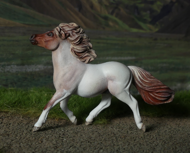
There were four Fell Ponies in my recent whole box, and while their most famous colour is undoubtedly black, which I already painted, they also come in the much more scarce grey, and the very very rare chestnut, which has only recently been allowed in the stud book. (It used to be regarded as rather a disappointment or embarrassment when two black Fells produced a chestnut foal - assumed to be a throwback to some accidental cross-breeding, or dodgy cover-up of a mare's true pedigree, and the chestnuts weren't allowed to be registered, shown, or bred from as pure Fell Ponies!)
But greys have always been acceptable, though not anywhere near as common they're not looked down on in the showing or breeding circles, and I think they're very handsome, here's a real one. So because I already did myself a black Fell, and have one of the chestnut in factory-finish paintwork, that left grey as the last colour to complete the set.

A while ago I did an experimental pencil-scribble dappled grey, and thought it was about time I used the same technique again. But rather than scribble dapples of equal darkness all over the white base coat, I decided to go for this faded-out look of a slightly older horse, where the dark colour is mostly left on the hindquarters and legs, while the front half has almost reached the white-grey stage.
It was quite tricky getting the pencil to go fainter, it seems to catch heavily on the paint surface rather than being able to control the shade of grey precisely like you would on paper, but I used a little bit of white and black paint over the top of the scribbles to help blend them without covering too thickly.

I've named him Harecroft Hailstorm, as we had such a lot of hail it was layering thick like snow on every flat surface and gathering in every hollow, just a couple of days after I painted him and was still trying to think of a name.
I like how he turned out, better than my first try with the pencil (I've got better at applying the marks like little individual lines rather than letting them loop too much), and I think the colour's really pretty and suits the mould well. He's kind of a half-way point between pencil and painting, and that's more effective than pencil alone.

The one down side with the pencil graphite is that it gets a kind of shiny, silvered effect where you lay lots of scribble down in layers, but I found that gently tapping it with my fingertip took the metallic bloom off without smudging or fingerprinting the colour.
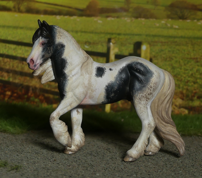
With the pencil dappling going so well once, I thought I'd get on with another custom idea I've had for a while, a really pale dappled grey draft horse, the French Boulonnais.

I've wanted to paint one of these for ages, they're always in the horse books with their pretty grey colour pointed out as a feature of the breed (their nickname being 'the white marble horse'), but hadn't had the right type of heavy-set draft mould in my body box til now.


Some before-and-after shots of the mould as it's sold, and my adjusted version with a loose mane and tail made from Milliput.
I just don't like it as the Clydesdale it's supposed to be, the build and conformation is all wrong (true typey Scottish Clydes are rather lanky, deliberately cow-hocked and close behind, and just generally look narrow and upright even when working-fit and strong; this chunk is wide, massively rounded, with a barrel chest and enormous bum, the back feet are far far apart, like the typical Continental-European draft breeds it's more muscle than legs!)


I've given him the name Harecroft Grandeur, though in French naming grammar it'd probably be Grandeur de Harecroft, and the name 'Harecroft' doesn't sound French in the slightest, so I'll just leave it the English way round!

Much like the Fell, I did his base coat of off white first, then the pencilling, with a little bit of black paint on the face and lower legs just to apply some more solid shading.
Next came a custom inspired by a small adventure!
On my way home from a day with my real horses, a very fast loose shetland pony shot across the main road in front of me and darted into a farmer's crop field, pursued by a panicking owner, and two random chaps from the house next door who'd seen him get away and were dashing after him too.
Of course, the pony was having a GREAT time, bombing about this huge field at speed in all directions, and cos there was nothing to stop him leaping out back onto the road in front of oncoming cars, I took on the double role of 'the one who stands in front of traffic' and 'the one who flails wildly at the pony to turn it away from the road every time it comes this way'.
While the people in the field tried to corner the shetland, which kept on evading them, a horsey family from a neighbouring house came out with a bucket of horse feed, some carrots, and a long rope, and joined in the catching game, while I carried on directing traffic, letting them go every time the pony was a safe distance away, and stopping them to a standstill or crawl whenever he was heading back toward the road and could've caused an accident.
The food trap didn't work, and the pony was so skittish and hyped up not even the owner could get near him by gentle sneaking or bribery, let alone the strangers he didn't trust, so in the end they changed tactics and worked as a pack to surround and slowly herd him the way they wanted him to go. There were a few false starts where he realised what was going on and shot between them at top speed bucking, but eventually they'd got him heading toward the corner of the field nearest his home.
I stopped the traffic both ways and stood there as a road block while the people in the field chased him briskly and determinedly across the road, across the bridge he'd escaped over, and back toward his yard. Then it was time for us all to hurry after him, one opened the yard gate while the rest of us blocked every escape route and shooed him in the right direction, and in he went - looking like he'd thoroughly enjoyed his adventure and gone home exactly when he'd had enough of exploring!
I've been passing this pony and his donkey friend in their field for years now - I live in one village, my ponies live in another, and I work in a third village just down the road from there, and they're on my bike route between all three places.
And I've always thought he was a really nice colour, which would be fun to paint one day. I'd kind of thought I'd just pinch the colour idea and put it on a totally different breed, like an American paint horse or a cob, but after being one small part of his rescue operation, I changed plan and put his colour on a shetland pony after all - so although it's not a true portrait as the placement of his patches is all made up, it's a custom inspired by the real pony.

He's just the G2 Shetland pony mould, unaltered - the real one was shorter-legged, more chunky, and of course still in winter fluff mode at this time of year so his patches blended into his white parts much more, but painting that fuzzy blurry look on smooth plastic wouldn't have looked right, this flat smooth sculpt is obviously intended to show the sleek summer coat (which Shetlands shed soooo slowly they have full shiny coats for about two weeks a year before the winter fuzz starts growing back, hah)


I think his name was either Thistles or Bristles or Brizzles, it was honestly too hard to hear what they were calling from halfway across a field on a windy day, so I'm calling my little one Thistles cos I think that's the nicest of all those possible overheard names!

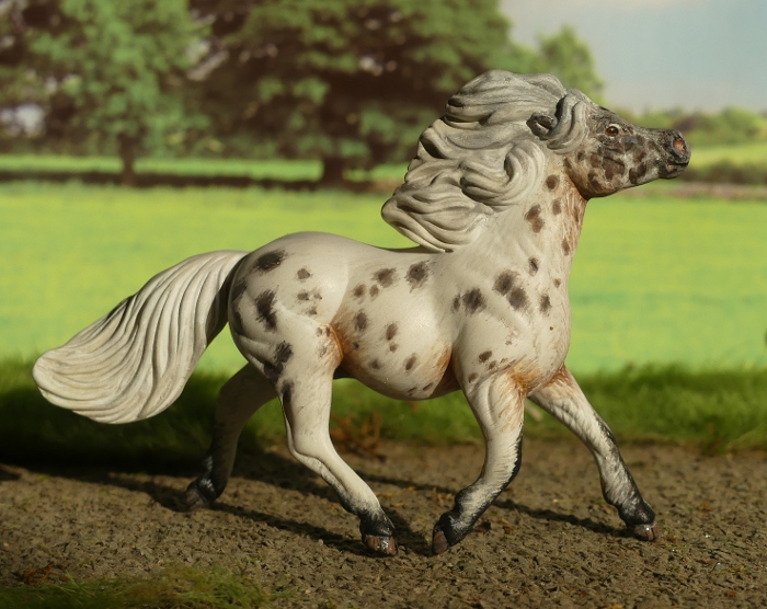
Here we have a LOT of spots! I tend to paint very roany blanket appaloosa patterns, so I decided it was time to do another full-on leopard spotted version for a change. He's a bay base, so the spots on his body are brown but the ones on his legs are black.

The spots didn't take too long to put on, each one was painted thickly enough that it took just one coat for full coverage, then a light diluted layer over the top for the halo effect. Normally I don't like applying paint thickly at all, but on an appaloosa it doesn't matter that the spots aren't perfectly smooth - in real life the spots can be felt when you run your hand across the coat, cos they stand up a bit thicker and more solid than the white parts!
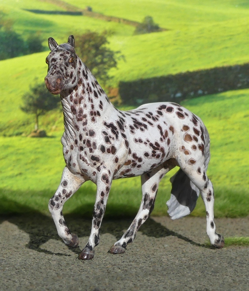

The mould was sculpted as a Quarter horse, so it's a bit more chunky in the bum and full-tailed than a foundation type Appaloosa horse, but the majority of show ring Appaloosas are so stock-type these days, and allowed to register as purebred with a lot of QH blood in them. So it's fine for models to echo those real life trends, and I can easily get away with allocating Appaloosa for a sculpt which doesn't look like the old-fashioned true typey examples.
Over the years I've done quite a few racehorse portraits, even since beginning this blog I've introduced four or five new racing stars in miniature, but almost all of them have been jumps horses.
The reason so often given for why UK and Irish fans enjoy jumps racing more is the horses we get to know and love - coming back year after year, for a career of six, seven, eight seasons, in contrast to the flat racing stars, which might only race for one summer, possibly two, before being whisked off to stud.
Where a great chaser or hurders' expertise is in it's experience, and a lasting reputation comes with accumulating a lot of wins over multiple seasons, flat racers aren't usually asked to come back into training again and again. Their prime comes early, and often their careers are so very short, which makes it frankly quite hard to get attached to all these beautiful horses which show up with awesome speed and strength for a few days spread over their immature years, then are never seen again.
So I think it's no co-incidence that the first flat racer I painted was Enable, a hugely talented mare and sympathetically trained for a long career, who raced on successfully for many seasons before finally retiring to her new life as a mum to the next generation.
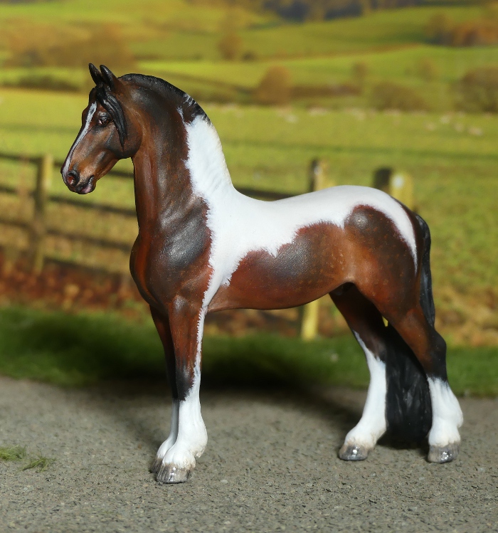
Now, the same trainer has an eight-year-old stallion, Stradivarius, who's also still racing and winning, long after the average flat horse has disappeared from the public eye. Whether the longevity is all in the kinder training, or the combined attitude of connections to manage the horses with a longer career in mind, I don't know - but it's been lovely to see him continue into adulthood as a magnificent horse at the top of his game.
Here's a photo of the real Stradivarius which shows his bright colour nicely, but what really made me decide I had to paint his portrait was this shot, taken after one of his big wins. His pose is so much like one of Breyer's recent Stablemate sculpts!

And here's the mini version - see what I mean about the pose! It's a very narrow and wiry-muscular mould, which has the look of an old-fashioned hunter or a very fit lean racehorse, I'm really glad Breyer have given us this option as their Thoroughbreds are often fairly stocky and rounded and small-looking somehow.


Stradivarius also has the advantage of being a really eye-catching colour, with his bright shade of chestnut emphasised by so much white, it was fun copying his markings for all four legs and the narrow stripe on his face.


For once I didn't have to resculpt the mane for this portrait, thankfully Stradivarius always races with it loose and unplaited, just trimmed for tidiness, and that's the same way the mould was styled, too. He makes a really nice addition to my racehorse collection.
The final one for this month's batch isn't a portrait as such, but from a reference photo of this anonymous horse which always comes up in my Google image searches for appaloosa pattern ideas and information - she too reminds me of a Stablemates mould, and after I'd seen her so many times, I just couldn't get the idea of that colour and pattern on that mould out of my mind!

So here she is! I made her a mirror image of the real one, since my model photographs better from this side, but other than that I tried to get the colour, shading, roaning, and spotting to be as close as I could to the real horse which inspired her.


As there's no name or details attached to the original photos I picked one at random, Chickadee, as it's such an adorable name for a bird, and from the same country as my little horse would be. She looks very kind and gentle and steady-tempered, the sort of horse which would be very easy to look after and a good influence on the rest of the herd!

I've found several references to appaloosa spotting patterns occurring in the Choctaw Pony breed, which is what I've used for my others on this mould so far, even though there's no modern photo examples, only older black and white ones, so it's possible those genes have died out. It might be better to file her as a foundation-type Appaloosa for her colouring, but as the vast majority of my Appaloosa models - actually Appaloosa models in general - are now spotted paintjobs on modern stock-type horses, she wouldn't really fit in there either, so I'm more inclined to keep her as part of my small herd of true Native American heritage.

Her other side, which isn't quite as nice - I did this side first to figure out the strange new smeary-blotchy-roaned paint techniques by trial and error before going over to her more important display side!
That's it for this month, but I'm really happy with them all. Which do you like best?