Monday 28 October 2019

Horatio

Here's my second really exciting parcel to post about - a horse I've wanted in Julip form for about eight years - meet Horatio!


Horatio is a fictional 1910s hunting horse from my own writing and illustration. He can be a bit of a character, and a right handful to handle on the ground, but he has a spectacular enthusiastic jump, and is a very keen and sure-footed horse cross country in just about any conditions. Here's a few of the pictures he's been in over the years...


I've been drawing him since 2011 and always thought I'd need a Julip eventually, but never got round to ordering one as a portrait. I'd been kind of hoping I might be able to pick up a bay of the right colour on the TB mould as a spare, then adjust the markings myself, if I waited long enough and was lucky enough, but it never did happen. 
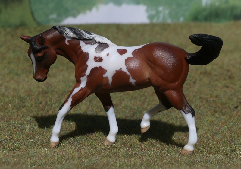
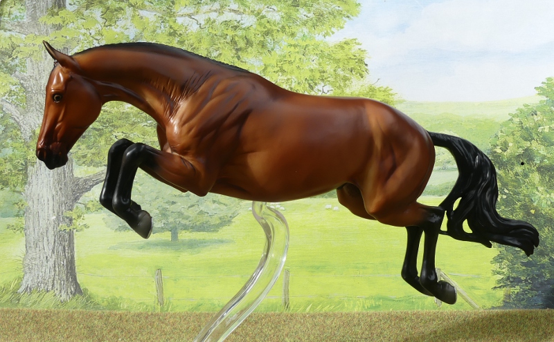
Last week, this stunner of a hunter popped up second hand on ebay, and I immediately forgot all about the preferred TB mould because this one had the makings of the perfect Horatio. 
He had a very tiny white star, and no socks, which meant I could easily add on the right markings. He also had a full length tail, and I admit it was so lovely I didn't have the heart to chop it off for the historically accurate bobbed tail of the era - instead I carefully popped out his whole tail unharmed, and made him this short one with some spare black mohair. The original tail is safe in a plastic bag, and because I didn't use any glue in attaching this one, they can be swapped at will - if he does any showing, he can wear his long tail for the breed classes!


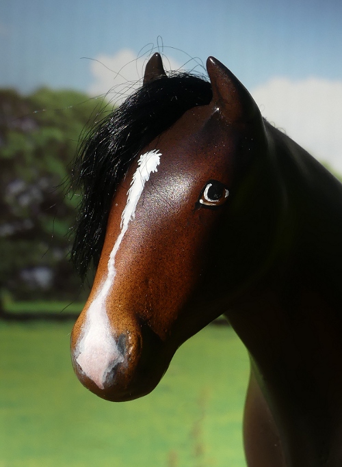
Here's his distinctive kinked stripe with a pink nose, carefully copied from his drawn version but trying to keep to a 'Julippy' style, so he looks as if he could've been a factory-finish order and not look out of place with the rest of my herd.


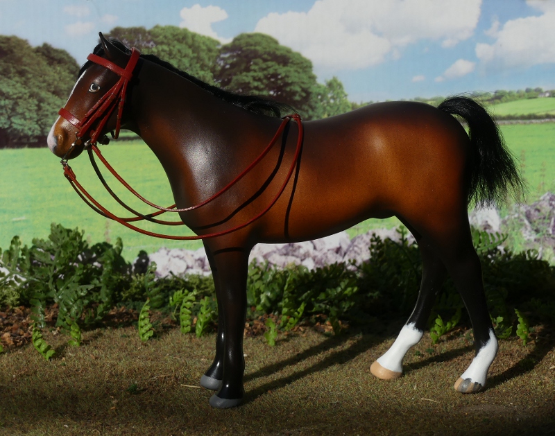
Another side-on view. The first few pictures of Horatio had a smattering of dapples, but at some point I accidentally forgot this while colouring him, and for the last few years (I draw him going out on the Boxing Day Hunt every winter) he hasn't had any! This may've started out as a mistake in my artwork, but at least it means the model's accurate, and I'm not wishing I'd waited for a dapply one. I think the hunter mould genuinely does suit him better than the thoroughbred I'd had in mind, too, it's much more chunky and rounded, where the TB tends toward being lean and leggy and very narrow in the body.


I made him a headcollar with this really nice antiqued leather I got on ebay, it's given an aged colour treatment, smoothed edges, and with a bit of bending between your fingers it softens up beautifully too. It's too wide for bridle leather (and you can't cut it down narrow because you'd lose the colour and roundness of those antiqued edges) but ideal for headcollars, and I'll be able to use it for Horatio's rug and surcingle buckles, too, as he's from the era where those were leather straps, not modern nylon webbing. And yes, in his day, headcollars did have browbands!


And the creativity didn't stop at the halter, in the wet-weather wait between his arrival and getting his pictures taken, I also made him a bridle.


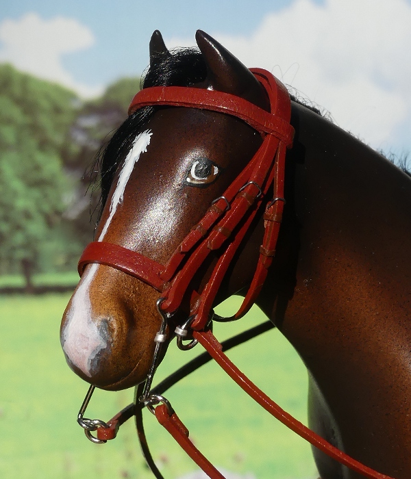
Here's a closeup, again this was leather lace from ebay, and it's a good flat, crisp quality to work with, though their 'tan' turned out to be quite red! Unlike the antique brown, this lace can be cut narrower for the thinner straps; here the browband, noseband, and headpiece are the original 3mm width, while the rest of the bridle parts had to be sliced in two lengthways with a scalpel and ruler, then the edges painted in to match. The bits are made of paperclips bent to shape, with a little blob of tinfoil rolled round for the ends of the mouthpieces.


Harpley Horatio - I'm delighted to have added him to my herd at long last, he's been on my wish-list for such a long time it's hugely satisfying to look up and see him on my mantelpiece!

The Copperfox Conga gets Longer and Longer

First of two very exciting parcels to post about today, and as the title says, my Copperfox Welsh Cob conga line has lengthened a little bit lately!


The two gorgeous new boys actually arrived last week, but some truly hideous weather stopped me taking their pictures til today. And because my garden is so shaded now the sun's slower in the sky, I still had to chase the only tiny patch of un-dappled light across the lawn, and halfway into the flowerbed and bushes, just to get any pictures at all!


Here we have Sovereign, the regular run of 250 from 2016. I've had my eye on a few of these since I set my sights on collecting Copperfox cobs, but each one sold for £100 or more, finally I was able to get one for much less, and I'm so pleased - isn't he handsome!


I've named him Harecroft Welsh Gold - at last I've hit on a naming scheme for these cobs : rather than words in Welsh (which I find way too difficult to figure out the right pronunciation for!), I'm calling each one 'Welsh something', the name taken from whatever he was officially released as. Celtic Warrior becomes Harecroft Welsh Warrior, and Prince Cavalier is Harecroft Welsh Prince.


A really striking colour with his true-white mane and tail to match his socks - the 'fact' that a palomino has to have white hair is one of those lines horse books always seem to make note of, but in real life and also in model form, they're very often flaxen or blonde-haired instead, so it's interesting to see one who really does fit that old much-repeated rule. He's also got beautiful subtle dappling, the picture doesn't really pick it up so well as the eye.

I don't know what it is about these Copperfox cobs, but they do seem to like bringing friends along for the journey - he came with this travelling companion, from the same seller...


This one's Percival, also one of 250 from 2016, and another really beautiful colour I was thrilled to add to my collection. Again, his dappling barely shows up in the photographs, it's so faint and soft, but this is a very good thing when you think back to the rather polka-dot spots the first batch came out with way back at the launch; the delicate dappling of the later runs shows how the factory did get things very right in the end!


I've given him the name Harecroft Welsh Knight (Sir Percival was one of King Arthur's loyal knights). 


His pictures aren't the best for lighting and bad shadows, but by this point I was standing with one foot on the garden and the other on the drain outside the back of the house just to be able to reach a shot from where my chair-of-scenery set-up had ended up!

This leaves me with three to find for my Welsh Cob conga - Tiger Woods in black, Rupert in chestnut, and Gibson in dark dappled grey. I'm not after the original Kickstarter versions or rarities, I don't do glossies, and I'm not going to get my hopes up too high that any future releases will be on the affordable side of pretty horses just to look at and not buy, but finding the three colours to complete my regular run set is a target I can definitely aim for.


Monday 14 October 2019

Tales from the Body Box - Icelandics

One of my favourite recent Stablemate moulds is the Icelandic horse, a breed I've been interested in for decades - even before the internet, their unusual gaits and colours fascinated me in the pages of my horse breed books.
I happily welcomed into my collection the Trad scale Svali frá Tjörn (who I thought was a bay, but in asking google how to type his name with the right little accents on the letters, I've discovered he's really a dark buckskin!), and later Elska the pale dappled grey on the same mould.
But the arrival of an SM-scale counterpart opens up another opportunity - not only are the releases going to be cheaper to collect, but they're also cheap enough and small enough to buy a few spare bodies and paint up some customs!

First, here's my small OF conga - Eirikke the grey 2018 regular run single, Hrimfaxi the flaxen chestnut from the 2015 mystery foal set, and Heimdallr from 2018's glow-in-the-dark set.


Last month at Burghley, I picked up a couple of duplicates of the plain grey for my body box, but they didn't spent long languishing in it, and both have already been given their new coats of paint!


The palomino was inspired by a pony in one of those free advertising-stuff horsey magazines you find in tack and feed shops. I always pick one up even though I don't really buy much for my real horses (they live out, their rugs are all second hand, and I don't buy riding gear because I don't ride!), so the advertising may not work on me but they're always handy as potential painting references for horse colours. This one provided a lovely dusty greyish shade of palomino I hadn't ever tried before, so out came the paints and here's the result!


Copying the photo also meant the shading didn't go in my usual pattern - I tend toward having the belly paler, especially behind the elbows, with the shoulder and neck darker, where this one's almost the opposite with the deepest golden tones on the girth area but much paler shading to the shoulder and neck. I think that's why it's so good to work from a photo now and then, rather than falling into a basic template of 'this is how I paint a horse' - trying to match a picture forces you out of the habits you've slipped into.
I gave him different socks and face markings than the reference, just because it's not a famous horse but someone's pet pony; it'd be a bit weird to make portraits of ones which aren't in the public eye or our own personal friends!


I've named him Falhófnir, meaning a horse with white feet - Icelandics are very often named by a physical trait, with names having literal meanings like 'brown head', 'stripe on face', or 'long mane'.


For my second Icelandic, I decided to go for one of the more obscure colours that are found in this breed, this little stallion is a smoky black. The smoky gene is a dilution factor, acting on base colours, a bit like the better known cream or dun. Actually, I was a bit concerned he was looking more like a dun during painting, but there's no dorsal stripe or leg barring, and the mane and tail fade out to brown and blond toward the tips, so hopefully he doesn't look overly grulla-like. 


He did look good plain, but even as I was buying the bodies I'd wanted one to be a pinto, so I decided to go for a minimal flash of white and a small star, snip and single sock.


I've called him Gullinbursti (the name of a mythical boar ridden by Freyr in the Norse sagas), which is just a fantastic-sounding word to an English-speaking ear!

My main thought on completing them : I wish I had some more of these! I've already had a look but the single one seems to be out of stock everywhere, so I have to wait before I can paint up any more colours, but I'll definitely be adding to this conga at some point.

Saturday 12 October 2019

Tales from the Body Box - five pintos

I'm trying to catch up a little bit on the painted SMs which seem to be scattered in little groups all round my house - I've got no room left in the "custom mini" section of my shelves so they're currently tucked between Trad scale hooves, hanging out with Julip dogs and bunnies, decorating the mantelpiece and the top of the gas fire, and even balancing on piles of books! I'm going to have to do something about this to give the herd a proper home, but for now, I'll just make do with introducing them here and getting them onto the CM SM page of my website, so at least I'll feel like I've done something with the poor things!

First, we have a little group of piebalds and skewbalds - I didn't mean to paint so many in a row and I have done some solid colours since, honest!


The big bargain box of last year's mystery Stablemates brought with it several moulds I hadn't painted before, including this, my first ever custom of the Tennessee Walking Horse breed. A nice mould to paint, a little chunky in the legs but most of the moulds from this batch are - I've always wondered if Breyer asked for them to be made that way as they'd be more robust for children's play than the thinner legs of the G1 and G2 moulds. 
The hardest parts to paint were the braids in mane and forelock, unlike the ASB's smooth braids, these have the plait detail pressed in, so you have to paint the colours exactly onto the marked out sections - very fiddly!


Her markings went a little bit blurry on this side as I had slightly too much paint on the brush when giving them a light dusting to soften the edges, but so many real life pintos have mottled or roany parts to their patches, I think I've got away with it!


I've named this one Stormy Autumn, and really love how she turned out. Bay is probably my favourite colour to paint, and the white markings make her that little bit more flashy and eye-catching.

Next up, my first on the new Cob. I've always had mixed feelings about this mould - on one hand it is very sweet, with that ponyish look and cute friendly face, and it's always nice to have a model representing the masses of random unknown-partbreds, the heinz57s, the riding school horses and the family pets. Model ranges usually focus on the high performance sport and show horses, and the specific breeds, which fill the catalogue pages and the collection shelves, so it's a change when we get a model of the kind of horse we might've grown up with, or learnt to ride on, or see in a field on the way to work. 

And it's even better when that's a cob. 
But... it's just not a very good example of a fully grown cob! 


Take another look, and tell me that's not a youngster - the neck's very slim with not much topline or muscle, the shoulders are narrow and pinched, the quarters also look angular rather than rounded, and most tellingly, the withers are notably lower than the rump - you get a general impression that it's got some growing to do, a gelding colt which hasn't levelled out and matured, or built up muscle in all the right places. As that, it's fine. So I'm just going to imagine mine as being youngsters! 
I painted this one up with less colour than usual; I find this hard because to get the white covering large areas well it has to go on first, then I'm left trying to get the colour bits neat and smooth within the patch shapes, it's always a difficulty and not always a success - there's usually some colour which escapes and then I try to paint over it but it spreads around and tints the entire side of the horse faintly pink/orange. This one just about escaped the worst of that cos I deliberately let his patches be a bit roany and mixed up with mapping and smudgeyness, but to be honest it's not as nice as I'd hoped.


A visit to a quarter horse stud a couple of years ago gave me my first look at western riding in person, and a new appreciation of the models which represent the particular movements found only in the working and showring western disciplines. Cutting or sliding stop poses make sense now, rather than seeming quite so outlandish and odd, and I think I enjoy my few western models a little bit more, now, than I did before. Which is good, cos my body box came with three of these to paint!


I have trouble finding a sandy-colour paint to use for duns, so this time I gave in and mixed my own : part golden yellow, part mushroomy grey-brown, and part beige, with more and more of the beige paint added to the mix to shade the pale areas. The white markings were added afterwards, with several layers of diluted paint so they'd go on smoothly with a small brush, as I hadn't done an overo for ages and this seemed a good breed to suit it.


Another pinto, another technique! This body was from the second series of blind bag mystery horses, and because the OF paintjob left so much bare white plastic exposed, I decided I could do something experimental with that, and use masking on the parts which were already white. 
Instead of masking tape, which doesn't allow for over-fiddly shapes, I put on a layer of PVA glue with the mysterious pointy thing that comes in the packs of brushes I buy (it's a fine metal tip on a paintbrush handle, I've no idea what purpose they have in nail art but that's what my mini brushes are sold for so I'm guessing nail fans have a use for them!), making up the markings as I went along but being careful to keep all the glue on the parts which were white. 
Once it's dry, just paint the horse bay, then peel off the glue and you're left with a neat little tobiano pinto pattern! 
I put a few streaks into his mane, finished off his face and hooves, and left it at that. On some previous glue-masked paintjobs, I've gone along and added some feathering and mapping to the edges of the colour, but those were the basecoated white bodies, on this one I thought it might stand out weirdly against the bare plastic so I've left the patches sharp-edged.


Last one for now, another TWH, in piebald this time. Another one where the white was done first, but at least black is easier to apply inside the patch shapes, because it doesn't have to be shaded all over the horse, so there's no layering of different colours blended and smudged and mixed but trying to keep within the outlines - black is black and a couple of coats did the trick!


She's got one of those face markings with a patch of colour inside it, and striped hooves to match her ermine spots, but no name yet, I'm still thinking!

Friday 4 October 2019

Breyer Mid-year release : Voyeur

Breyer's mid-year announcements always have the potential to be a little bit exciting for OF collectors, it's a bonus chance to pick out new horses without having to wait all the way round to the following spring/summer.
I don't always like many from the mid year batch (they tend to do more decorators then, something I'm just not into even though I can appreciate the artistry of it all : the colour effects they're coming up with seem to get more inventive and complex every year!), but usually there's one or two which I think I might buy, and some years there's a must-have where I end up really impatient for the shipment to arrive over here so I can get my hands on one.
This year's wow-I-want-it horse was Voyeur, the jumping warmblood, so I put in a pre-order just incase demand for this exciting new mould overtook supply and the UK struggled to get enough to go around!


He arrived today, I've named him Harecroft Hawkwings (a flight themed name seemed essential for this one!), and I'm pleased to confirm this model is every bit as wow in person as I was imagining!
As always, click any photo to see it larger; I keep them small to fit the blog layout neatly but they're all bigger than they look here!


It's so nice that the regular run line has been treated to the Bristol mould so quickly - just one year after it first appeared. Because lately, Breyer've been making us common regular-run buyers wait what feels like aaaaages for the new sculpts to come around on general release : usually the moulds take several years to filter down from the exclusive models of the Premier Collection/Collector's Club, to Breyerfest and Web/Store Specials, and then finally into regular run colours. I'm not quite sure why this happens, on the most basic level they'd probably make more money from shifting loads of units by dropping something fantastic and brand new into the regular run line, than from the lucky and dedicated few who can afford and justify the high prices for the rare models, but perhaps they're going for the hype of the mould being rare to start with, to make collectors want it more? Or they suspected that not many people would join the clubs and pay the prices if they didn't promise them first bite at the exciting new moulds? Either way, it seems that the days of first edition releases directly into the mass market are sadly gone, and we just count ourselves lucky if the regular runs come along within a year or two!


So, what do we think of the Bristol mould, now it's here? Personally, I love it! There's a real feeling of quality and attention to detail in the sculpting, the kind of fine sharp precision which is rare in plastic - in fact the entire thing really reminds me of the sort of thing you only ever saw in artist resins, from the dynamic pose, to the anatomical accuracy, and the superb level of surface finish detailing too (this boy has whisker bumps, and creases where his ears are pricked far forward). One of the best in the entire Traditional range!


The paintjob is perhaps a little plain, but they chose a real horse with no white markings or dappling to copy, so he was always going to be a basic bay colour. He is a lighter shade than average, though, and they have made a decent job with his shading, mostly by careful spraying to add the paint thinly or more heavily, so he's noticeably paler at the stifles and behind the elbows, with some darker brown tones in the deep hollows of his hindquarters, and above his shoulders too.


His eyes stand out as unusually pale - almost the amber colour of some dilute breeds (my sooty palomino has amber eyes, though interestingly they're down as blue on her passport which was filled in when she was a foal!). I've tried googling the real Voyeur to see if he's known for a light eye colour, but can't really see anything out of the ordinary in photos, so maybe this is just Breyer picking a paler paint than they usually use for a brown eye!


The only down side to jumping models is that I never really know what to do with them for photos!
They need a jump for it to make logical sense for the horse to be in a jumping pose, and then you think on it a bit more and realise, ah, actually, they need a minimum of a bridle (without reins) or halter too, because you can excuse the lack of saddle and rider by saying it's loose schooling, a photo like all those sales ads showing off the jumping scope of a potential competition horse absolutely skying a fence set up in an indoor school!
But I've never done performance set-ups outside of Julip showing, so I don't have any Trad jumps - I think I might have to make one, now I've gone and got this horse who needs a decent sensible photo where he isn't jumping thin air!

Finally, here he is with two other Trad jumping moulds, for comparison purposes :


The top one is the Newsworthy jumping pony, so I expected him to be substantially bigger than that, but having laid out all three I find he also dwarfs the Peter Stone jumping horse (excuse him being a bit of a state, he's from my body box!).
I expect he'll be really popular with performance showing, the best thing in plastic - the older Breyer jumping horse isn't that great nowadays, the Stone one is basic in style and not exactly common, and the Newsworthy is nice but a pony when more people would want set-ups featuring full size horses and adult riders.
He's really tack-friendly round the head and neck, the only possible issue I can see is his stand being in the way of the stud-guard girths which are so common in the real horse world, but as most jumping models have their support stand under the belly somewhere, I imagine that's something the showing people have already come across!

So has anyone else been impatient enough to pre-order and get their hands on the very first batch to land on British soil? Or is he on your wishlist? Let me know your opinion in the comments, do!