Showing posts with label Breyer CM. Show all posts

Saturday, 31 December 2022

Tales from the Body Box - Two Stablemates, two CollectAs

I'm trying to catch up on posting, so that all my 2022 customs have a '22 date on their blog posts! Here's the last few customs I did a while ago - as you can tell from the background being open country, they had their photoshoot the same day as Red Queen.

First, two racehorse portraits. I don't always paint the winners of the biggest races, but rather my favourites - the horses I like for their character, their looks, their performances - any where I've especially enjoyed following their careers.


This is Frodon, a tough and sparky little horse (his regular jockey describes him as 'such a dude' cos she loves his cool fun attitude so much) who's defied his size and been the underdog who out-performed all predictions, winning some of the most prestigious races in the country with his front-running speed and stamina.

His name is apparently the name for Frodo in the French translation of The Lord of the Rings, though I've no idea why it needed alteration as it's already not a real name in the author's native English either!

He's a good colour to paint, with just enough white markings to make it easy to capture the likeness - when they're plain bay or chestnut it can be harder to make the model look like the real horse, but a few socks and a face marking or two and it's much better! He varies in colour through the year and depending on how recently his coat has been clipped, but here's a fairly similar picture to how I've painted mine.

Potters Corner is another long distance steeplechase horse, another tough stayer who relishes the winter mud conditions and did great things for a small yard, for a trainer with not many horses he was the first stand-out star. He won the Welsh National, but never made the big one - he won the 'virtual' Grand National the year it didn't happen due to Covid lockdown, when a computer programme worked out the most likely winner based on form, stamina, suitability for the track, and previous jumping ability. He's retired now, so he never will get a real run in the race, but he's been given to the stable hand who looked after him and promised a home for life with 'lots of attention and cuddles', which is pretty adorable in a world where horses can easily be passed on and forgotten when they stop winning.

Another interesting colour to paint, he's officially a bay but with a lot of light brown shades in his coat, including the mane and tail which would usually be pure black. You can see a nice picture of him here. And again, I like that he's got plenty of white on, so it's given me plenty to match to the reference photos.

The next two are CollectA customs, but the first also has a racing link. You might recognise him if you're a Breyer collector, as they've also made a portrait of the same horse.

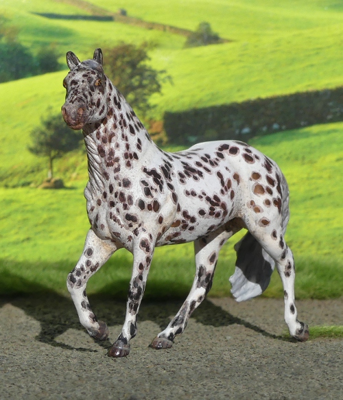
Harley is a spotted draft horse who works on the racetrack where this year's Breeders Cup racing was held. His role is 'ponying', which is accompanying racehorses down to the start, and back again afterwards - we don't have horses doing this job at all in the UK (it's legally allowed in our rules, but you only ever see it in practise when US horses have been flown over for the big meetings - none of our British or European trainers seem to bother!)

For the last couple of years, the Breeders Cup race meeting has been covered by British tv, so we've got the chance to see Harley in action for the first time. He really is a striking-looking animal, huge and sturdy and with such an eye-catching colour, I started wondering if I should buy his official Breyer portrait release after all.

But I'm not keen on the mould - I love the pose, but not the sculpt style - and no matter how good the colour was, or how much I liked the real horse, I didn't think I'd take to the model. So I decided to paint my own, and with no Stablemate mould really looking like him, I went up a scale and looked through the CollectA moulds to choose the one which was the best match.


This is the 'American Cream Draft', but no longer cream coloured! He was a fun one to paint, with plenty of references out there from all angles cos he spends so much time in the public eye. There's plenty of pictures and a full biography of him here.

A couple more pictures, including the other side, cos I often neglect the 'wrong' side when a mould looks better from a certain direction.


His black bits aren't quite jet black, which made him much more interesting to paint - his nose is especially shaded. And he has a big spotted bottom!

And finally, one more CollectA custom, the Yakut horse.

When this model was first announced, I remember saying it's a shame he's not dun, as that's such a distinctive colour for the breed as well as being a bit more interesting than plain grey - and I've seen several other collectors saying the same thing since. Rather than wait for them to re-release it in dun (now they are reissuing moulds in alternate colours, that's at least a possibility to hope for!), I decided to buy a duplicate and make my own dun one.

He's bay dun, with leg barring to help make it clear that he's intended as a dun not a light bay. I'd love to do some different shades as well, maybe a paler bay or buckskin dun, a black dun, and a greying-out dun which would be even paler, I'd happily have a whole herd of these little things!

He looks nice against the blue sky! I've named him Ärčimnǟx, which means strong and energetic in the Yakut language - most of their horses are named with descriptive terms about their colours or characters, and the word for 'dun' was too hard for me to read or say so I picked something else!


Weirdly the other side of him looks more orange in photos, but it must just be the angle of the light cos I used the same pots of paint throughout! I love the attitude of this sculpt, and I think he looks even more expressive with his features painted in more detail. And he does look good in dun, so we were right!

One last shot, it seemed a shame not to make the most of the frosty ground for this horse breed from a very cold climate, here's a bit of local icy road standing in for Siberia.

Sunday, 23 October 2022

Tales from the Body Box - An autumn assortment

Let me start by explaining I haven't been suddenly incredibly productive over a couple of days and created all these customs in one big batch - it's more a case of getting myself ridiculously left behind in compiling blog posts, so there was an ever-growing waiting list of painted and photographed horses ready to be shown here, and now I'm making them all share one big post to catch up!

The first one, you could say, came to me in a dream!
Normally, any model-related dreams seem to be about finding models for sale somewhere and either not being able to buy them, not being able to carry as many as I want to take home, or somehow managing to go through with the purchase then being mildly disappointed to wake up and realise I haven't added those ones to my collection after all, hahah! But this time, the dream was about painting : I picked out a pearly blue unicorn on the Breyer Stablemate walking thoroughbred, which was exactly the one I really did have in my body box, and painted it to match this reference photo. And in my dream, it turned out really, really nicely, just like the picture, a very striking little horse with super-flashy markings.
So I decided this meant I needed to make it happen in real life!
I found a photo of the same horse from the other side, then picked out the Stablemate from the body box - a very tricky pattern to match, eeek!


The mould looks much better without the unicorn horn, and it's not too bad for the Akhal-Teke breed either. Despite being sculpted as a Thoroughbred, it's very much the extreme end of the long-and-lean variety (many TBs these days are either much more compact and muscular as sprint distances are most popular, or else more chunky and solid-looking if they're jumps-bred to be tough and sound), so it gets away with being re-purposed as a 'Teke without much work. All I did was carve off the mane and forelock, and take a bit of the thickness out of the tail so it's more tapered toward the end.


Something about his attitude also helps capture the Akhal-Teke breed, I've added in a line of eye-white like he's giving us a bit of a wild look. But none of my lush leafy green backdrops look remotely like the middle-eastern homelands of this breed, so rather than post him in front of something inappropriately British-looking I've used a plain fence which could be anywhere, hah!


Unfortunately I haven't been able to find out the name of the real horse which inspired him, so I've picked a name myself and called him Menekli, which means 'spotted' or 'colourful' depending on which Turkmen translator I run it through - either way is very fitting for his wild splashy pattern!

I think I'd like to paint more of this mould in Akhal-Teke coat colours, there's nothing else in the Stablemate range which would be a better fit, and I doubt there will be unless they ever decide to shrink down the large scale Altynai/Adamek sculpt to mini size!
So I'm plotting this one in perlino, and golden palomino, and metallic sooty buckskin, whenever I eventually get my hands on more, of course! At the moment they're only available as unicorns in painting kits, in horse/unicorn family sets, or annoyingly in those lucky-dip blind bags where you've far more chance of getting a different mould, so it's a case of fingers crossed for a normal 'single' release at some point soon, so they're easier to stock up on for the body box!


Next, a Stablemate 'Prince charming' I fished out of the body box and gave the colour I'd had in mind ever since I ordered it - a second Orlov Trotter for my herd.

The first one I painted was a very dark dappled grey, but in researching her I'd seen quite a lot of photos showing older horses, a few years further along in the greying process, with the remains of dapples shading into dark legs. And they looked very striking, so I decided back then that next time I got one of this mould (known as Prince Charming, but actually a mare) that's what it would be set aside for.


I used an off-white base coat, lightly shaded just to give the hints of dark skin showing through to capture that typical faint greyishness which remains even in a white horse, then added all the dappling and leg shading using pencil.
I've tried paint over pencilled dappled to shade the legs before, and it seems to somehow not take properly, like the pencil graphite layer is water-repellent and argues with my water-based paints, so this time I just went with lots and lots of determined scribbling to fill in the legs with the pencil too.
The reason she has white socks on all four feet is so I didn't have to scribble all the way down, it's hard to get proper coverage in the tendon grooves so I image the tricky bits behind the ankle joints would be even more inaccessible!

I've named her Strekoza, which means dragonfly, because my first one is Babochka, or butterfly. If I ever paint up any more of this beed, I'm going to be googling the words for bee or hoverfly or moth, to keep the theme going!

The Django mould was sculpted as a Friesian, in fact it's alternative name is the Standing Friesian. But Breyer have been selling him in lots of incorrect colours for that breed - so far we've had just one regular run (if you can call that dratted blind bag system a 'regular' run when you can't decide which model you're getting), a spotted dun. There's also been a pinto and a palomino as club-member-only exclusives, a Breyerfest grey, a bay only sold in US Walmart shops, and a couple of clear/metallic decorator colours.
So we've had the mould since 2016, and they still haven't released it in black?!


I got fed up waiting for them to get round it, and painted my own black one!


Black might sound like a really easy colour to paint, and it's certainly easier than fiddly colours like roany appaloosas or intricate pintos, but it's getting some sort of depth and warmth to it which is the tricky part. I used some chocolate brown in the mix for the belly and flanks, and a hint of beigey grey dotted into the black paint to give the face some shading where the skin would show.
The main body of the horse is polished with a bit of fleece to give the paint finish a natural shine, then the mane and tail I gave a coat of varnish followed by a very thin wash of dilute black just to take the edge off the gloss and soften it slightly. The hooves have two coats of clear nail varnish to capture the look of blacked and oiled hooves, the traditional turnout fashion for Friesians.


This angle shows the brilliant upright alert posture, so typical of the breed. I do like Breyer's trotting Friesian mould, but I prefer this one - the proportions and pose are perfect, the head is more detailed, and the sculpting style is more my taste too.
I've named him Adarik, cos my G2 Friesian is Alaric and matching names do amuse me!

Next, my first ever custom on this mould, and my first ever custom of this breed...


Introducing Harecroft Shakespeare, the Cleveland Bay.
This mould was sculpted as an Irish Draft (again, we haven't had a regular run in any right colour for the breed - only a spotted one!) but ever since it was first announced, I thought it would be perfect for a Cleveland Bay. The roman nose, the chunky legs, the big deep rounded body, and the kind placid look of him.
Bay is a fairly straightforward colour to paint, I went for a dark shade with less of the pale highlights than I'd usually put on, this one has more reddish undertones but all toned down with plenty of black. The only issue I had was the spots from the factory paintwork - being slightly thick they showed through my experimental first layer of paint, so I had to scratch them all off with a scalpel blade and start again on a smoothed surface!


At some point I might do another Cleveland in a lighter bay, they do come in many varied shades despite being a single-colour breed, but this was the colour of the one I rode in lessons for a little while, so it's how I always think of them.
She was an ex hunter and rather difficult for a riding school, leapt everything as though it was a five foot wide hedge, which took some getting used to, as a lightweight kid who'd only ever jumped low heights with ponies and cobs! I also took her to a gymkhana once and got scolded for 'bombing about on that great big horse' cos I had very little control and she was enjoying herself a bit too much. But we came home with a string of five rosettes (which I still have, with her name written on the back), so we did ok despite me being little more than a passenger!
I credit many different horses with teaching me different aspects of horsemanship and riding over the years - she was the one who taught me the art of pretending I really did want to go that fast!


Another first for me, though not a new mould it's the first time I've painted one as an Altér Real, a strain developed and preserved at the Portuguese royal stud. They're a little bit deeper in the neck and chest than the usual modern Lusitano's build, due to crossing with Andalusian and Carthusian stallions to bring the breed back to it's old type after they'd been spoilt with too much TB and Arabian crossing during Napoleon's era. So their typical shape is rather like a halfway point between the Lusitano and Andalusian, meaning I can use an Andalusian sculpt to represent one.
They're a breed which is almost entirely bay in colour, but through various shades from deep dark-chocolate brown right through to a gingery tan colour, always with black points. I picked a shade I don't paint very often, a medium bright bay, with just a little bit of dappling and shading to give him some depth. 


I'm not sure which photo I like best as his main shot! I was really pleased I'd got a background of the right country, most of them are just fields or fenced paddocks with some green countryside behind, but when I searched through the stack of pictures I found this one, which shows the landscape around the stud where they're bred.
I've picked a name from a real pedigree, he's called Maravilha (but that's Harecroft Maravilha AR, to give him his full title with my show prefix and his breed suffix).
 

Bright Lights, my first custom on the Missouri Fox Trotter mould. It's not a breed I know a great deal about, this is only my third model of one (after the CollectA chestnut mare, and the grey on this Stablemates mould). I looked up colours and while solid coats are the most common, there was also a really lovely example of a purebred in this bay pinto with quite subtle pinto patterning - just very high socks, a flash of white on the neck, and a mostly white tail.


It's always fun painting a new mould for the first time, and this one has only been available in the 70th Anniversary blind bags, so I've not been able to buy them by choice, just by random luck. I'm kind of hoping a lot of these more recent moulds will make it to the next batch of 12 single horses sold on cards so you can see what you're getting. But knowing Breyer they'll probably just do more unicorns and blind bags (or blind bags that contain unicorns, haha!)


Yet another first, this time my first ever Pony of the Americas custom, though the sculpt is one I've painted before. The 'POA' was developed by breeding small Appaloosas with Shetlands, to get the Pony size and tough nature combined with the flashy colour, they're quite a new breed compared to either of their contributing halves, but seem to be popular and much liked.


They come in all variations of appaloosa pattern, but leopard and near-leopard seem to be the commonest, and I paint more roany blanket patterns normally, so I decided to go for full-body spotting this time! His base colour is bay, so the spots vary in colour from light brown to dark brown to black.


Adding in the spots is always the most fun part of the process, making up a pattern and filling it in til there's just the right amount. Of course the number of spots any one horse will have varies hugely, from just a couple to hundred upon hundred, so that leaves me plenty of leeway for making up a realistic design!


Another of the 70th Anniversary moulds, this is the Fighting Stallion - no breed given but I think he's usually regarded as a Mustang. I've called mine Daredevil. As I said before, the glossy finish had me a bit worried that my paint wouldn't stick or cover as well as usual, but it was just fine.


I've got some white paint which is rapidly trying to set solid, so I'm trying to use it up by doing horses which have layers of solid white as base coat and then smaller markings like patches or spots added, rather than applying just a bit of white over a painted colour! That does make it tricky to get the patches on smoothly, the result always looks a little bit water-colour and tends toward messiness.


This is Harecroft Reckless, yet another tobiano cob on the mini Vanner mould. I have about eight of these to paint so there's bound to be a lot of different pintos!


I decided to do a dun/buckskin base colour this time, to use my golden shades of paint - not quite sure which he'd end up as I went along, in the end I settled on buckskin so didn't give him a dorsal stripe or leg barring.

The last painted custom is based on a fascinating reference picture I found online, here. I've tried to figure out what colour that horse is, genetically speaking, and the best I can come up with is that he's a sooty buckskin, going grey, but then also clipped, which really changes the look of the coat by taking off the coloured tips of the hairs. It especially messes with the look of dapples and greying, both of which this horse seems to have, so it's no wonder he's ended up all blotchy and mottled!


It was a very hard colour to replicate, and I think mine does have less contrast between the dark and light because I was scared of spoiling it and stopped at a point which looked reasonably neat and nice, rather than adding more layers and risking ruining it into a paintstrokey blobby bit of impressionist art!


He looks quite a bit darker in the shade, but when it's such a weird colour anyway I don't think any lighting would really flatter it - I doubt I'll ever enter this one in photo shows cos 'Sooty buckskin going grey but also clipped' isn't a colour there's ever a class for, and judges might just take one look and think I'm a messy painter!


I haven't chosen him a name yet, but the mould was sculpted as an Irish Draft, and as both buckskin and grey are found in that breed, there's no need to change it. The original horse in the reference picture has 'Galway' in his name, so I suspect he's either pure ID or at least a partbred one and from Ireland.


And finally (phew!), an attempt at etching, taking the factory paint off with a knife point or scraper, leaving the original colour behind only where you want it - usually in a pinto or appaloosa pattern, as that looks more dramatically different than just extending the white socks or giving it a new face marking.
It's very fiddly and time-consuming (getting both sides of this small foal mould to the amount I wanted took nearly two hours!) but looks quite fun when finished, and it made a change from painting.
There is a little bit of my own paint applied here, to give the hooves some colour and add the pink speckling on the face, but other than that it's just white plastic revealed by scratching off the black paint finish.

Tuesday, 26 April 2022

Tales from the Body Box - April additions to the home-painted herd

Time for another recap on a few weeks' worth of Stablemates!

There were four Fell Ponies in my recent whole box, and while their most famous colour is undoubtedly black, which I already painted, they also come in the much more scarce grey, and the very very rare chestnut, which has only recently been allowed in the stud book. (It used to be regarded as rather a disappointment or embarrassment when two black Fells produced a chestnut foal - assumed to be a throwback to some accidental cross-breeding, or dodgy cover-up of a mare's true pedigree, and the chestnuts weren't allowed to be registered, shown, or bred from as pure Fell Ponies!)
But greys have always been acceptable, though not anywhere near as common they're not looked down on in the showing or breeding circles, and I think they're very handsome, here's a real one. So because I already did myself a black Fell, and have one of the chestnut in factory-finish paintwork, that left grey as the last colour to complete the set.


A while ago I did an experimental pencil-scribble dappled grey, and thought it was about time I used the same technique again. But rather than scribble dapples of equal darkness all over the white base coat, I decided to go for this faded-out look of a slightly older horse, where the dark colour is mostly left on the hindquarters and legs, while the front half has almost reached the white-grey stage.
It was quite tricky getting the pencil to go fainter, it seems to catch heavily on the paint surface rather than being able to control the shade of grey precisely like you would on paper, but I used a little bit of white and black paint over the top of the scribbles to help blend them without covering too thickly.


I've named him Harecroft Hailstorm, as we had such a lot of hail it was layering thick like snow on every flat surface and gathering in every hollow, just a couple of days after I painted him and was still trying to think of a name.
I like how he turned out, better than my first try with the pencil (I've got better at applying the marks like little individual lines rather than letting them loop too much), and I think the colour's really pretty and suits the mould well. He's kind of a half-way point between pencil and painting, and that's more effective than pencil alone.


The one down side with the pencil graphite is that it gets a kind of shiny, silvered effect where you lay lots of scribble down in layers, but I found that gently tapping it with my fingertip took the metallic bloom off without smudging or fingerprinting the colour.

With the pencil dappling going so well once, I thought I'd get on with another custom idea I've had for a while, a really pale dappled grey draft horse, the French Boulonnais.


I've wanted to paint one of these for ages, they're always in the horse books with their pretty grey colour pointed out as a feature of the breed (their nickname being 'the white marble horse'), but hadn't had the right type of heavy-set draft mould in my body box til now.


Some before-and-after shots of the mould as it's sold, and my adjusted version with a loose mane and tail made from Milliput.

I just don't like it as the Clydesdale it's supposed to be, the build and conformation is all wrong (true typey Scottish Clydes are rather lanky, deliberately cow-hocked and close behind, and just generally look narrow and upright even when working-fit and strong; this chunk is wide, massively rounded, with a barrel chest and enormous bum, the back feet are far far apart, like the typical Continental-European draft breeds it's more muscle than legs!)


I've given him the name Harecroft Grandeur, though in French naming grammar it'd probably be Grandeur de Harecroft, and the name 'Harecroft' doesn't sound French in the slightest, so I'll just leave it the English way round!


Much like the Fell, I did his base coat of off white first, then the pencilling, with a little bit of black paint on the face and lower legs just to apply some more solid shading.

Next came a custom inspired by a small adventure!
On my way home from a day with my real horses, a very fast loose shetland pony shot across the main road in front of me and darted into a farmer's crop field, pursued by a panicking owner, and two random chaps from the house next door who'd seen him get away and were dashing after him too.
Of course, the pony was having a GREAT time, bombing about this huge field at speed in all directions, and cos there was nothing to stop him leaping out back onto the road in front of oncoming cars, I took on the double role of 'the one who stands in front of traffic' and 'the one who flails wildly at the pony to turn it away from the road every time it comes this way'.
While the people in the field tried to corner the shetland, which kept on evading them, a horsey family from a neighbouring house came out with a bucket of horse feed, some carrots, and a long rope, and joined in the catching game, while I carried on directing traffic, letting them go every time the pony was a safe distance away, and stopping them to a standstill or crawl whenever he was heading back toward the road and could've caused an accident.
The food trap didn't work, and the pony was so skittish and hyped up not even the owner could get near him by gentle sneaking or bribery, let alone the strangers he didn't trust, so in the end they changed tactics and worked as a pack to surround and slowly herd him the way they wanted him to go. There were a few false starts where he realised what was going on and shot between them at top speed bucking, but eventually they'd got him heading toward the corner of the field nearest his home.
I stopped the traffic both ways and stood there as a road block while the people in the field chased him briskly and determinedly across the road, across the bridge he'd escaped over, and back toward his yard. Then it was time for us all to hurry after him, one opened the yard gate while the rest of us blocked every escape route and shooed him in the right direction, and in he went - looking like he'd thoroughly enjoyed his adventure and gone home exactly when he'd had enough of exploring!

I've been passing this pony and his donkey friend in their field for years now - I live in one village, my ponies live in another, and I work in a third village just down the road from there, and they're on my bike route between all three places. 
And I've always thought he was a really nice colour, which would be fun to paint one day. I'd kind of thought I'd just pinch the colour idea and put it on a totally different breed, like an American paint horse or a cob, but after being one small part of his rescue operation, I changed plan and put his colour on a shetland pony after all - so although it's not a true portrait as the placement of his patches is all made up, it's a custom inspired by the real pony.


He's just the G2 Shetland pony mould, unaltered - the real one was shorter-legged, more chunky, and of course still in winter fluff mode at this time of year so his patches blended into his white parts much more, but painting that fuzzy blurry look on smooth plastic wouldn't have looked right, this flat smooth sculpt is obviously intended to show the sleek summer coat (which Shetlands shed soooo slowly they have full shiny coats for about two weeks a year before the winter fuzz starts growing back, hah)


The other side, as I said I've just guessed at a random tobiano pinto pattern for him, cos at the time I was concentrating way more on stopping him from getting hit by cars than on where his markings were.


I think his name was either Thistles or Bristles or Brizzles, it was honestly too hard to hear what they were calling from halfway across a field on a windy day, so I'm calling my little one Thistles cos I think that's the nicest of all those possible overheard names!


Here we have a LOT of spots! I tend to paint very roany blanket appaloosa patterns, so I decided it was time to do another full-on leopard spotted version for a change. He's a bay base, so the spots on his body are brown but the ones on his legs are black.


The spots didn't take too long to put on, each one was painted thickly enough that it took just one coat for full coverage, then a light diluted layer over the top for the halo effect. Normally I don't like applying paint thickly at all, but on an appaloosa it doesn't matter that the spots aren't perfectly smooth - in real life the spots can be felt when you run your hand across the coat, cos they stand up a bit thicker and more solid than the white parts!


The mould was sculpted as a Quarter horse, so it's a bit more chunky in the bum and full-tailed than a foundation type Appaloosa horse, but the majority of show ring Appaloosas are so stock-type these days, and allowed to register as purebred with a lot of QH blood in them. So it's fine for models to echo those real life trends, and I can easily get away with allocating Appaloosa for a sculpt which doesn't look like the old-fashioned true typey examples.

Over the years I've done quite a few racehorse portraits, even since beginning this blog I've introduced four or five new racing stars in miniature, but almost all of them have been jumps horses.
The reason so often given for why UK and Irish fans enjoy jumps racing more is the horses we get to know and love - coming back year after year, for a career of six, seven, eight seasons, in contrast to the flat racing stars, which might only race for one summer, possibly two, before being whisked off to stud.
Where a great chaser or hurders' expertise is in it's experience, and a lasting reputation comes with accumulating a lot of wins over multiple seasons, flat racers aren't usually asked to come back into training again and again. Their prime comes early, and often their careers are so very short, which makes it frankly quite hard to get attached to all these beautiful horses which show up with awesome speed and strength for a few days spread over their immature years, then are never seen again.

So I think it's no co-incidence that the first flat racer I painted was Enable, a hugely talented mare and sympathetically trained for a long career, who raced on successfully for many seasons before finally retiring to her new life as a mum to the next generation.
Now, the same trainer has an eight-year-old stallion, Stradivarius, who's also still racing and winning, long after the average flat horse has disappeared from the public eye. Whether the longevity is all in the kinder training, or the combined attitude of connections to manage the horses with a longer career in mind, I don't know - but it's been lovely to see him continue into adulthood as a magnificent horse at the top of his game.

Here's a photo of the real Stradivarius which shows his bright colour nicely, but what really made me decide I had to paint his portrait was this shot, taken after one of his big wins. His pose is so much like one of Breyer's recent Stablemate sculpts!


And here's the mini version - see what I mean about the pose! It's a very narrow and wiry-muscular mould, which has the look of an old-fashioned hunter or a very fit lean racehorse, I'm really glad Breyer have given us this option as their Thoroughbreds are often fairly stocky and rounded and small-looking somehow.


Stradivarius also has the advantage of being a really eye-catching colour, with his bright shade of chestnut emphasised by so much white, it was fun copying his markings for all four legs and the narrow stripe on his face.


For once I didn't have to resculpt the mane for this portrait, thankfully Stradivarius always races with it loose and unplaited, just trimmed for tidiness, and that's the same way the mould was styled, too. He makes a really nice addition to my racehorse collection.

The final one for this month's batch isn't a portrait as such, but from a reference photo of this anonymous horse which always comes up in my Google image searches for appaloosa pattern ideas and information - she too reminds me of a Stablemates mould, and after I'd seen her so many times, I just couldn't get the idea of that colour and pattern on that mould out of my mind!


So here she is! I made her a mirror image of the real one, since my model photographs better from this side, but other than that I tried to get the colour, shading, roaning, and spotting to be as close as I could to the real horse which inspired her.


As there's no name or details attached to the original photos I picked one at random, Chickadee, as it's such an adorable name for a bird, and from the same country as my little horse would be. She looks very kind and gentle and steady-tempered, the sort of horse which would be very easy to look after and a good influence on the rest of the herd!


I've found several references to appaloosa spotting patterns occurring in the Choctaw Pony breed, which is what I've used for my others on this mould so far, even though there's no modern photo examples, only older black and white ones, so it's possible those genes have died out. It might be better to file her as a foundation-type Appaloosa for her colouring, but as the vast majority of my Appaloosa models - actually Appaloosa models in general - are now spotted paintjobs on modern stock-type horses, she wouldn't really fit in there either, so I'm more inclined to keep her as part of my small herd of true Native American heritage.


Her other side, which isn't quite as nice - I did this side first to figure out the strange new smeary-blotchy-roaned paint techniques by trial and error before going over to her more important display side!

That's it for this month, but I'm really happy with them all. Which do you like best?