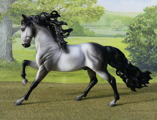
A much-awaited brand new model arrived here with me yesterday...
Yes, at long long last, Breyer's 70th Anniversary Traditionals have reached UK stockists!
This may seem crazy if you're a US collector and have had this set around since the spring, but over here we're often subjected to long waits for some regular run items. The current estimation for one of the 2020 'mid year' models is spring next year!
But this is the first time I've ever ordered one in January and had it arrive in October. Actually, I'm just relieved he's here at all. On top of unavoidable production delays from covid and the international distribution being a bit rubbish, the company I pre-ordered him with never even acknowledged or confirmed my order in the first place, then in ten months I never had a single email update on delays to likely delivery dates (meanwhile the website said 'due March' and this was never changed), and they ignored not one, not two, but three increasingly worried emails through the autumn, as I tried to contact them and got no response whatsoever. So I wasn't sure I'd ever be getting this model, and he definitely takes the record for longest I've had to wait!

Way back when the Anniversary collection of five Traditionals was first announced, this was the one who stood out, for me, and the only one which I knew I was going to want to buy.
I realise collectors have been raving over the Saddlebred most of all, they sell out in minutes, but I reckon I'm the odd one out there : he hasn't even made it to my wishlist yet! At first it was the oddly twirly sculpting of the tail which put me off, but when we saw 'real' photos which clearly showed his paint finish, I didn't like the highly metallic body and pearly mane & tail. I think a little metallic sheen can be a good thing, golden colours can reflect the light that way in real life, but too much and it's more like a decorator finish than a realistic coat. Some saddlebreds seem worse than others, I've seen a few which are perfectly done with just a hint of gold, so there's a lingering 'maybe' if I ever get chance to hand-pick one, or buy second hand with clear photos, so I could be sure of getting one which was less shiny. But now, back to the Andalusian!
He's just as nice in person as I'd hoped. The amount of black shading on them does seem to vary a little bit from the promo photo; some have starker contrast with a lighter near-white base coat, or entirely dark hindquarters and a more solid streak down the shoulder, mine's faded out more gradually into a dove grey body colour. That combined with well-rounded, distinctly non-fishscaley dapples makes him look quite soft and subtle. There's been none I've seen that looked absolutely terrible, though, some previous Trad runs have had 'good ones' and 'bad ones' but the painters have done a great job with copying this design - they do vary but even the ones which stray most from the prototype paintjob still look nice, if you get what I mean!
Here he is in different light, it's extremely tricky to find any big-enough patch of sunshine in my garden for many minutes each day between October til March, so these photos aren't the best - I had to make his shadow fall either left or right, to avoid hitting the backdrop behind. You can click any picture I post here on the blog to see it full size.
I think the photos with his shadow in front of him look the nicest, but these with it away behind him probably show him a bit more clearly, so it'll be difficult deciding which to use in photo shows!
The other side, it's one of those moulds which looks handsome either way round, and they'd display equally well on the shelf cantering left or right, I just love the big wild-flying mane so I tend to favour the near side. As the back of the box details, in explaining why they chose this mould to represent the 1990s-2000s, there's a lot more detail and complexity in the moulding, with cut-outs in the mane and tail. I've liked this dramatic and handsome mould ever since it first appeared, in 2004 as the unnamed black first edition (incidentally, still one of the best black OFs ever made, with shading and dapples worked in to his colour rather than just spraying it all over with a semi-gloss pure black paint and calling that good enough!)
You can just about see if you look closely at these two photos, that he's missing the tips of his ears, more drastically on the near side but the off is curiously blunted, too - it looks like over-zealous buffing of the mould to remove seam lines and going too far, not broken ear tips which escaped notice and got painted over. Luckily you can't really tell in the side-on photos, nor at a distance, so he looks just fine for display or photo showing - you probably hadn't noticed til I hadn't pointed it out, either!
I've tentatively gone with calling him Aniversario, as he's likely the only one of the 70th Anniversary Trads I'll end up with it, and in Spanish it doesn't sound too unappealing as a horse name - it's just rather unoriginal and if I think of anything better later, I'll change it!


No comments:
Post a Comment