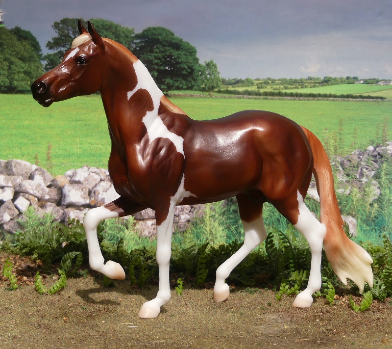
At least, this seems to be the side of him Breyer want us to see first, as he's photographed facing this way for their catalogue/promotional photo, and packaged in the box with this side showing, but I personally think the other side is his 'display' side, what do you think?
I also really love his markings on this side - facing the other way it just looks like he has a white section in his mane but here we get a brilliant flash of tobiano patching, nicely designed. And that made me realise, for once this horse doesn't seem to be real - the info on the back of his box just refers to the breed in general, and the example photo isn't even pinto (or chestnut!) - bucking the trend for portrait models as regular runs. He's apparently named Enzo in the press releases, but oddly the box doesn't mention this name anywhere. I've named mine Harecroft Mantiquiera - when a breed is so linked to a specific country, I like to look up an authentic name from real pedigrees, and this just popped out as something that suited him.
The Mangalarga mould is one which seems to have divided opinion, in sculpting style and detail it's just fantastic (he even has whisker bumps, and fluff in the ears!) but I've seen negativity about the pose, especially the legs. And it's something I've pondered while I waited for him to arrive - I think the reason it might look 'off' is that for the vast majority of collectors, we're just not as familiar with the breed and their particular variety of unusual gait.
Think of the gaited models we've been seeing year after year - the American breeds in a flashy high-stepping running walk, Standardbreds pacing, Peruvian Pasos with the spectacular swing of the forelegs, and Icelandics almost invariably sculpted in the tölt. They're not the usual walk/trot/canter/gallop we know off by heart, but we're used to them. They've stopped looking out of the ordinary.
This model brings a new gait to the mix, one we've maybe never even seen a video of to understand the action, and at a glance, paused in a 3D freeze-frame of plastic, it leaves the legs looking kind of jumbled and strange, almost a mistake - but it's perfectly right, and anatomically correct, for the breed. It's one of those cases where the more you read and watch about the real horses, the better the model version gets - have a search on Youtube for 'mangalarga marchador marcha picada' for some videos showing the gait in motion, it's faster than you might be imagining!
And the reason I'd already read up on the Mangalarga Marchador? This new chap isn't my first one!
Yes, I managed to get my lucky hands on the Breyerfest run from 2016, Imperador das Aguas JM, second hand on UK Ebay a little while ago. A dappled grey done with a really nice hint of brown in his shading, a refreshing change from the standard black or blue-grey looking paint - this one looks rich and realistic for the warmer colour tone. His dapples are done differently than usual too, they're smaller, and rather less even, so you find areas clustering and bending to shape rather than being a grid of perfect circles. It'd be lovely if this technique filters down to regular run releases eventually.
I've also got the Mangalarga Marchador by Collecta, but I'll leave that part of my collection for another day.


I can't believe they were using his off side for his promotional pictures! It does him no justice at all. I've never been a fan of this mold because of the head, buy this guy has changed my mind. That colour really flatters him and his pattern is lovely.
ReplyDeleteI think almost all moulds have a 'right' side, usually dictated by the turn of the head or bend in the neck - even if it's only slight, it's enough, and it's pretty easy to work out which looks nicest for a photo, and shows it off best in the box.
DeleteI do very occasionally use a horse's 'wrong' side as the display side on my shelves, if that's how the model looks best in the space I have for it (but that'd be less of a problem if I had more shelf or less horse, as I'm sure you understand all too well, hahah)